![]() Spectre Logo PNG
Spectre Logo PNG
The Spectre logo reflects the essence of cars designed for speed and racing tracks. It is a brand where the vehicle’s form serves aerodynamics, precision, and the pursuit of maximum performance.
The history of Spectre Supersports began in 1991, when British engineer Ray Christopher proposed creating a modern sports car based on the legendary Ford GT40. The car was named R42, honoring Ray’s initials and the car’s height in inches. The prototype was presented to the public at the 1993 London Motor Show, but GT Development went bankrupt due to the economic crisis.
In 1995, the project was bought by the American company Spectre Motors, headed by Anders Hildebrand, who established production at a factory in Dorset. The production model was equipped with a 355-horsepower Ford Mustang V8 engine and accelerated from 0 to 60 mph in 4.5 seconds. Aerodynamics experts from Stockholm University participated in the development. Spectre also introduced a racing version, the 600-horsepower R42 GTR, but financial issues halted the project.
The car appeared in the film “RPM” and the video game “Need for Speed III,” but sales were weak due to high production costs and build-quality issues. By 1998, the company had gone bankrupt, having produced only about 25 cars, now rare among collectors.
Meaning and History
![]()
What is Spectre?
It is a British automotive manufacturer founded by entrepreneur Anders Hildebrand that produces exclusive sports cars. The brand’s only model was the R42, a modern interpretation of the classic Ford GT40. The car featured a lightweight aluminum monocoque, composite body, and a powerful 350-hp V8 engine, accelerating from 0 to 100 km/h in 4.5 seconds.
1994 – 2009
![]()
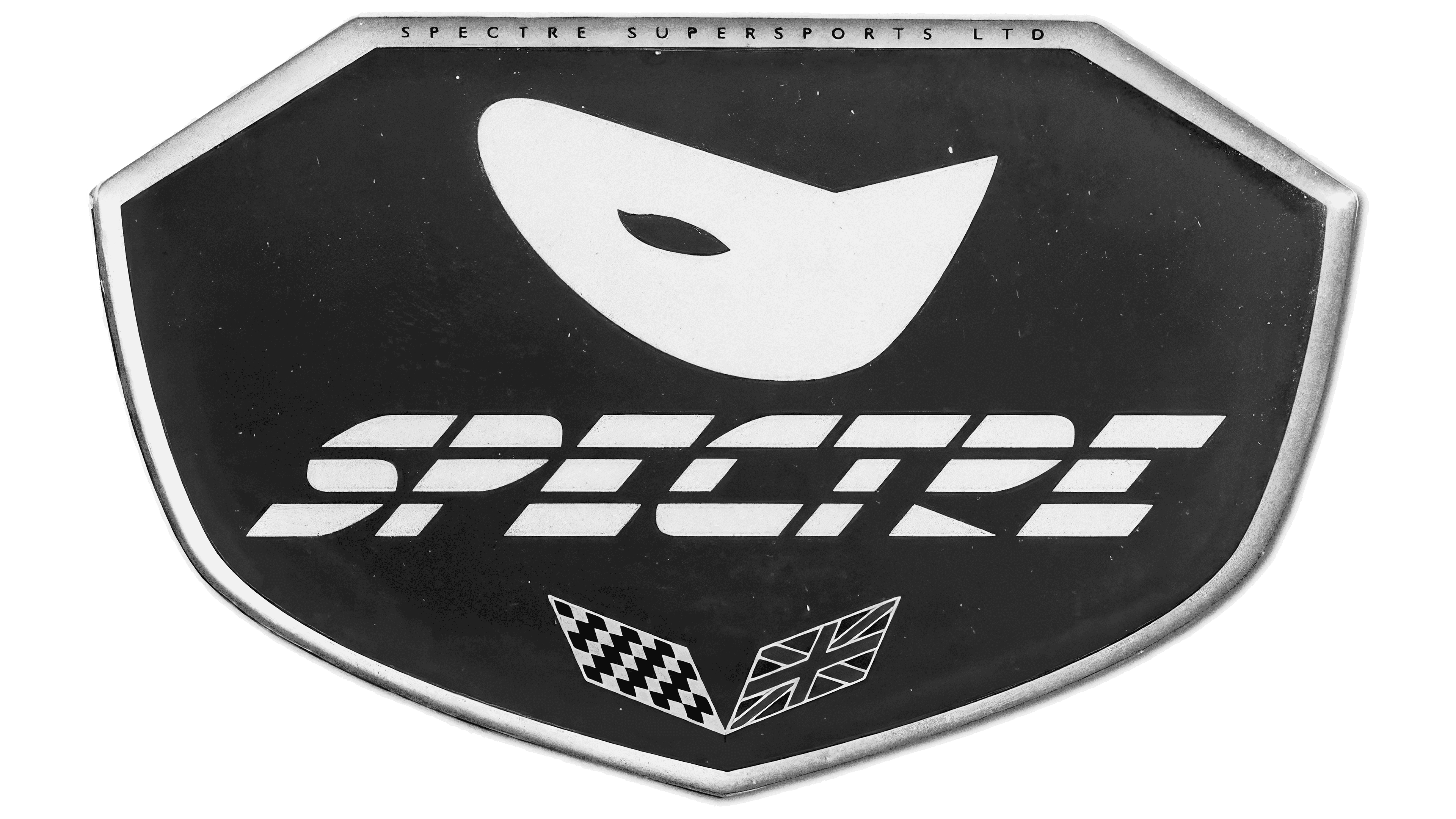
The Spectre Supersports Ltd logo appeared symbolic and concise, conveying the character of a company operating at the intersection of modern engineering technologies and racing traditions. A heptagonal shield with a silver relief border gives volume to the entire composition. The upper part of the frame is designed with the inscription “SPECTRE SUPERSPORTS LTD”, executed in a narrow black typeface with uppercase letters and wide letter spacing.
The inner area of the shield is filled with a rich blue, forming a background for the composition’s key elements. The center of the background is occupied by an abstract white figure stylized as a mask with a single eye-shaped cutout. The figure’s lines are smooth and soft, without sharp angles, evoking a ghostly image and aligning with the brand name.
Below the mask is the brand name “SPECTRE”, set in white type, stylistically close to classic technical typefaces such as Microgramma and Eurostile Extended, but significantly modified by the designers. Horizontal gaps separate the letters. All letters are slanted forward and composed of separate segments, emphasizing the company’s technological and racing orientation.
The lower part of the shield is decorated with two flags. On the left is a black-and-white checkered motorsport symbol associated with racing competitions. On the right is a stylized British flag, indicating the company’s origin and its connection to British engineering culture.
The logo of the British supercar manufacturer conveyed the spirit of a company focused on high-performance sports cars, combining British engineering expertise and modern technologies.