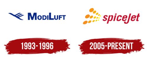
The SpiceJet logo resembles a flock of digital birds that fly neatly and coordinatedly toward their goal, increasing in number. The emblem symbolizes order and ease, affordable and comfortable flights, and a wide selection of destinations and routes.
SpiceJet: Brand overview
SpiceJet, an Indian low-cost airline based in Gurgaon, Haryana, was founded in 2004, though its origins date back further. Initially established as ModiLuft in 1994, it was a joint venture between Indian industrialist SK Modi and German airline Lufthansa. ModiLuft ceased operations in 1996, but the groundwork was laid for future endeavors.
In May 2004, the airline was resurrected as Royal Airways and soon rebranded to SpiceJet, with entrepreneur Ajay Singh at the helm. Singh transformed it into a budget airline. The first flight took off on May 23, 2005, from Delhi to Mumbai, utilizing a fleet of three leased Boeing 737-800s.
The company rapidly grew, focusing on domestic routes within India. By the end of 2006, it was serving 13 cities. In 2008, American investor Wilbur Ross invested in the aviation operator, providing a financial boost for fleet expansion and modernization.
2010, the aviation firm ordered 30 new Boeing 737-800s and initiated international flights to Kathmandu and Colombo. The following year, the airline diversified its fleet by ordering 15 Bombardier Q400 turboprops for regional services.
2012 saw a change in ownership, with media tycoon Kalanithi Maran acquiring a controlling stake through his Sun Group. In 2013, the brand became the first Indian budget airline to offer a premium economy service called “SpiceMax.”
However, 2014 was challenging, with financial difficulties leading to flight cancellations and salary delays. In January 2015, Ajay Singh regained control, initiating a turnaround plan that restored financial stability.
By 2016, the company returned to profitability and placed a significant order for 205 Boeing 737 MAX aircraft. 2017, it became the first Indian budget carrier to join the International Air Transport Association (IATA).
In 2018, the brand launched its cargo division, SpiceXpress, diversifying its operations. The airliner expanded its international network the following year, adding destinations in Southeast Asia and the Middle East.
As India’s second-most popular airline, SpiceJet commands a 10-15% share of the domestic market, positioning it just behind IndiGo, the leader.
The air operator is known for its innovative marketing and promotional campaigns, including offering tickets at a symbolic price of 1 rupee. By 2020, it had become one of India’s largest airlines, serving over 60 domestic and international destinations with a fleet of more than 100 aircraft.
Meaning and History
What is SpiceJet?
This is an Indian low-cost airline based in Gurgaon, known for its innovative business model and vibrant branding. The company operates a diverse fleet, including Boeing 737 and Bombardier Q400 aircraft, allowing it to efficiently serve both major cities and regional destinations. It is known for its SpiceMax program, which offers passengers additional comforts for a small extra fee, an uncommon feature for low-cost carriers. The company is notable for its SpiceClub program, one of the first loyalty programs among Indian low-cost airlines.
1993 – 1996
From 1993 to 1996, SpiceJet used a logo that vividly showcased its multifaceted nature and focus on serving many passengers. The elements of this emblem were filled with the company’s symbolism and ambitions.
The central element of the logo was a bird ascending with three wings depicted on it. This unique design added dynamics to the image and symbolized the speed at which the company aimed to serve its customers. The bird’s three wings represent the continuous flow of flights and the stability of the airline’s operations. This logo element emphasized SpiceJet’s commitment to fast and efficient service and its reliability and steadiness in the aviation industry.
Next to the image of the bird was the inscription “Modiluft” in a monochrome palette. The company’s original name was given in honor of the Indian entrepreneur who founded the brand. Under this name, the company operated until 1996, when it rebranded to SpiceJet.
The deliberately chosen deep blue color was important to the logo design. This color is part of the national flag and is associated with the celestial world and divine creation. The logo’s use of this color hinted at the company being blessed by the gods and destined to use the sky, highlighting its deep roots and cultural connections with its homeland.
2005 – today
After Ajay Singh gained control over the company, he updated the logo to reflect a new era in the brand’s history. The new logo was designed to visually convey a sense of dynamism and positivity that the company aimed to offer its customers. Vertical rows of orange and yellow dots in the design symbolized an airplane cabin filled with happy passengers. These dots, receding into the distance, created an impression of depth and scale, illustrating the airline’s extensive network of routes and travel opportunities.
The design highlighted that every Ajay Singh customer could expect a high level of comfort, courteous service, and exceptional attention to detail, regardless of destination. These aspects strengthened passenger trust and loyalty to the new brand.
The name SpiceJet was chosen to emphasize the affordability and appeal of the services offered. It reflected the company’s strategy of providing cost-effective yet quality flights, making air travel accessible to many passengers.
The choice of red in the logo was deliberate. It symbolized the passion and energy the company aimed to re-enter the market after the relaunch. This color reflected the company’s rapid development and growth, highlighting its ambitions and determination to move forward.


