The Srilankan Airlines logo, shimmering with various colors, represents the beauty and diversity of Sri Lanka against the backdrop of a beautiful sky and ocean. As it flies around the world, the company aims to convey the uniqueness of its homeland.
Srilankan Airlines: Brand overview
Sri Lankan Airlines was founded in 1947 on December 10, when Air Ceylon was established. This airline emerged shortly after Ceylon (now Sri Lanka) gained independence from the British Empire. Air Ceylon was a joint venture between the Ceylonese government and Australian National Airways (ANA), reflecting the new nation’s ambition to develop its aviation sector.
In 1951, the airline launched its first international flight to Madras (now Chennai), India, utilizing a Douglas C-47 Skytrain. This milestone was crucial in enhancing international connections for Ceylon and fostering economic and tourism growth.
During the 1960s, the airline expanded its route network across Asia and the Middle East. The airline started modernizing its fleet with more advanced aircraft to improve service quality and operational efficiency.
In 1978, Air Ceylon was dissolved due to financial and operational difficulties. The Sri Lankan government established a new national airline, Air Lanka, as part of broader economic reforms.
On September 1, 1979, the new airline commenced operations with its inaugural flight from Colombo to Bangkok using a leased Boeing 707. The airline swiftly expanded its network, connecting major Asian and European cities.
Throughout the 1980s, the airline grew despite political challenges within the country. The fleet was upgraded with modern aircraft like the Lockheed L1011 TriStar, enabling more efficient long-haul flights.
In 1998, Emirates acquired a 40% stake in Air Lanka and secured a 10-year management contract. This partnership brought significant operational and strategic changes to the airline.
In 1999, the airline rebranded itself as Sri Lankan Airlines as part of its modernization strategy. This rebranding included new aircraft livery and enhanced passenger services.
Under Emirates’ management in the 2000s, the airline continued modernizing its fleet and expanding its route network. New Airbus A330s and A340s were acquired, opening new long-haul routes and enhancing service quality.
In 2008, Emirates sold its stake back to the Sri Lankan government, ending the 10-year partnership and ushering the airline into a new phase under full government control.
During the 2010s, the airline faced several challenges, including increased competition and financial difficulties. Despite these hurdles, investments were made in fleet renewal and service enhancements.
On May 1, 2014, the airline became an official OneWorld Global Aviation Alliance member. This membership provided new opportunities for collaboration with leading airlines and expanded the airline’s global footprint.
Various restructuring and optimization initiatives were implemented between 2015 and 2019. The focus was on improving financial performance, optimizing the route network, and increasing operational efficiency.
In 2020, amidst unprecedented challenges in the aviation industry, the airline had to adapt its operations to the drastically changed market conditions, focusing on maintaining key routes and passenger safety.
Meaning and History
What is Srilankan Airlines?
This is the national carrier of Sri Lanka, based at Bandaranaike International Airport near the country’s capital, Colombo. The company offers an extensive route network covering destinations across South Asia, the Middle East, Southeast Asia, and Europe, which is key in developing tourism and trade on the island. The airline operates a modern fleet of narrow-body and wide-body aircraft, including the Airbus A320, Airbus A330, and Airbus A350, striving to provide its passengers with optimal comfort, service, and efficiency.
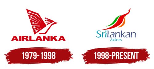
1979 – 1998
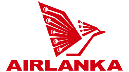
The company, which started as Sri Lanka’s flagship carrier, actively incorporates cultural symbols of its region into its branding. This dedication to local traditions is evident in the name and the logo design. The bold red letters of “Air Lanka” exude confidence and strength, highlighting the airline’s leading position in the national market.
The emblem’s central element is an image of the Indian peafowl, which is prevalent on the islands of Sri Lanka and can be considered one of the country’s symbols. The peacock in the logo represents an aspiration for flight and travel. The bird’s brightness and beauty in the logo reflect the magnificence and cultural diversity of Sri Lanka. The spread feathers with a unique pattern are styled attractively, making the image memorable.
Schematic lines in the logo design evoke associations with the precise and elegant structures of airplanes, complementing the image of the peacock and emphasizing the airline’s technical sophistication. This design symbolizes the flight of a metal bird over the paradise landscapes of Sri Lanka, creating an image of dreams of distant travels.
In Sri Lankan culture, the peacock holds a deep symbolic meaning and is associated with longevity, love, and immortality. The choice of such a symbol for the logo is deliberate: it foretells the airline’s passenger affection and many years of successful operation.
1998 – today
After being acquired by Emirates, the airline received a new name and an updated logo, which combines emblem elements in a dynamic and rapid fusion of colors and shapes. This update represents a new chapter in the company’s history, highlighting its ambitions and global reach.
The central element of the new logo is an image of a peacock, which has been completely redesigned to reflect modern design trends and corporate identity. The bird’s body is now depicted with an elegant wavy line that smoothly changes color from orange to red and then to green. These colors are deliberate: they correspond to the flag of Sri Lanka and symbolize the flame and passion of red, as well as the lush green nature of the country, emphasizing the airline’s roots. The dynamic of the peacock’s flight embodies the aspiration for new heights and growth.
At the bottom of the logo, the inscription “Srilankan” is rendered in soft aquatic tones reminiscent of ripples on the water’s surface. The smoothness of the font creates the impression that the inscription floats under the image of the peacock, which seems to have just emerged from the water, leaving behind a gentle stir. The blue and cyan shades of this part of the logo reflect the endless water expanses surrounding the islands of Sri Lanka, and the sky mirrored in these waters. The color palette of the inscription conveys a sense of calm while emphasizing the company’s boundless opportunities in the world of aviation transport.


