


![]() SsangYong Logo PNG
SsangYong Logo PNG
The SsangYong logo, which features spread wings, reflects the company’s aspiration to distant horizons and focus on leadership. This stylization is understandable in any country where the automaker supplies products, so the trademark uses a graphic logo rather than text.
Meaning and History
![]()
Two independent companies founded this brand. One was established in 1954 and was called Ha Dong-hwan Motor Workshop. The second was young and had been in the automotive industry since 1962 under Dongbang Motor Co. In 1963, they were merged into Ha Dong-hwan Motor Co. A year later, they began manufacturing buses, trucks, military jeeps, and other specialized equipment.
In this status, the company existed until 1977, when it changed its name to Dong-A Motor. Then, in 1984, it came under the control of Keohwa, a South Korean company based in Seoul that produced jeeps for export. In 1986, the company was taken over by the SsangYong Business Group. It became a part of it and adopted its current name. Frequent transitions between structures affect identity. Its emblems sometimes differ sharply from each other. She has seven of them in total.
What is SsangYong?
This is the fourth-largest automaker in South Korea, specializing in reliable SUVs and adaptable crossovers that combine affordability with practicality. The company began as a manufacturer of trucks and buses, later becoming a major player in the global automotive industry, gaining renown for models such as the Rexton, Korando, and Musso. The brand is known for its unique design approach that blends elements from international alliances, such as Mercedes-Benz, which helped implement new technologies alongside Korean innovations.
1950s – the 1960s
![]()
The first logo was very simple. It consisted of a single V on a brown background. The sign’s shape also resembled a checkmark, usually used to indicate points. A thin yellow underline was drawn under the symbol.
the 1960s – 1978
![]()
After the redesign, the logo changed in style and color. Now, it was a bold black checkmark with narrow tops. Above it (more precisely, in it) was another letter “H,” made in a font from the ExtraBold category. The developers made it flat and well-defined.
1978 – 1987
![]()
The authors chose the icon from the previous version for the updated logo, but only changed its color. Therefore, it was painted blue and white. But besides the V-shaped checkmark, there were also thin circular lines. All graphic elements were placed in a blue square. On the right, they placed the company name written in Korean. A light gray rectangular frame surrounded the emblem.
1988 – 1989
![]()
In this version, the designers changed the font, using smaller hieroglyphs. They also changed the badge, placing the English company name in a ribbed pattern of oblique stripes. The letters were white, the lines were blue, and the background was gray. In the lower-left corner, there was a miniature yellow triangle.
1989 – 1997
![]()
Adhering to the principle of authenticity, the car brand temporarily adopted the Korean spelling of the name. But he changed the icon on the left, so the graphic sign was composed of two elongated “S”, the first letters of the brand name. One character is gray; the other is red.
1992 – the 2000s
![]()
In 1992, the company adopted a new identity that did not resemble any earlier versions. The logo depicted three rings: one large and even, the other two flat because they were drawn in profile. Therefore, outwardly, they resembled uneven ovals. All lines were painted in two colors: half white and half blue. In addition, an inscription appeared at the bottom: “SSANGYONG MOTOR.”
the 2000s – today
![]()
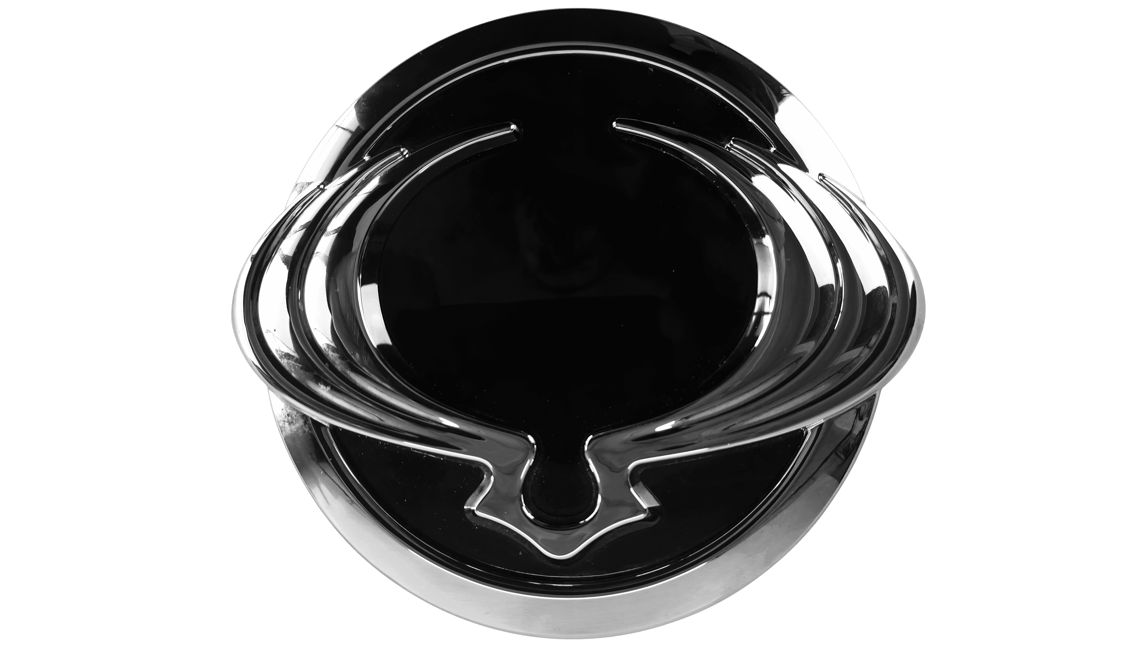
The current emblem has changed the concept. She is as close as possible to the phrase “SsangYong,” which, in South Korean translation, means “twin dragon.” Therefore, the logo features two wings united by a common figured element. Each side has three strokes of different lengths and widths: the inner “feathers” are wide, and the outer ones are narrow. The modern name of the automobile brand is placed under them.
Font and Colors
This brand has a turbulent history, marked by frequent structural transitions. This activity was reflected in the logo’s evolution, which at times bore little resemblance to previous versions. Moreover, the manufacturer adhered to the Korean spelling of the name for a long time, and only after the new millennium did they switch to the English version.
The car brand chose a simple typeface for its graphic designation: austere, printed, smooth, sans serif. Moreover, both words are written together, although they are marked with capital letters “S” and “Y.”
The original palette consists of blue and white. Early varieties also include yellow, red, and gray.
FAQ
Is SsangYong Korean or Chinese?
The brand is a South Korean automaker specializing in SUVs, including the Rexton, Korando, and Musso. It is known as the best choice in Korea for this type of car. Over time, the company has invested heavily in improving diesel engines and making them more environmentally friendly. This has helped it stand out in Korea’s automobile market and worldwide by offering high-quality, efficient vehicles.
Are SsangYong reliable?
South Korean automakers, often confused with Chinese ones, are known for their reliable cars. The company has made great strides in engine technology, especially diesel engines, improving their reliability. Owners report that these vehicles are well-built and last a long time. Models like the Rexton and Korando are known for their performance and comfort, offering more than you’d expect for their price. This makes the brand a good choice for those looking for a reliable and affordable car.
What does the SsangYong logo mean?
The logo features two dragons, which match the brand’s name, meaning “double dragon” in Korean. The dragons are stylized as intertwined, forming a single pair of wings. The use of dragons, symbols of power and mysticism in many East Asian cultures, shows the brand’s uniqueness.
Who is SsangYong made by?
The brand is managed by Mahindra Motor Co., an Indian company known for manufacturing transportation equipment. Mahindra acquired the South Korean automaker and began producing cars under its name. This partnership combines South Korean automotive skills with Mahindra’s resources to create quality vehicles for local and international markets. The company faced financial difficulties, leading it to sell Edison Motors amid bankruptcy proceedings initiated in 2021.
Does Mercedes own SsangYong?
No, these are separate enterprises, but they work closely together. The South Korean brand uses German-made engines and applies Mercedes-Benz technology to its cars. This partnership helps leverage Mercedes-Benz’s cutting-edge design and technology to improve the performance and reliability of SsangYong’s models.
What car brand has a dragon logo?
Alfa Romeo, an Italian automobile brand, is widely known for its snake logo, adding elegance and mystery.
Other car brands use dragon symbols in their logos. SsangYong from South Korea has a logo depicting two intertwined dragons resembling a pair of wings, directly related to its name, which means “double dragon.” Drako Motors, an American manufacturer of electric sports vehicles, uses a modern, stylized dragon in its logo.