


![]() St Jude logo PNG
St Jude logo PNG
The designers created the St. Jude logo featuring an image of a small child with his head bowed and his palms folded, as if he were praying. This emblem indicates that the therapeutic and research institution is engaged in saving children. The artist deliberately made the drawing impersonal to create a universal image without reference to a specific person.
St. Jude Children’s Research Hospital began with Danny Thomas’s 1940 prayer in a Catholic church in Detroit. A young Lebanese-American entertainer with little money, he asked St. Jude Thaddeus for help in finding his place in life. He promised to build a shrine in his honor. Thomas donated his last seven dollars that day. Later, he found better-paid work, and in 1953, he received his own television show.
In the early 1950s, Thomas began shaping the promise into a real project. Cardinal Samuel Stritch advised him to look to Memphis, Tennessee. By 1955, local businessmen joined the plan. The idea changed from a regular children’s hospital into a research center for catastrophic childhood diseases. At the time, overall childhood cancer survival in the United States was about 20 percent, while acute lymphoblastic leukemia survival was near 4 percent.
In 1957, one hundred members of the Arab-American community met in Chicago. They founded ALSAC to raise money for the future hospital. On February 4, 1962, St. Jude opened in Memphis before an audience of 9,000. Families received no bills for treatment, housing, food, or travel. During segregation in the South, it became the region’s first fully integrated children’s hospital, with Black and white children treated in the same wards.
Soon after opening, doctors launched Total Therapy for leukemia. In 1966, the first children with acute lymphoblastic leukemia were taken off treatment in sustained remission. In 1972, St. Jude reported 50 percent survival for the disease, changing leukemia care at centers including the Children’s Hospital of Philadelphia. Danny Thomas died in 1991 and was buried on the hospital grounds. In 1996, St. Jude immunology chair Peter Doherty won the Nobel Prize in Medicine. By 2006, ALL survival at the hospital reached 94 percent.
Meaning and History
![]()
St. Jude was so named after St. Jude Thaddeus, to whom comedian Danny Thomas prayed. The young entertainer was poor and asked the apostle several times for money to support a newborn child. He promised the saint that if he succeeded, he would build him a temple. When Danny became famous, he kept his word, but he did not build a service center; he built a hospital for children with cancer.
Despite its name, St. Jude Children’s Research Hospital is not affiliated with any religious organization. It is a comprehensive cancer center that combines a research institute, a charitable foundation, and a hospital. Its sole purpose is to find new therapies to save children, which is reflected in its corporate logo. The image of a defenseless child perfectly captures the essence of the brand.
What is St Jude?
St Jude is the acronym of St. Jude Children’s Research Hospital. It is one of the best facilities in the world to care for some of the world’s most challenging patients, primarily those with cancer. The doctors working there treat patients and search for cures for life-threatening diseases. The Comprehensive Cancer Center has existed for more than 60 years, and during that time, it has raised the survival rate of children with cancer from 20% to 80%. All services, including treatment, food, and lodging at the hospital, are free because benefactors pay for them.
1958 – 1973
![]()
According to the official St Jude site, the logo was created in 1958 but used only 15 years later, in 1973. Another version is that the baby logo comes much later, as it depicts Emily Taylor Stearns, the only patient to survive in 1977 on the wing, where 13 children were being treated at the time.
Anyway, the logo shows the orange silhouette of a child with a gray armband on his arm. A large sun with broad white rays shines in the background. The graphic composition is square-shaped. At the bottom is the orange inscription “ST. JUDE CHILDREN’S RESEARCH HOSPITAL,” divided into two lines and in bold italic serif type.
1962 – 1973
![]()
The central element of this logo resembles a reclining cross, a reference to the hospital’s religious prehistory: it was built as a shrine to St. Jude Thaddeus and named after him. The emblem is based on a white ellipse with a thin black outline. This version was used until mid-December 1973.
1994 – 2006
![]()
Designers revived the baby logo in a new dark red. As before, the silhouette is against the sun’s background with its broad rays, but in this version, the background behind it is shaded with many thin horizontal lines. The hospital’s name is at the bottom and is divided into two levels. It uses a bold, contrasting serif font; all the letters are dark red. Even below is a long gray bar, and in the same gray color is the phrase “ALSAC Danny Thomas, Founder.”
2002 – 2018
![]()
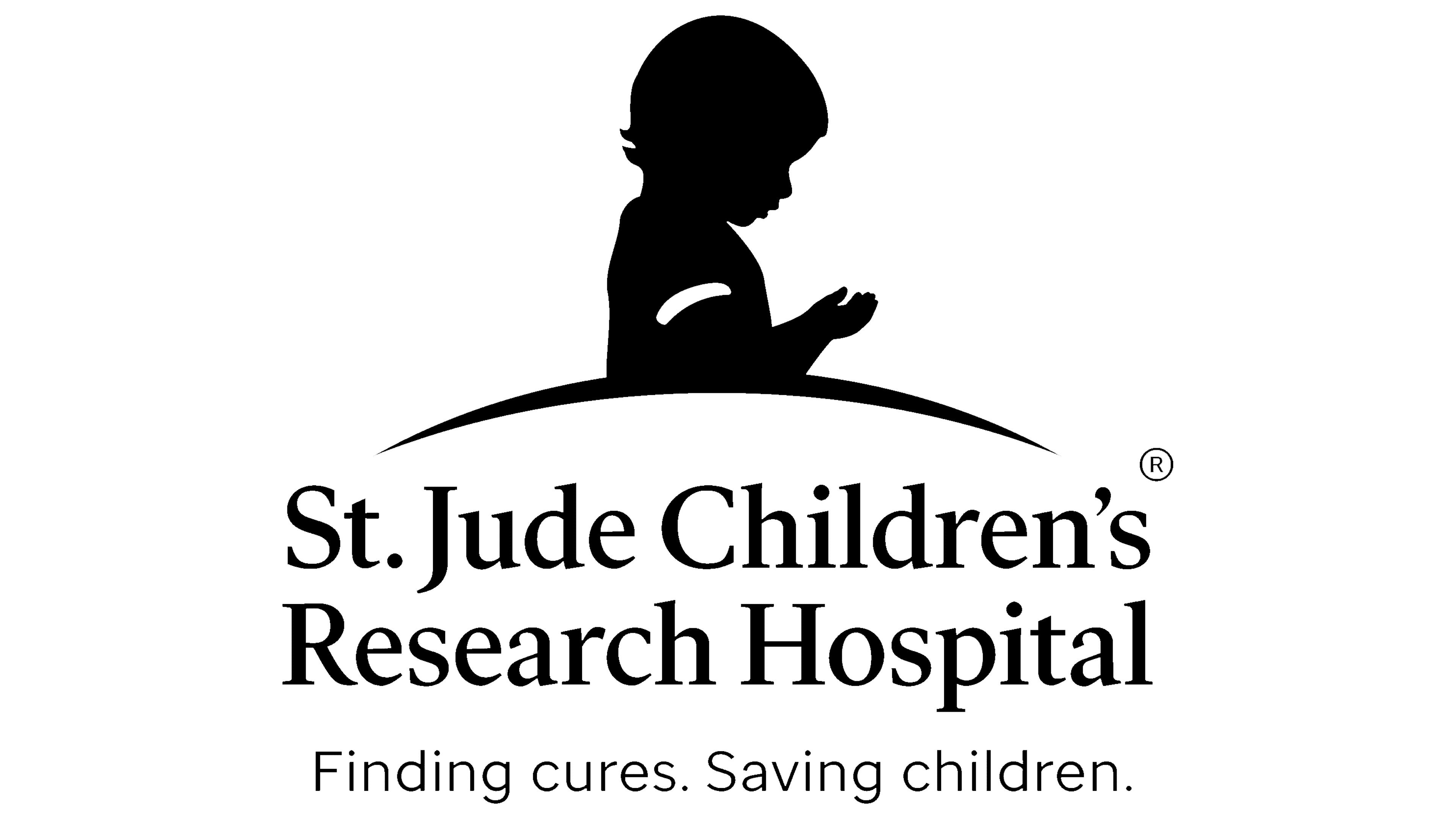
In August 2002, the child’s silhouette took on a crimson-purple hue. And to make the pattern look more harmonious, the designers made it solid by painting a gap between the head and torso. The base, in the form of the sun, was removed, so the emblem appeared on an empty white background. But thanks to the arc added at the bottom, it does not hang in space. The inscriptions have been moved to the right and repainted in silvery gray. The horizontal stripe separating them has disappeared, and at the bottom, there is an additional line containing the slogan “Finding cures. Saving children.” in dark red. The designers used bold italic font for the slogan to make it stand out from the rest of the text.
2018 – today
![]()
In May 2018, St. Jude Children’s Research Hospital underwent another rebranding. As a result, the baby’s silhouette was lighter and brighter, adding optimism to the image. All of the lettering has been moved downward under the arc. The motto font was changed to St Jude Sans. At the same time, the name of the hospital, as before, is in serif type. As for the line “ALSAC Danny Thomas, Founder,” it has been removed.
Font and Colors
The emblem on a child’s arm has a symbolic meaning. Although it is white, it can be compared to the lavender ribbon usually worn to recognize cancer. After all, St Jude is a comprehensive cancer center.

St Jude Sans’ signature font is a geometric grotesque with thin lines. It is usually used for the motto. In turn, the hospital’s name is written in contrasting antiqua with large serifs. The logo combines both uppercase and lowercase letters. The base of the palette is a combination of burgundy and gray. The first color symbolizes energy and determination, and the second is stability, calmness, and compromise.