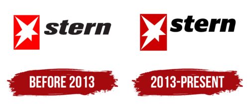
The Stern Logo, which has become a familiar sight, displays an asymmetric six-pointed star in white, settled within a red rectangular background. The symbol has withstood the test of time, maintaining its original form over the years, contrary to the logo’s text element.
Employing black for its textual component, Stern presents a bold and compelling tricolor scheme comprising red, white, and black. The logo effectively mirrors the brand’s appeal to a contemporary demographic while honoring its deep-seated roots.
The significance of the Stern emblem lies in its simplicity and its contrasting color scheme. The asymmetrical star serves as a beacon of distinction and originality, underlining the brand’s commitment to standing out in the industry. Using black for the wordmark signifies strength and authority, indicating the brand’s unwavering stance in its sector. The tricolor palette encapsulates a sense of passion (red), purity (white), and power (black), beautifully reflecting Stern’s ethos. The persistent design over the years further attests to the brand’s dependability and steadfastness.
Stern: Brand overview
| Founded: | 1 August 1948 |
| Founder: | Gruner + Jahr |
| Headquarters: | Hamburg, Germany |
| Website: | stern.de |
Born in the vibrant city of Hamburg, Stern has carved out a significant position in the world of publishing. This illustrated broadly left-liberal weekly current affairs magazine has been shining brightly, akin to its namesake, the ‘Star.’ Brought into being by Gruner + Jahr, a subsidiary of Bertelsmann, it has been delivering insightful narratives to German households since its inception.
Stern doesn’t just report the news but rather wraps every piece in an engaging narrative. The brand’s commitment to quality journalism and insightful analysis of politics, economics, and culture forms the core of its identity. This unique approach resonates with its reader base, ensuring a place in their weekly reading habit.
Meaning and History
Moving on to the visual elements that comprise the brand’s identity, Stern’s approach to design is firmly rooted in the marriage of imagery and text. Accompanying its articles with thought-provoking illustrations and photographs, Stern seamlessly blends the lines between a news magazine and an art exhibit. This fusion of vivid imagery and compelling stories offers readers an immersive and multi-sensory experience.
The logo of Stern, a minimalist, stylized representation of a star, mirrors the brand’s identity beautifully. It signifies a beacon, a guiding light in the often convoluted world of current affairs, symbolizing the magazine’s mission of guiding its readers through the complexities of the world. The simplicity of the logo is a testament to the brand’s direct and unadorned approach to news delivery.
The typography and color palette of Stern also contributes to its brand identity. The magazine uses a simple, clean typeface, emphasizing readability and sophistication. The color scheme primarily employs a contrast of black and white, further enhancing the sense of simplicity and focus, with the occasional use of bold colors for emphasis and visual appeal.
What is Stern?
Stern is a well-established weekly news magazine based in Hamburg, Germany. It was founded on August 1, 1948, by Gruner + Jahr, a major publishing firm. The magazine covers a broad spectrum of topics, including politics, economics, culture, science, technology, and lifestyle. Stern is known for its in-depth reporting, insightful feature articles, and striking photography. Its substantial readership and influence make it one of Germany’s leading general-interest magazines.
before 2013
2013 – today
Stern color codes
| Racing Red | Hex color: | #cc0000 |
|---|---|---|
| RGB: | 204 0 0 | |
| CMYK: | 0 100 100 20 | |
| Pantone: | PMS Bright Red C |
| Black | Hex color: | #000000 |
|---|---|---|
| RGB: | 0 0 0 | |
| CMYK: | 0 0 0 100 | |
| Pantone: | PMS Process Black C |


