


 Steve Madden Logo PNG
The Steve Madden logo reflects the brand’s core principles, prioritizing the quality of each product. This is its main value. The logo is associated with classic simplicity, avoiding flashy shine or excessive luxury. It embodies minimalism, highlighting practicality and style without layers or complex elements.
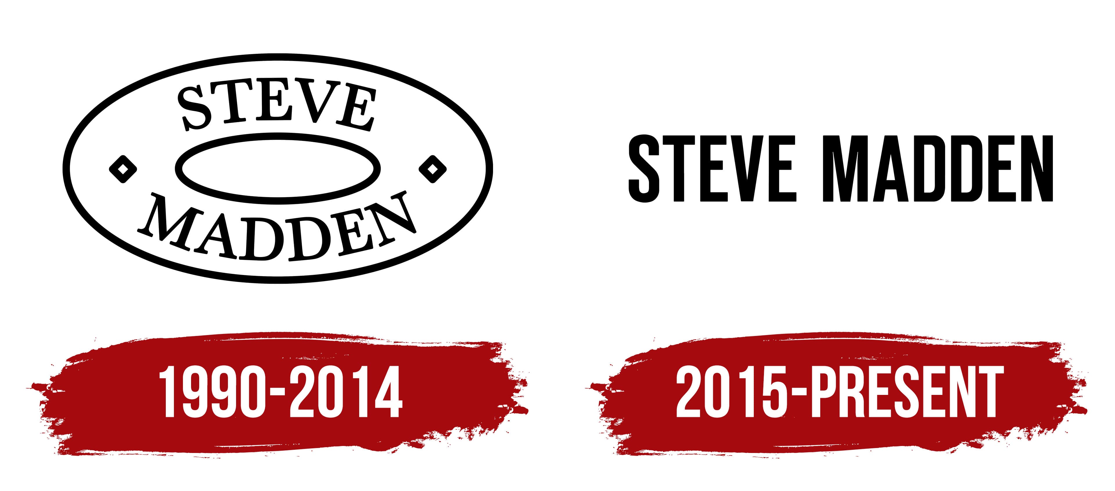
The modern emblem is significantly different from its original variation. It has acquired a more refined look, free from geometric shapes, drawings, or unnecessary details. Designers focused on the brand’s name, believing this was the primary element to emphasize. By 2014, the “Steve Madden” brand had become so recognizable that additional elements were simply no longer necessary. This evolution of identity reflected the company’s achieved status and was justified on all levels.
The restrained, elegant style became the foundation of the logo, with a black-and-white color palette that emphasizes its classic character. The harmoniously placed font looks perfect on a white background, creating a sense of lightness and purity. Each letter is easily readable, adding dynamism and completeness to the logo.
Steve Madden began in 1990, when its founder invested $1,100 and sold shoes from his car in New York. The first product was the Marilyn cowboy boot, aimed at younger buyers. After working for footwear companies and retailers, Madden used his experience to develop trend-led shoes at accessible prices. The first store opened in SoHo in 1993 for direct customer feedback.
In 1994, Steve Madden completed an IPO and used the capital to expand. During the mid-1990s, the range grew to include handbags and accessories, while marketing focused on younger consumers. The Slinky platform shoe, released in 1996, became closely linked to 1990s fashion. By the end of the decade, the company had added stores and expanded its presence in US department stores.
In 2002, Steve Madden was convicted of money laundering and securities fraud tied to a pump-and-dump scheme and received a 41-month prison sentence. Management continued operating the company during his absence. After his release in 2005, he returned as a creative consultant, and the brand added a men’s footwear line in 2006.
International expansion continued through the 2010s, with stores in Europe, Asia, Canada, and Mexico. The company acquired Betsey Johnson in 2011, launched a clothing line in 2015, issued a 25th-anniversary collection in 2017, and bought BB Dakota in 2019. During 2020 and 2021, it expanded e-commerce and digital marketing. New collaborations followed in 2022, while retail and online operations continued in 2023.
Meaning and History
What is Steve Madden?
This vibrant American fashion brand gained popularity for its stylish and affordable accessories and footwear. The brand offers many products, including bold platform shoes, trendy casual boots, and sandals. The company now also sells handbags, accessories, and clothing, maintaining the bold yet accessible style synonymous with the brand. The brand strongly understands youth culture and celebrity style, skillfully creating trendy items that appeal to fashion influencers and everyday consumers.
1990 – 2014

The first Steve Madden logo attracted attention with its expressiveness and originality. Despite the absence of bright color accents or a complex palette, its black-and-white color scheme looked impressive. The designers achieved a layered and memorable style using only two words and a few geometric elements. This logo lasted for over ten years, becoming a company symbol.
The logo’s distinguishing feature was its unconventional shape. It consisted of two parts, which some saw as outlines, while others viewed as independent figures. Regardless of interpretation, the key point was that the brand name was placed inside this shape, creating a sense of completeness. A stretched ellipse, wide in the center and tapering at the edges, served as the foundation of the composition. The first word, “Steve,” was placed at the top of the shape, and “Madden” at the bottom. Two small diamonds were positioned on the edges of the ellipse, adding an accent and harmoniously completing the composition.
The font also played an important role in creating the logo’s visual appeal. Each letter was large and capitalized, complemented by elegant serifs that gave the text a unique character. Some consonants stood out with their width, adding dynamism and expressiveness. Thus, the emblem reflected the brand’s core values, attracted attention, and maintained elegance and simplicity.
2015 – today

In 2014, a decision was made to radically update the logo for various reasons. Customers of the well-known brand were presented with an entirely new identity that was drastically different from the previous version. All geometric shapes, such as ellipses and diamonds, were left behind, giving way to a more modern and minimalist design. However, the white background, characteristic of many well-known companies, was retained, emphasizing a classic, clean style.
The focus shifted to the letters, specifically the company’s name, which was presented in black, a traditional color for the brand. The capital letters were set in a sans-serif, giving them a sense of strictness and modernity. Every text element, horizontal and vertical lines, was crafted with precision and care. All the letters were uppercase, uniform in size, and even, without gradients or visual effects.
The consistent black color conveyed reliability, stability, and high quality, which are associated with the brand. This decision also strengthened the brand’s perception as mature and confident in its values. For the first time in the company’s identity history, “Steve Madden” was aligned on a single horizontal line, giving the logo even more simplicity and completeness.