


 Celine Logo PNG
The Celine logo reflects the founder’s unique personality and adherence to modern fashion trends. It represents a symbiosis of individuality and current trends, showcasing the brand’s ability to renew and adapt to changes in the fashion world. The emblem evolves, emphasizing continuous development and the desire to remain relevant in a rapidly changing market.
Celine began in Paris in 1945, when Céline Vipiana and her husband Richard founded a workshop for made-to-measure children’s shoes. The company served wealthy families and built its early reputation around premium craftsmanship. In 1960, women’s footwear entered the range, marking the brand’s shift from a narrow children’s shoe business toward a broader fashion house.
In 1964, Celine introduced its first leather handbags and gloves, adding categories that became central to its growth. The first ready-to-wear line followed in 1967, giving the company a fuller fashion identity based on refined, restrained styles. During the 1970s, Celine expanded abroad with stores in Geneva, Lausanne, Monte Carlo, and Rome, while adding perfumes and more accessories.
In 1987, Bernard Arnault, head of LVMH, acquired the brand and connected it with the world’s largest luxury group. Michael Kors became creative director in 1997 and helped raise Celine’s international profile. Roberto Menichetti replaced him in 2004, followed by Phoebe Philo in 2006. Under Philo, the brand moved toward practical minimalism and released major bags such as the Classic Box and Luggage Tote.
In 2018, Hedi Slimane became artistic and creative director and image director, changing the brand’s direction toward a younger, rock-influenced style. In 2019, he presented his first full collection and launched Celine’s first menswear line. In 2020, the brand introduced eleven unisex fragrances and expanded online sales. From 2021 to 2022, Celine added new bags, accessories, jewelry, boutiques in major Asian cities, and the updated Triomphe bag.
Meaning and History
What is Celine?
It is a French luxury clothing brand known for its elegant designs and minimalist style. The company sells ready-to-wear, accessories, leather goods, fragrances for men and women, and other high-end products. Among the brand’s most famous products are stylish handbags, sought-after status symbols in the fashion industry. The brand is characterized by exquisite craftsmanship, subtle elegance, and clean lines. It remains a key player in the luxury goods sector, with flagship boutiques in major fashion capitals and a presence in high-end department stores worldwide. The brand is a favorite among celebrities, fashionistas, and industry insiders, and it often sets trends in the design world. The brand’s influence is not just limited to fashion.
1973 – 1990
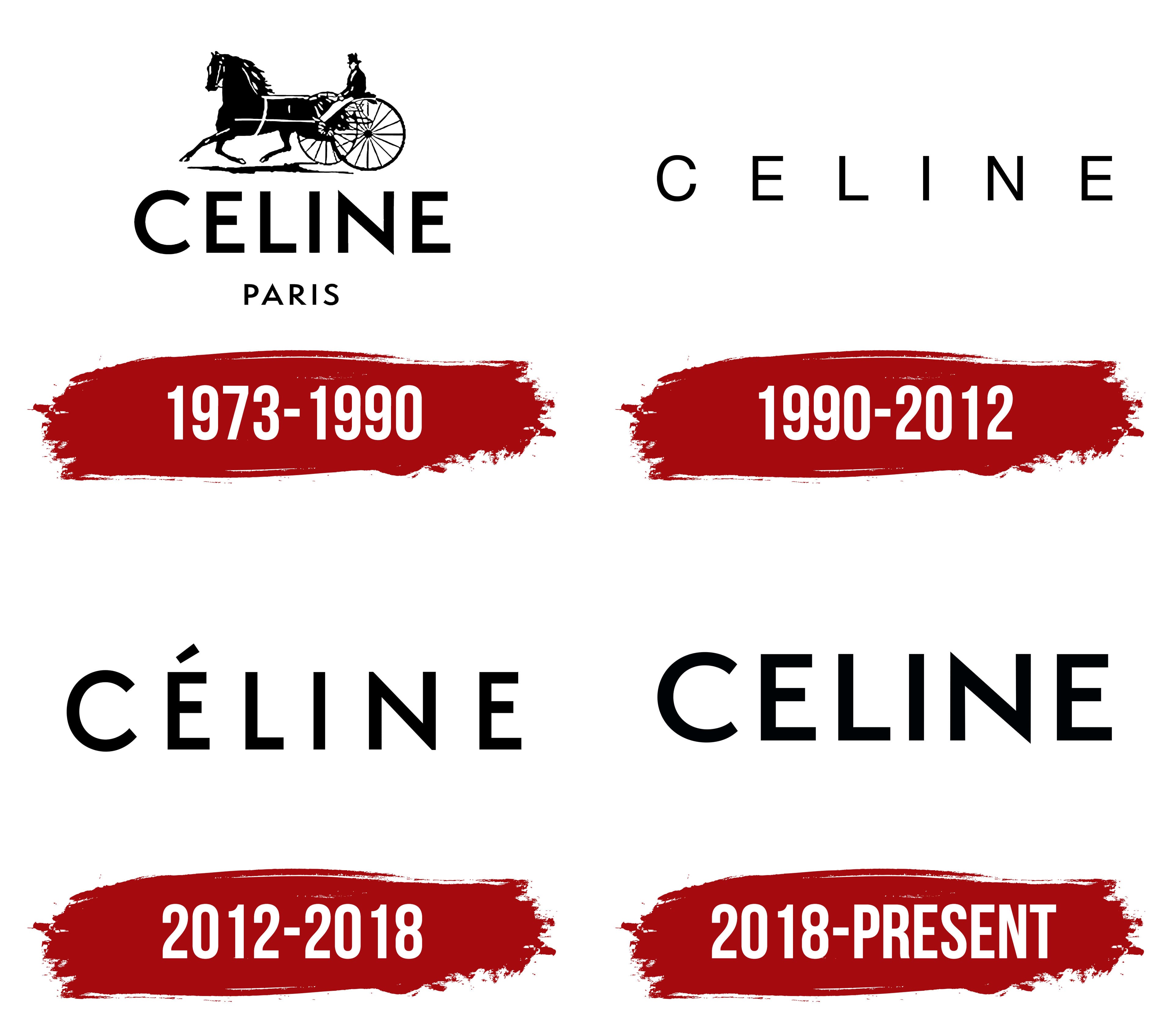
The logo, featuring an elegant man driving a two-wheeled carriage, reflects the company’s rich history and venerable age. This image immediately transports us to the past, highlighting the founder’s passion for horse racing and horses. It symbolizes the sophistication and nobility that have always been integral to the brand.
When the company started, it positioned itself as a high-end maker of children’s footwear. However, by 1973, the brand shifted its focus to women’s sporty clothing. This change is reflected in the emblem; the speeding carriage symbolizes rapid movement, emphasizing the brand’s new key features: an active lifestyle and energy.
The logo also speaks to the brand’s ambitions. When this symbol appeared, the company opened new boutiques and expanded its international presence. The carriage racing forward suggests a drive toward new horizons.
The emblem’s black-and-white color scheme adds elegance and a classic touch, emphasizing the stability and reliability that have remained important qualities over the years.
1990 – 2012

The logo, designed with thin, barely noticeable lines, emphasizes the designers’ refined taste and the sophistication of Celine’s style. As it gradually became part of the renowned LVMH family, the brand continues to offer fashionable and high-end collections that meet this group’s high standards of quality and luxury. The emblem reflects the pursuit of perfection and confirms Celine’s status as one of the leading fashion houses.
2012 – 2018

The logo received a stronger and more confident design, reflecting the company’s readiness to secure its place in fashion history. The glyphs of the name became more substantial, and the addition of the Aссent aigu over the letter “E,” characteristic of French, gives the inscription a feminine touch. The wider spacing between the letters emphasizes the brand’s exclusivity and premium quality.
2018 – today

The modern version of the Celine logo stands out for its simple aesthetic. It is designed in a strict minimalist style, perfectly aligning with the spirit of the times and the fashion trends of the 21st century. There is nothing extra, just black capital letters positioned evenly and confidently. This approach highlights the brand’s status, renown, and strong standing in fashion.
This emblem appears unified and simple, but that is its charm. It reflects the philosophy of luxurious simplicity, now characteristic of many leading fashion houses. The omission of unnecessary details and the focus on clear forms are part of the global trend toward minimalism, where every line and element matters.
Notably, the updated logo has removed the Aссent aigu over the letter “E.” This change symbolizes a shift toward even greater simplicity and universality, in line with the modern demands of the global market. The emblem becomes more international, easier to read, and recognizable worldwide.