The Stoewer logo reflects the former regal quality of the brand’s automobiles, the high status of the brand, and a design fit for royalty. The emblem highlights the great significance of the manufacturer during that distant era when it supplied the market with passenger cars and luxury vehicles.
Stoewer: Brand overview
Bernhard Stoewer established the company in 1858 in Stettin, now Szczecin, Poland, to manufacture sewing machines. During the Industrial Revolution, he recognized the potential in the growing market for home appliances.
The business increased its product line scope during the following few decades. Bicycle manufacture started in 1893, marking an advancement in transportation engineering.
Bernhard Jr. and Emil, Bernhard’s sons, took over the business in 1899, marking a turning point. Enthralled with the new automotive technology, they entered this exciting sector.
The company debuted its first car in 1901. It was a compact two-seater with a 4.5 horsepower single-cylinder engine. Even with its basic features, this vehicle was a major turning point and a new beginning.
Over the next few years, car manufacturing expanded quickly. By 1908, the company began manufacturing various types, ranging from little city automobiles to larger, more potent touring cars.
Operations were significantly impacted by World War I (1914–1918). The business shifted to manufacturing trucks and specialized army and military gear vehicles. Later, this knowledge would come in handy for creating commercial vehicles.
The 1920s were a time of invention. In 1922, the business unveiled the D10 model, which came equipped with the first overhead camshaft production engine in history. This technological advancement greatly increased the engine’s efficiency and performance.
In 1930, the company debuted the Greif V8 model, which had an eight-cylinder engine. This vehicle became the flagship and a representation of technological advancement. The Greif V8 held its own against high-end vehicles from other German producers.
The Great Depression of the 1930s had a serious negative effect on the company. Due to financial issues, production was reduced. To sustain the business, AEG, a maker of home appliances, became a new investor in 1935.
Like many other German businesses, the company was involved in the rearmament effort after the Nazi dictatorship came to power in Germany. The business started manufacturing the Typ RZS, light all-wheel-drive cars for the Wehrmacht, in 1937.
The Second World War (1939–1945) had disastrous effects. The Allied bombers severely damaged the Stettin facility. By the time the war ended, automobile manufacturing had entirely stopped.
After the war, the company lost its manufacturing facilities, and Stettin joined Poland. In 1945, the company closed its doors despite efforts to resurrect it in West Germany.
This company’s history exemplifies the development of the German auto industry, from the production of home appliances to automobiles. The business achieved important advancements in engine development and automotive technology overall. Even though the company only produced cars briefly (1901–1945), it impacted the development of the German auto industry.
Meaning and History
What is Stoewer?
The German automobile manufacturing company had its headquarters in Stettin, Pomerania (now Szczecin, Poland), and produced cars and motorcycles. The company manufactured various vehicles, including trucks, tractors, and passenger cars. It was renowned for its high-quality engineering and innovative design; some models featured advanced innovations for that era. The brand became well-known for its participation in motorsports, especially endurance racing. Despite being successful and having a reputation for producing reliable vehicles, the company faced financial difficulties and was ultimately forced to shut down.
Before 1939
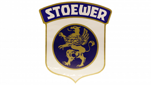
The emblem features a heraldic lion, which takes center stage on the crest flag. The animal is depicted in profile, with one ear and one eye clearly visible. The lion is in a traditional pose known as Rampant: it strides to the left on its hind legs while holding its forelegs extended in front as if clearing the way. Its tongue is sticking out of its mouth, and its tail is raised upward, as per the rules of heraldry.
The only difference from the classic image is the wings. In this case, it is a griffin – a mythical creature with the body of a lion and the wings and claws of an eagle. Through this symbol, the company wanted to demonstrate its dominance over two elements:
- Earth (the cars move on roads and off-road, showing remarkable maneuverability and reliability)
- Air (the vehicles cut through it at high speed, easily covering distances)
In this way, the manufacturer hinted at the vehicles’ excellent aerodynamic capability and high performance, emphasizing their ability to travel long distances quickly. Additionally, it conveyed their vehicles’ strength, power, generosity, and nobility. The golden griffin in the blue circle truly inspires these feelings.
The mythical creature is positioned on a shield of milk oak color, above which extends a wide ribbon with the name of the automobile company. The inscription is in white font with extensions at the ends of the letters instead of the usual serifs. This technique demonstrates the brand’s accessibility to a wide range of consumers and underscores its exclusivity.
The letter “W” stands out, resembling a trident due to its rounded bottom and short stroke in the center. The “R” has a short leg starting from the middle, and the “O” looks like a tall drum or a rotund barrel.
1939 – 1945
The emblem is adorned with a heraldic lion, which occupies the central position on the coat of arms flag. The animal is depicted in profile – as is customary, one ear and one eye are distinctly visible. The lion is in a traditional pose known as Rampant: it strides to the left on its hind legs, with its front legs extended forward as if clearing the way. Its tongue sticks out of its mouth, and its tail is raised, as required by the rules of heraldry.
The transformed Stoewer logo has adopted a retro design instead of historical heraldic symbolism. It resembles emblems from the 1910s and 1920s, evoking a sense of nostalgia for the bygone era and significantly drawing attention to the brand’s cars.
- Horizontal orientation.
- Simple geometric shape.
- Absence of a totemic image.
- Emphasis on the name.
However, several factors remained unchanged. For example, the font style was preserved – ornate, sophisticated, uppercase, with slight extensions at the ends of the letters, featuring a barrel-shaped “O” and a forked “W.” Due to the reduced boldness, they now appear refined, and the gold outline adds nobility.
The colors also remained the same: blue (with a cobalt tint), white, and gold. This combination emphasizes the luxury of the cars, adds appeal, and imparts a touch of aristocracy. The oval is divided into three zones, with the brand name in the central one. A double border encircles the entire perimeter of the ellipse.


