The Strawberry Shortcake logo looks enticing and delicious, like the sweet treat thousands of girls dream about. The logo represents something delightful, fragrant, tasty, and romantic, much like most products in the franchise.
Strawberry Shortcake: Brand overview
In 1977, the story of Strawberry Shortcake began with a simple character sketch by Barbie Sargeant at American Greetings. Fran Cariotakis later refined this sketch, giving the character her iconic look. Created for greeting cards, the character’s potential quickly became apparent.
By 1979, American Greetings started licensing the character for toys and merchandise, with Kenner producing the first dolls. These dolls, released in 1980, became an instant hit. Each one featured a unique fruity scent, becoming a hallmark of the brand. The 1980s saw several television specials, starting with “The World of Strawberry Shortcake,” boosting the character’s popularity.
The franchise expanded, introducing friends like Blueberry Muffin, Raspberry Tart, and Lemon Meringue. In 1985, the animated film “Strawberry Shortcake: The Sweet Dreams Movie” further solidified the brand’s success.
By the late 1980s, the character’s popularity waned, leading to fewer new products. 2002, American Greetings revived the brand with a modernized design for a new generation. This updated version appeared more contemporary and stylish.
A new animated series premiered in 2003 and ran until 2008, featuring 44 episodes. In 2009, the characters underwent another redesign, appearing more realistic. This change came with a new series, “Strawberry Shortcake’s Berry Bitty Adventures,” aired from 2010 to 2015.
In 2015, Iconix Brand Group purchased the rights to the character for $105 million. Two years later, DHX Media (now WildBrain) acquired the rights.
Meaning and History
What is Strawberry Shortcake?
It is a fictional character created for a line of greeting cards released by American Greetings. The character is a little girl with red hair and a strawberry-shaped hat. She later became the heroine of animated series, movies, and toys. The main setting is Strawberryland, where she lives with her friends, Apple Dumplin’, Raspberry Tart, and others.
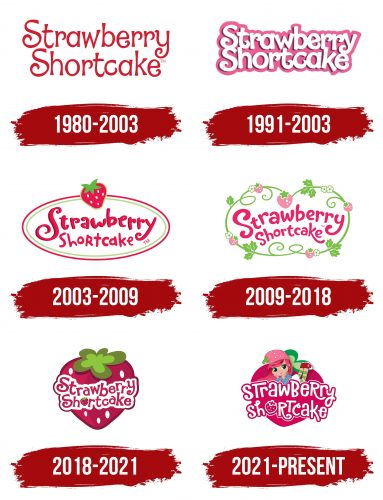
1980 – 2003
The name was first used on greeting cards. The lettering in the logo, made of red strawberry-shaped letters, seems to exude the subtle aroma of ripe berries. The curled ends of the characters look slightly whimsical and resemble the tendrils of strawberry plants. The color scheme was chosen in honor of Valentine’s Day when the character Strawberry Shortcake was created. The symbols embody love, romance, and affection.
1991 – 2003
In 1991, THQ released a series of dolls. The main character’s image changed, which is reflected in the transformation of the logo. The pink background with white letters looks childishly naive and fresh. According to the company, Strawberry Shortcake is a little girl about five years old with a bow and a pink short dress.
2003 – 2009
In 2003, Bandai took over the brand, and the heroine became more mature and modern. Her short haircut and hat are featured in the oval emblem with a raspberry and light green border. At the top of the logo is a strawberry. The fresh, sweet berry with green leaves echoes Strawberry Shortcake’s name in the logo’s center. The shape of the emblem resembles a cookie. Smooth edges and streamlined lines convey harmony and perfection.
2009 – 2018
In 2009, Hasbro introduced their version of the heroine. She is a youthful, charming girl with a strawberry theme. The emblem, shaped like blooming stems and berries, conveys a theme of youth and beauty. The plant winds around the name, creating a living border. The emblem exudes youthful charm, naivety, and freshness.
The letters of the name resemble strawberry jam stripes, and the soft and flowing glyphs look elegant and sweet. This logo was used for dolls, comics, movies, and series related to the theme.
2018 – 2021
After acquiring the rights to the character, the animation studio DHX Media presented their vision of Strawberry Shortcake as a youthful rebel. The heroine’s logo features a large, ripe red strawberry, with the name written in curly red letters on a white background. The logo looks appetizing and juicy, evoking a desire to taste the sweet berry. This emblem was created for the animated web series Strawberry Shortcake.
2021 – today
The image of Strawberry Shortcake was created in the 1980s and has undergone numerous changes since then, adapting to new generations of children. In its modern transformation, the heroine maintains her recognizability while acquiring new features that align with the spirit of the times. The animated series “Berry in the Big City” presents her in a new light while preserving all the key elements familiar and beloved by many generations. The logo reflects this evolutionary journey, combining traditional and modern elements, making it relevant and appealing to a broad audience.
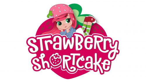
The emblem features Strawberry Shortcake, a strawberry fairy with long pink hair, and a strawberry-shaped hat. She lies on a berry with her legs bent, looking attentively at the viewer. The animated series Berry in the Big City presents this depiction of the heroine. The name “Strawberry Shortcake” is written in large white letters on a bright pink background, creating a vivid and memorable image.
The logo symbolizes joy, innocence, and the magic inherent in children’s worlds. The strawberry fairy with pink hair and a strawberry hat evokes a world of fantasy and sweets, attracting children’s attention and eliciting positive emotions.
The emblem emphasizes the brand’s central idea—a fun and magical adventure. Strawberry Shortcake’s image combines features of traditional fairies and modern cartoon heroines, making her relatable and appealing to today’s children. This reflects the brand’s effort to stay current while remaining true to its roots.
The logo’s font is playful and slightly whimsical, adding a touch of fun and drawing attention. Each letter appears hand-drawn, creating a sense of homeliness and warmth. The “Strawberry Shortcake” inscription is written in large letters, making it easy to read and memorable.
The primary colors of the logo are pink and white. Pink is associated with gentleness, friendliness, and happiness, while white adds purity and freshness. This color choice highlights the target audience – children and their parents, evoking positive emotions and associations.
The strawberry hat on the heroine and the berry she lies on play a key role in creating the image. They emphasize the theme of sweets and joy, characteristic of the brand. The fairy’s long pink hair adds a touch of magic and uniqueness to the image.
