


![]() Super Mario Logo PNG
Super Mario Logo PNG
The game’s emblem demonstrates the mountains and obstacles that the main character must overcome in the arcade. After one level, you can move on to the next. At the same time, the children’s theme is evident in the bright elements of the Super Mario logo.
Super Mario began in 1981, when Nintendo released Donkey Kong. Hiroshi Yamauchi asked Shigeru Miyamoto to rework the failed Radar Scope machine. Miyamoto first wanted Popeye, but talks with King Features failed, so Nintendo created Jumpman, Donna, and Donkey Kong. 16×16-pixel limits constrained the hero’s mustache, cap, and gloves.
The name Mario came from the name of Nintendo of America’s landlord, Mario Segale. In 1983, Mario Bros. introduced Luigi and turned Mario from a carpenter into a New York plumber. In 1985, Super Mario Bros. launched with the Nintendo Entertainment System in the United States, after weak Atari releases had damaged the market.
Super Mario Bros. sold over 40 million NES copies and introduced mushrooms, pipes, coins, Bowser, and Princess Peach. Super Mario Bros. 2 sold about 10 million copies in 1988, while Super Mario Bros. 3 passed 18 million. In 1990, Super Mario World arrived with the Super Nintendo and sold 20 million copies. Sega answered in 1991 with Sonic the Hedgehog, starting the main console rivalry of the early 1990s.
Super Mario 64 came out in 1996 for Nintendo 64, sold over 11 million copies, and shaped 3D platformers through camera control and open levels. Later entries included Super Mario Sunshine, Super Mario Galaxy, New Super Mario Bros., and Super Mario Odyssey. In 2023, Nintendo released Super Mario Bros. Wonder and The Super Mario Bros. Movie in collaboration with Illumination Entertainment, which together earned over $1.3 billion worldwide.
Meaning and History
![]()
The series began in 1985, when the first Super Mario Bros. game was released. Nintendo created it for its famous NES console. Then the 2D platformer had many sequels, forming a subseries with different logos. About 10 Mario-themed video games are released each year, and most do not follow general branding guidelines. In some ways, this is even good because individual identity helps to distinguish one game from another.
The series’ title is inspired by the arcade game Mario Bros., which debuted in 1983. The word “Super” was added when the developers introduced the Super Mushroom into the fictional world. In the game’s beta versions, it was not present, so the character could not shrink or enlarge. But tests have shown that Mario is too tall. The creators had to use their imagination to figure out how to resize it without affecting the levels’ design.
The series of platformers lacked a universal logo for a long time, even though it first appeared in 1985. The names of the games were written in different fonts. Branding only became more consistent with the release of Super Mario 64 in 1996. Based on its headline, a colorful franchise symbol was developed. Then the authors slightly changed the letters’ shapes and colors, coinciding with the redesign for the release of Super Mario 3D Land.
1996 – 2011
![]()
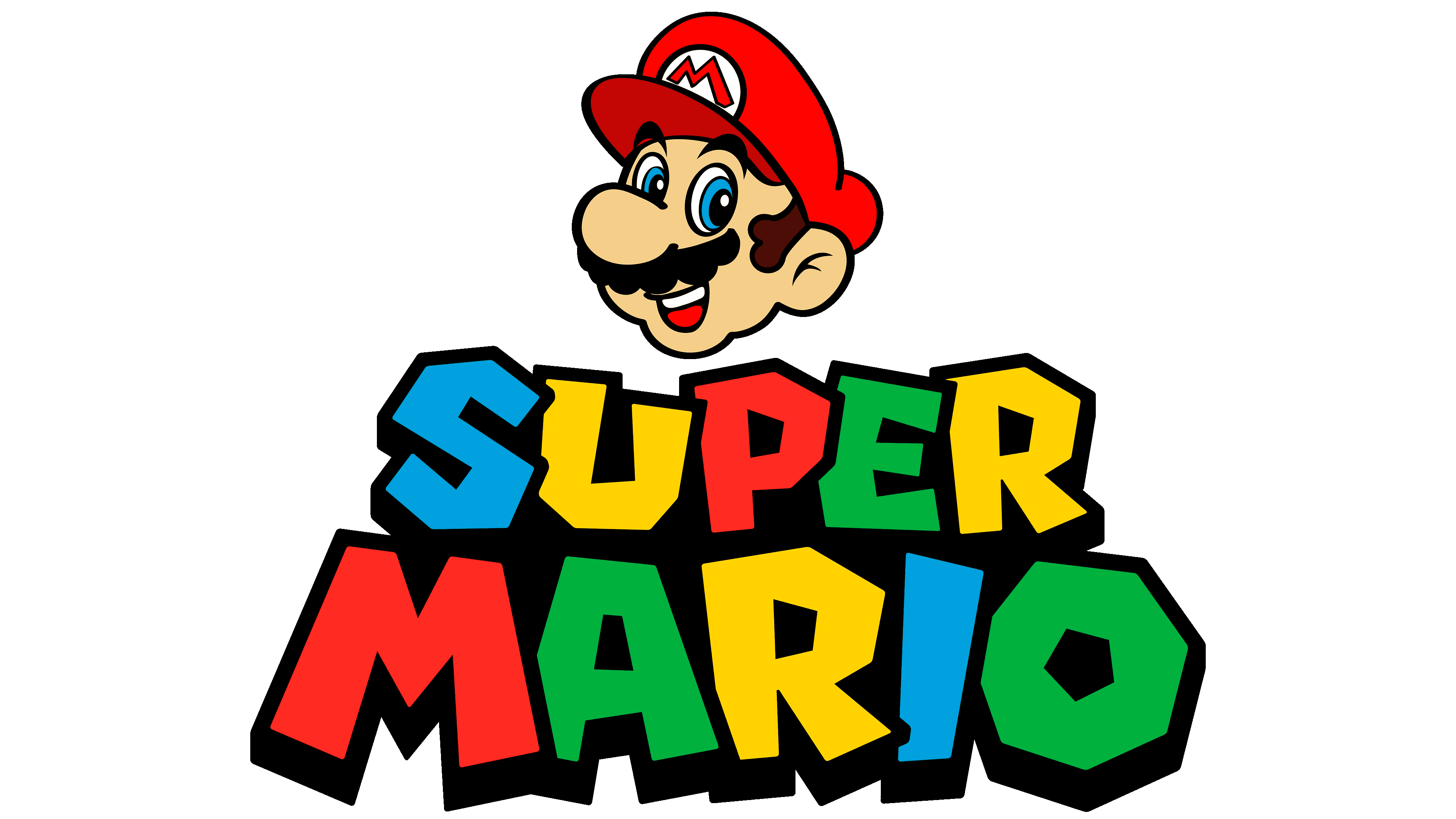
The first official version of the logo had much in common with the lettering on the cover of Super Mario 64. And that, in turn, was inspired by the Super Mario World title (1990), in which each letter was painted in a different color.
The video game series title was split into two lines, with the first line slightly shorter than the second. The designers used four bright colors to style the text. They alternated in such a way that “I” and “S” were red, “M,” “E” and “U” – light blue, “O,” “A” and “R” (the last in “SUPER”) – green, and “P” and another “R” (the third in “MARIO”) – yellow. Each of them was outlined in black and cast a thin gray shadow.
The developers redesigned the logo by making the letters bold and giving them a clear geometric shape. The angular font made the “O” look like an octagonal nut. In general, the words did not look written but rather drawn, as the proportions were not respected. “A” has been slanted and partially obscured by the diagonal stroke “M.” The left and right sides of the “U” did not match in height. The R in SUPER fell back, and the E seemed flattened.
2011 – today
![]()
Along with the 2011 release of Super Mario 3D Land, a new logo for the series debuted. In terms of structure, it repeats the previous one, but the designers changed the colors in places and adjusted the letterforms. Now “U” and both “R” are yellow, “M” and “P” are red, “I” and “S” are blue, “O,” “E,” and “A” are green.
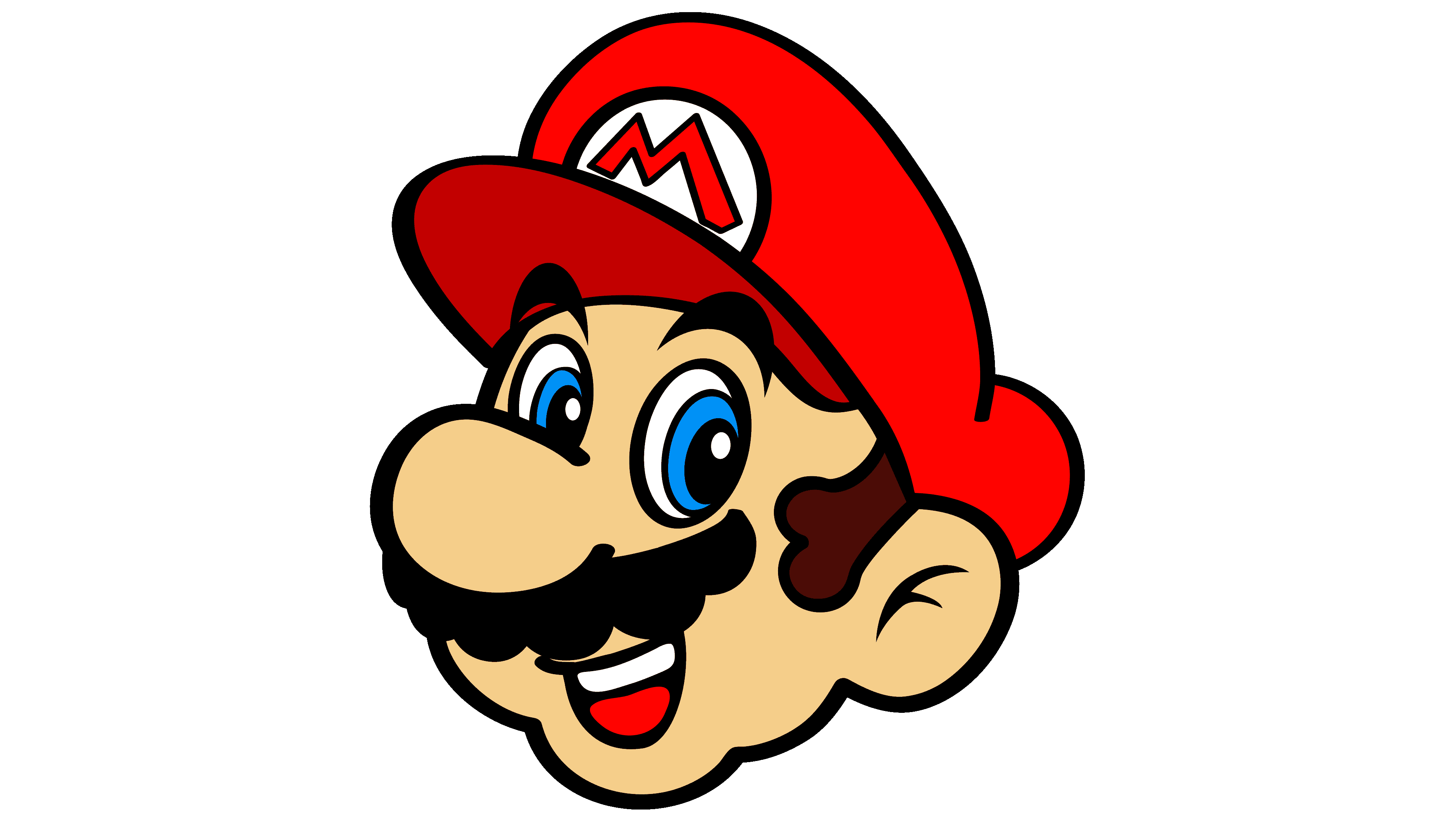
The “O” has become an octagonal ring. “A” has leveled off slightly. The “M” has also become more proportional, resembling the franchise’s iconic symbol: the famous red “M” on Mario’s hat. The rest of the letters have also changed. For example, the “I” in the form of an asymmetrical quadrilateral is tilted to the right and tapers from top to bottom. Previously, everything was the other way around: “I” sloped to the left and expanded at the base. A slight modification made it possible to parallel one of the “O” faces so that they do not touch.
If we talk about other letters, they not only touch but also overlap at different points, unlike in the previous version of the logo, where the “M” was partitioned off from the “A”. Thanks to this, the protrusion on the vertical stroke “E” is now hidden behind the “P.” Slightly rounded corners are another change. They make the lettering softer and more streamlined. The gray shadows disappeared, but the black outlines expanded so much that they formed one solid base.
Font and Colors
The franchise did not have an agreed design for a long time because it did not need an introduction: everyone already knew perfectly well who Mario was. But in the late 1990s, the developers still decided to unify the brand. Since then, his emblem has been the striking SUPER MARIO lettering inspired by the titles of some of the games in the series.
Based on the logo, the Super Mario 256 font was developed. It can be recognized by its irregular polygonal letters, primarily by the characteristic octagonal “O” and the “M,” which resembles the main character’s hat symbol.
The unusual typography is complemented by a vibrant color scheme that alternates among green, red, yellow, and blue. Black serves as a common basis for them: it fills in the gaps and separates the letters so that they do not merge in a colorful kaleidoscope.