


 Superdry Logo PNG
The Superdry logo embodies a deep connection between two different cultures, combining elements of Western and Eastern traditions. The brand helps its customers feel unique and distinctive, standing out among others with original lettering and unusual designs that create a unique style. Special attention is given to fashionable cuts and individuality, reflected in the emblem, wherein calligraphic lines and symbols are harmoniously combined.
Superdry traces its roots to 1985, when Ian Hibben and Julian Dunkerton founded Cult Clothing Co. in Cheltenham, England. The retailer began with branded goods and retro American-style clothing, then expanded into university towns across Britain. In 2003, Dunkerton met designer James Holder, and the pair developed a label combining British design, Japanese lettering, and vintage American references.
The first collection appeared in 2004, followed by the Windcheater jacket, one of the brand’s early commercial products. A Covent Garden store opened in 2005 and later became its flagship location. International expansion began in Belgium in 2006, with further stores opening across Europe as the retail network grew.
Parent company SuperGroup listed on the London Stock Exchange in 2010, raising capital for international growth. The first US store opened in 2011, followed by premium denim in 2012 and a sportswear line in 2014. A 2015 collaboration with Idris Elba extended the premium offer, while the first store in China opened in 2016 and the sports range expanded in 2017.
Julian Dunkerton stepped down as chief executive in 2018. Still, he returned as interim CEO in 2019 amid financial pressure and a change in direction. During 2020, the company increased investment in e-commerce and online retail. New collections aimed at younger customers arrived in 2021, and by 2023 its main ranges included Original, Sport, denim, and premium clothing.
Meaning and History
What is Superdry?
This British fashion brand gained worldwide fame for its unique blend of British design with American and Japanese graphics. The company is known for its stylish vintage-inspired clothing, iconic T-shirts, hoodies, and coats. The brand stands out for its original aesthetic, often featuring combinations of Japanese and English. Combining sports and urban elements, the company offers a diverse range of clothing and accessories for men and women. Special attention is given to details, from intricate embroidery and prints to careful fabric selection, highlighting the quality and individuality of each piece.
2003 – 2014

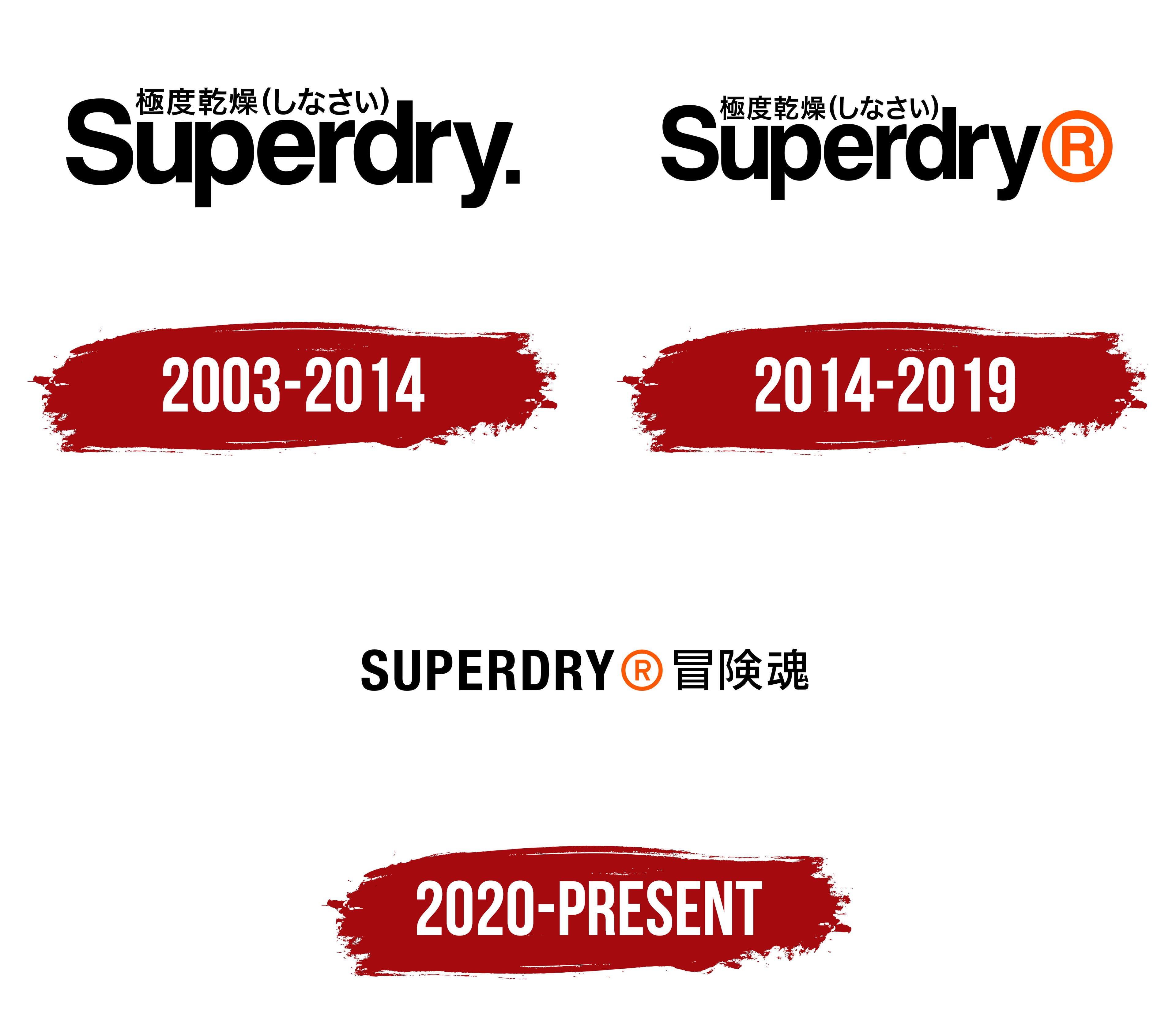
The manufacturer’s first emblem combines English and Japanese text. The letters in the word “Superdry” represent simplicity and confidence, emphasizing the brand’s core message. The emblem targets a young audience and evokes street style. The bold font highlights the products’ strength, high quality, and durability, which are key characteristics of the brand.
The brand name consists of two words: “Super” and “dry.” The first word was chosen to connect with young men, as it is often used in their everyday speech. The founders noticed that this phrase frequently appears on packaging in various stores and among young people. The second part of the name, “dry,” emphasizes the products’ comfort and practicality.
Above the word “Superdry” is Japanese text that means “dried to the extreme.” This element adds a sense of mystery and intrigue, captivating customers and giving the brand an exotic atmosphere. The Japanese text emphasizes the uniqueness of the products, highlighting one of the brand’s distinctive features: Japanese prints.
One of the founders, fascinated by Japanese culture, suggested using Japanese. During a trip to Tokyo, he noticed many English phrases on the streets, though they were often mistranslated or misused. These amusing inaccuracies inspired him to take a reverse step, using random Japanese phrases on the brand’s clothing. This added a touch of humor to the brand’s products and made such prints an attractive feature, giving each item a sense of exclusivity.
The word “Superdry” ends with a period, which adds weight to the text and emphasizes its finality. This mark symbolizes the wearer’s self-sufficiency in an urban environment where strength and confidence are valued. This element subconsciously appeals to male customers, strengthening their connection with the brand.
2014 – 2019

In 2014, after a change in the CEO, the period in the logo was replaced with a red trademark symbol. This step emphasized that the name had become exclusive, and such products could no longer be found elsewhere. The change sent a clear message: despite the departure of the brand’s founders, their legacy would continue to live and evolve for many years.
However, the first models of the brand’s clothing have now gained an even more vintage and unique status, as they were created by the founders who were at the company’s origins. These early pieces are rare and preserve the spirit of the time and the brand’s original concept, making them valuable to collectors and enthusiasts of the brand’s history.
2020 – today
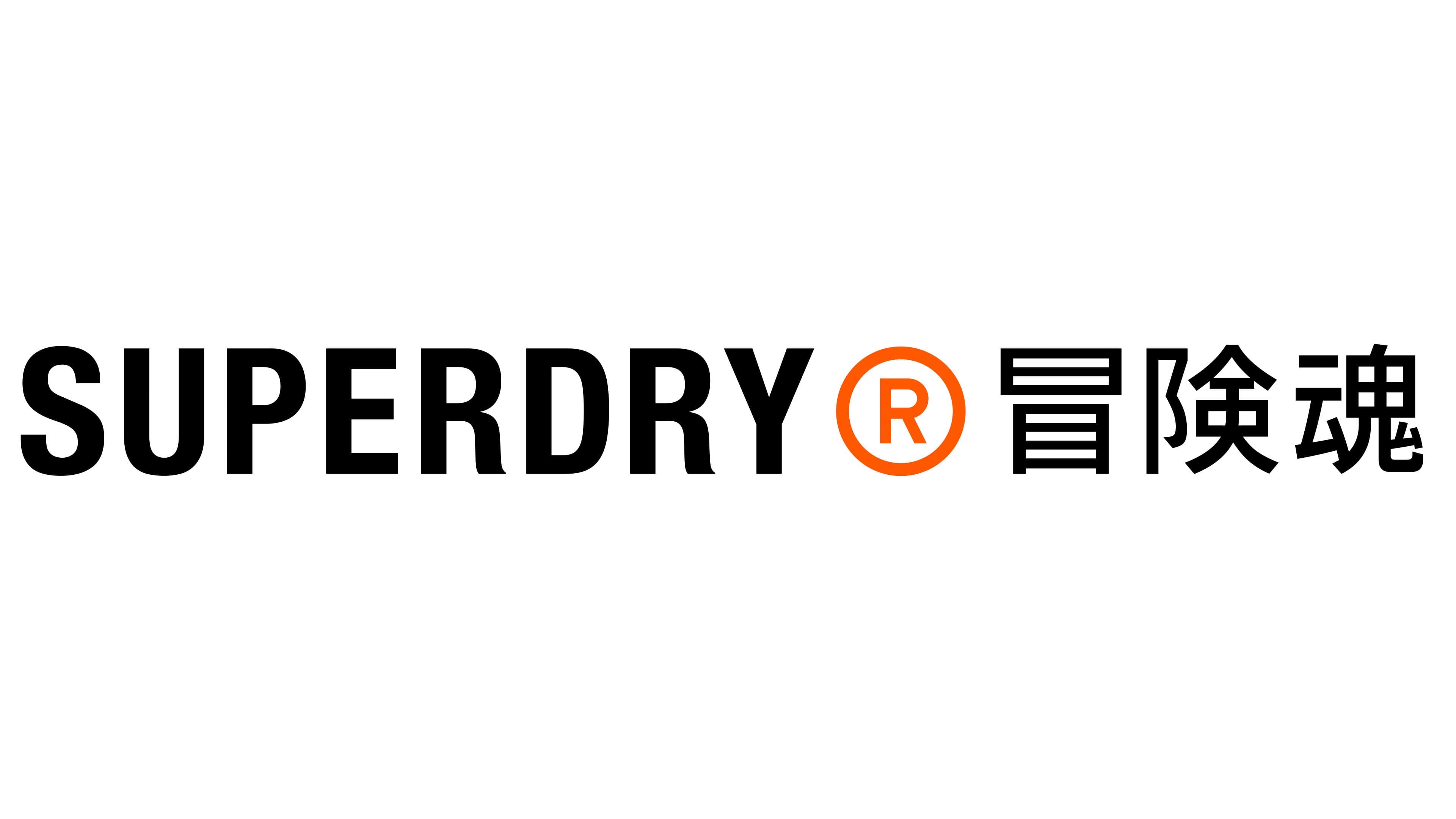
The return of Dunkerton as CEO marked a significant milestone for the Superdry brand, initiating a complete strategy overhaul and logo redesign. Drawing from its roots, he returned to the company’s origins, focusing on producing vintage jackets and sweaters. This shift is reflected in the updated logo, where previous Japanese phrases were replaced with characters that can be interpreted as “spirit of adventure” or “adventurous soul.” These symbols emphasize the image of a stylish, romantic man who has experienced the world. The combination of bold Latin lettering and elegant characters creates a contrast that reflects a blend of Western and Eastern cultures, giving the emblem a unique and memorable quality. The brand has always sought to stand out in the market, and this cultural mix perfectly captures its international, modern, and unafraid-of-experimentation ethos.
The large black “SUPERDRY” letters, set in a simple, bold font, convey a sense of strength, confidence, and reliability. This element emphasizes the durability and longevity of the brand’s items, aimed at an active and energetic lifestyle. The orange circle with an “R” inside, symbolizing a registered trademark, adds a dynamic and youthful spirit. The orange color, associated with energy and creativity, is perfect for a brand that aims to capture the attention of young people living a fast-paced urban life and valuing functionality in clothing.
The English and Japanese inscriptions, arranged in a single line, highlight the brand’s continuity and development. This element symbolizes the harmony between the past and future, reflecting the company’s philosophy.
The simple shapes and unique details make the visual mark recognizable, emphasizing the brand’s vision of creating durable and relevant fashion.