


![]() Svedka Logo PNG
Svedka Logo PNG
The Svedka logo is as balanced as the taste of branded alcohol. There is nothing superfluous in it, only the most basic elements. But at the same time, harmony is created between sharp and soft lines, which, together with a slight asymmetry, makes the symbol very interesting.
Svedka chose a logo as simple as the taste of its products. The point is that it produces a soft vodka from five distillations, which can be consumed on its own and in cocktails. The brand offers several variants of the specialty drink: raspberry, vanilla, mango, orange, cucumber, cherry, grapefruit, pineapple, peach, and many others. They are bottled in 1-liter bottles with original labels. Their alcohol content is 40%. The brand was founded in 1998 by entrepreneur Guillaume Cuvelier. Its foundation is in Lidköping. The current owner is Constellation Brands.
Vodka has been produced in Sweden for a very long time, since about the 15th century. But the greatest activity occurred in the 17th and 18th centuries, when distilleries operated at full capacity due to the high popularity of this alcoholic beverage. Svedka is based precisely on native European traditions. It uses multiple distillations, so the spirit is extremely pure and contains no harmful impurities. Its basis is wheat grains and spring water.
The company’s founder first made it popular and sold it to the American conglomerate Constellation Brands of New York City. The buying and selling process took place in 2007 and cost $384 million. Despite the transition to a new owner, the alcohol brand retained the original logo with the product’s name. This decision brought the producer marketing success, as the vodka belongs to the medium-price category and should remain recognizable to many customers.
Meaning and History
![]()
The visual identity of Svedka is its name, made up of two parts. The first indicates the country of origin of the liquor (Svenska in the original language), and the second indicates its type (vodka). After acquiring the distillery, the American company almost immediately added a new flavor to its range: lemon. This put the brand in wide demand in the United States.
The Svedka logo is textual. It has no graphic elements. Such minimalism and simplicity stem from the specificity of Swedish vodka, which is pure and has only a few ingredients. But one cannot categorically state that the emblem has no graphic details.
What is Svedka?
Svedka is a Swedish vodka distilled five times with a mild flavor. It is also called cocktail vodka because it is usually mixed with fruit and berry juices. The standard strength is 40%. The company’s appearance dates to 1998. The founder is Guillaume Cuvelier. Constellation Brands now owns it.
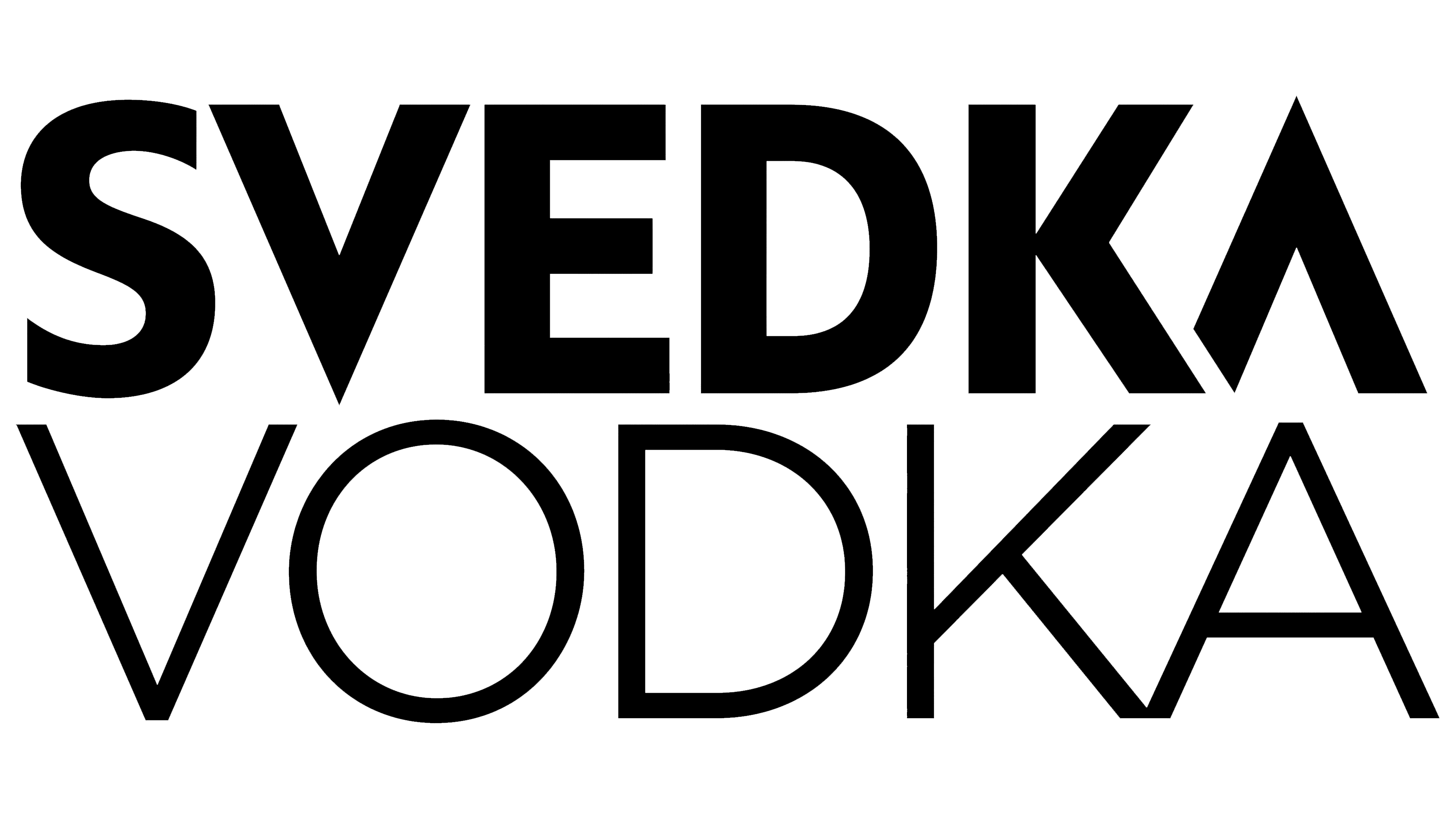
If you look closely, you can see a striking resemblance between the two letters, “V” and “A.” By removing the crossbar, the designers preserved their identity, keeping them “upside down” relative to each other. The “V” has the sharp part pointing downward, while the “A” points upward. These are the so-called graphics in the logo. Both glyphs resemble a wigwam in their shape, line angles, and width. The rest of the symbols are much simpler: they are smooth, flat, classic, and without serifs.
Interestingly, this combination makes the emblem catchy and balanced, suitable for an alcoholic brand known for its quality, character, and value. Its visual identity underscores the concept of inexpensive chic because the Svedka brand is the only one that offers consumers everything: a high-quality premium product, a stylish image, and affordable value. Therefore, the logo’s design is both simple and elegant, as the labels on each branded bottle demonstrate.
Font and Colors
The designers of the Svedka logo settled on a custom version of the Snell Roundhand font. It is smooth, flat, capitalized, and chopped. The modification touched two letters, the “V” and the “A,” which are almost identical. Of course, the left leg of the second glyph is slightly shorter, making it appear to be behind the neighboring character.
The color palette is single-colored but contrasting. The manufacturer set this condition before the designers. Whatever the background color, the logo inscription should be contrasting and legible in any light. That is why both black and white are used equally for text coloring.