The Talbot logo is full of grandeur, scope, and power. The emblem shows the leadership position of the company and the strength of its machines. The mark uses the techniques of connecting the brand with symbols of more significant organizations to increase the feeling of reliability among buyers.
Talbot: Brand overview
| Founded: | 1903 – 1995 |
| Founder: | Clément-Talbot |
| Headquarters: | United Kingdom |
Talbot is an English brand abolished in 1992 and owned by the second largest European manufacturer, Peugeot Société Anonyme. At the company’s heart is the success of a venture by a French businessman and an English car salesman named Clement Talbot. Thanks to the experience gained, Talbot decided to launch his brand of car. The brand was produced in two countries where it was popular.
Meaning and History
The whole history of the English company is inextricably linked with France. Therefore, there are many royal symbols of both countries in the signs of the company. For most of its existence, the brand was not independent. Changed owners and merged with other brands. This was reflected in the transformation of the identity and appearance of elements of other companies, such as Chrysler. Despite this, the visual sign retained the image of strength and power in each incarnation.
What is Talbot?
A European car brand that was produced at various times by Clement-Talbot, STD, Rootes, Simca, Chrysler, and Peugeot. The latest popular models are Talbot Alpine, Rapier, Tagora, and Sunbeam. The headquarters of the English division was located in Kensington, then in London.
1903 – 1908
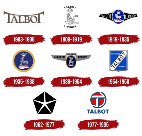
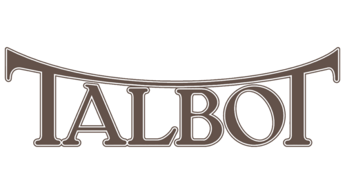
By 1904, a factory in England was ready, where, using the French parts of a partner, they began to produce cars under the Talbot brand. The logo emphasized the new brand. Two letters, T, are connected above the rest of the word and represent the car’s bumper. The upper case and white stroke reveal the pretentiousness of the new unit.
1908 – 1919
Talbot specifically hires a specialist to develop the design and construction of machines that are not similar to the French models of the company. The brand name has been changed to Talbot London. An additional accent is made in the logo, where the symbols of England are combined with the name.
The brand’s name and the factory’s London location are written in a semicircle above and below. In the center is the royal crown, and below it is the majestic image of a lion standing on a count’s cap from the time of the second French Empire since Sir Talbot was a count.
The monarchical symbol personified the patronage of the court for new cars and the development of the automobile industry in England.
The lion is considered the prototype of strength and courage and is included in the country’s shield as a symbol of unification. The founder is going to develop the company to glorify the COUNTRY. In 1907, the cars of his assembly more than 100 times won prizes in various competitions.
1919 – 1935
By the 20th year, Earl Talbot, having lost an heir, sells his company to the French company Darracq and Co Ltd, which soon buys Sunbeam Motor Car Co, forming the STD concern. Interestingly, all cars in it receive the Talbot brand, so the logo retains the main features of the previous sign.
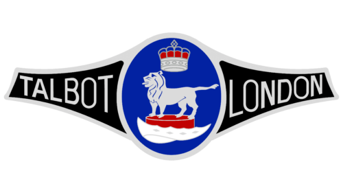
The lion and the crown are placed in a blue oval, in which Talbot and London are written in two branches since the London division is engaged in creating new models for the brand. The badge resembles a champion’s belt. And the blue, white, and red colors indicate the French flag of the new owner’s homeland.
1935 – 1938
STD, due to bankruptcy put up for auction. Talbot buys out Rootes. The brothers retain their visual identity, but the crown is changed to French. The lion’s mane is almost removed, demonstrating the loss of grandeur and independence. A yellow outline around the blue emblem symbolizes care: the brand is in good hands.
1938 – 1954
Rootes, which also bought Sunbeam, closed its production and transferred it to Talbot facilities, creating the Sunbeam-Talbot brand, which is reflected in the logo of this period.
The emblem takes the form of an airplane or a bird spreading its wings, each with a part of the brand name. The symbol predicts the rise and active promotion of new cars. The nose of the aircraft is the STD sign placed in an oval.
The image also looks like the car’s bumper, which, most likely, the owners wanted to portray. In the center is a schematic radiator grille. On top of the grille is the “supreme” inscription, supporting the idea of greatness and excellent quality, as the Rootes brothers were meticulous about the assembly.
The logo is intended to show that despite the bankruptcy experienced, brands remain afloat and will continue to offer their products.
1954 – 1958
The concern renames the brand to Sunbeam, abandoning the Talbot name, which was actively used in France as Talbot-Lago (in 1938, during the bankruptcy of STD, Anthony Lago bought the French enterprises).
The logo is shaped like a blue shield with a wide gray border. The name of the brand is written diagonally on a white stripe. Above it is indicated that cars are produced, and below the location of Suresnes (a suburb of Paris).
The shape of the shield and the blue background correspond to the heraldry of the commune where the production facilities are located. The white stripe alludes to the flag of France. This conveys the patriotic spirit of the company. Represents the majestic and famous brand. Territorial landmarks were of particular importance, so there was no confusion with the English unit.
The logo existed until 1958, when Simca bought the brand.
1962 – 1977
Chrysler bought 30% of Rootes and is on the board of directors, and in 1967 it bought the concern completely and renamed it Chrysler UK (1970), adding to the purchase of the French Simca with its Talbot-Lago, becoming Chrysler France.
The logo of this period corresponds to the American company – a star in a pentahedron. The image resembles a star that breaks through the darkness and gives light to everything around. The image shows the development of the concern, and its gradual rise into the sky, lighting up the world with new technologies developed by Chrysler and its brands. The five petals of the black flower symbolize the five brands of the corporation.
1977 – 1995
Chrysler France is sold to Peugeot-Citroën, which revives the Talbot brand and produces all cars of the former Simca under this brand.
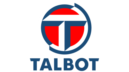
The new owner creates a stylish and massive logo similar to a wheel. The sign is three-dimensional, drawn as if it consists of bent metal corners. Two of them form a circle, in the center of which the letter T is formed from the same corners.
The circle is a symbol of completion. During its existence, the brand has developed the best models and was able to develop optimal strategies. The two parts of the figure indicate a permanent existence in two countries with two owners.
The red background is a revival and great powers given to the brand by the new owners.
The symbol is illuminated from the upper left corner, which can be seen from the shadows in the figure. The sun is in this position at sunset. This shows the impressive age of the brand and prophetically predicts its future closure in 1992.
Trucks of the brand were produced after the abolition until 1994.
Font and Colors
Primary colors of the visual sign: white, red, and blue. They indicate France, where part of the production facilities and most of the brand’s owners were located.
- Red – leadership.
- Blue – professionalism.
- White – the need to often start from scratch.
The lettering font is sharp, and sharp Ornitons TS Bold. It seems that you can cut yourself on its sharpened edges. It shows that the company is ready to defend its position.
Talbot color codes
| Dark Cerulean | Hex color: | #1a4c78 |
|---|---|---|
| RGB: | 26 76 120 | |
| CMYK: | 78 37 0 53 | |
| Pantone: | PMS 7693 C |
| Red | Hex color: | #ff0101 |
|---|---|---|
| RGB: | 255 1 1 | |
| CMYK: | 0 100 100 0 | |
| Pantone: | PMS 1655 C |
