The Technicolor logo is creative and vibrant, reflecting the visual identity that should be associated with entertainment video content. It conveys positivity and sets the stage for an engaging viewing experience. The emblem is a great example of modern design, where everything is balanced and aesthetically pleasing.
Technicolor: Brand overview
Originally named Technicolor and Thomson, Vantiva’s history began in 1893 with the founding of Thomson SARL by American engineer and inventor Elihu Thomson, who also founded the French division of Thomson-Houston Electric Company. During its early years, Thomson SARL focused on producing transformers and other electrical equipment. The business rapidly established itself as a creative manufacturer and substantially contributed to France’s electrification.
A significant event took place in 1928 when Compagnie Française pour l’Exploitation des procédés Thomson Houston and Thomson SARL combined to establish Compagnie Française Thomson-Houston (CFTH). This combination increased the company’s product line and reinforced its standing in the French market.
Following the Second World War, CFTH started expanding its business outside the production of electrical equipment. In the 1960s, it joined the consumer electronics sector and produced televisions and other consumer items.
1966 marked a sea change in the company’s history. Hotchkiss-Brandt and CFTH combined to form Thomson-Houston-Hotchkiss-Brandt, eventually shortened to just Thomson. This combination greatly increased the company’s product line and manufacturing capacity.
The enterprise expanded during the 1970s and 1980s through several calculated acquisitions. Among the most important was the 1987 purchase of General Electric’s consumer electronics division, which enabled the firm to enter the American market.
RCA was acquired by the corporation from General Electric in 1988, marking yet another significant transaction. As a result of this deal, the brand became among the biggest producers of consumer electronics worldwide.
However, the company faced financial challenges in the 1990s. It was compelled to sell a sizable portion of its consumer electronics company to concentrate on more promising areas.
In the early 2000s, the firm concentrated on creating technologies for the media and entertainment sector. The producer started creating solutions for creating, delivering, and consuming digital television.
Significant developments occurred in 2010 when the corporation became Technicolor SA. This moniker was derived from a well-known brand in the film business, a company subsidiary. Under the new name, the business created technology for the entertainment sector, such as post-production, animation, and visual effects.
The producer extended its visual effects services for film and television and actively researched virtual and augmented reality technologies between 2015 and 2020.
The corporation rebranded and changed its name to Vantiva in 2022, ushering in a new chapter in its history. This move reflected the company’s dedication to innovation and flexibility in response to the rapidly changing technological environment. The decision to adopt the new name emphasized future and technological advancements.
Meaning and History
What is Technicolor?
It is a multinational corporation known for its work in the media and entertainment industry, particularly in digital production, post-production, and distribution. The company has a rich history in film technology, originally famous for developing the Technicolor film process, which brought vibrant color to motion pictures in the early 20th century. It provides various services, including visual effects, animation, and sound for film, television, and games. The company offers distribution and content management solutions, helping media companies deliver their content to various platforms.
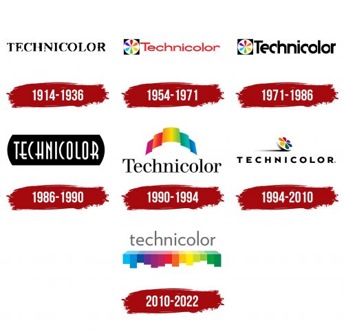
1914 – 1936
During this period, the Vantiva emblem featured the entertainment company’s original name—Technicolor, derived from the phrase “Technical color.” This logo is simple and minimalist, with no unnecessary elements—just short text arranged horizontally. Its concise form gives it a professional and restrained appearance.
The typeface is in uppercase, conveying the seriousness of a brand that first introduced the technology of color motion picture imaging. The black lettering inspires confidence, with harmoniously balanced glyphs by a thoughtful combination of rounded and straight lines. Each letter is a model of classic design. They have standard serifs with sharp ends. The wide, bold characters also reflect the company’s confidence in its work, as this was a groundbreaking step in the history of colorizing cinematic and animated films.
However, the coloring did not extend to the emblem: it is monochrome, traditionally composed of black and white. Dark text is most visible on a light background, rendered in black letters. This contrasts with the brand’s focus on entertainment video content and visual technologies. Still, at the dawn of film colorization, the primary focus was on productive work rather than visual identity. This approach resulted in a monochrome logo.
The large uppercase glyphs are highly legible, with ample internal space and optimal letter spacing preventing them from merging into a solid mass. Additionally, the Technicolor emblem has a sense of dynamism: it’s expressed through the strokes, which taper and widen. Thus, this simple yet bold logo began a brilliant series of variations, representing the era of innovative technologies in cinema and animation.
1954 – 1971
Technicolor adopted a new logo to address monotony, showcase professionalism, and highlight its focus. This time, it was, of course, in color. The overall appearance changed significantly, as it now featured two distinct zones:
- Graphic (personal symbol)
- Text (brand name)
The symbol comes first, as if it introduces the emblem, immediately representing the company’s purpose with its rainbow tones. Essentially, it’s a black square. But on this background, a white circle with a stylized flower of six petals meeting in the center stands out. Each petal has its own color: red, orange, yellow, green, blue, and violet. They symbolize a colorized film strip.
It’s more than just a white circle with teardrop-shaped elements—it represents an old film projector’s reel. This image perfectly aligns with the brand’s theme, presenting it as a master of coloring films and cartoons. The rainbow coloring reflects a positive outlook on the world and the work being done. It brings joy and draws attention.
Next to it is the text portion of the emblem, a horizontal inscription starting almost at the square’s edge. This minimal spacing is consistent between all the letters. The brand name is written in a compressed, wide font, where almost every letter has smooth curves—except for “T” and “l,” since the “i” essentially has its rounded feature: a bold dot at the top.
Additionally, the glyphs feature tiny and sharp serifs. Combined with the flattened letters, they add an extravagant touch, filling the logo with a creative vibe. The serif style also enhances the emblem, balancing the overly rounded strokes. Moreover, the bright red color—juicy, bold, and eye-catching—makes it stand out even more.
1971 – 1986
After the rebranding, Vantiva’s logo (formerly known as Technicolor) adopted a completely different font. It is more personalized because it was custom-made, turning a simple inscription into something unique. Its distinctiveness lies in using two unconventional letters: “E” and “C” with shortened strokes. Instead of a full semicircle, the bottom is cut off.
Another unusual feature of this typeface includes the non-standard shapes of both “O” s. The right side of these glyphs is trimmed, which means they lack the usual roundness, making them appear slightly overlapped by the neighboring letters (“l” and “r”). The font is bold, vertically elongated, and mostly lowercase, with only the first “T” in uppercase. Interestingly, its horizontal stroke is offset: it’s longer on the right than on the left.
The inscription is also black to harmonize with the dark square. This approach balances the emblem, giving it a professional, restrained, modern look. At the same time, the presence of bright colors doesn’t detract from it—on the contrary, it helps the vibrant tones stand out, drawing attention to the company’s area of activity.
1986 – 1990
Technicolor’s visual identity was completely transformed, as if the brand had looked back and returned to its roots. The logo became minimalist and monochromatic again. It lost its most important feature—the vibrancy that a pioneer in colorizing cinematic and animated films would strive for.
The emblem contains only one word – the company’s name. It is horizontally placed within a barrel-shaped geometric figure, resembling a sideways cylinder. White letters – bold, tall, and sans-serif – stand out sharply against the black background. However, the lack of serifs here is not a sign of openness but an innovative element, as the brand focused on a custom font to compensate for the absence of color.
The creative spirit is conveyed through an unusual typeface that resembles TallDeco Normal. There are no direct equivalents, as each character is a custom design carefully crafted by the creators:
- – “C” resembles a door handle or bracket;
- – “E” has a lowered stroke;
- – “H” features a low-placed crossbar;
- – “N” is enhanced with a sharp spike on the left side;
- – “R” looks awesome with one leg extended forward.
The only standard letters are “T” and “I.” They are geometric, strict, and straight, filled with a sense of utility. These glyphs are perfectly even and symmetrical without a hint of allegory or decorative form. They exude seriousness and practicality. This significant factor speaks for itself, reflecting the French company’s focus on creativity and business acumen.
This is reinforced by the classic combination of black and white. It communicates that while creativity is important, one must focus on business to continue growing and perfecting unique technology. In this case, the monochrome adds sophistication, elegance, and charm to the logo, inspired by a retro style.
1990 – 1994
The French company incorporated vibrant colors into its logo to highlight the technology of film colorization, enhance its prestige, and present a perfect image. Instead of choosing a flower with six multicolored petals reminiscent of an old film reel, it adapted a modern film strip to suit its creative needs. This approach solved two issues: it emphasized professionalism and modernized the identity.
During this period, Vantiva’s emblem became bright and positive. It radiated friendliness, joy, and happiness. How did the designers achieve this? They radically revamped everything:
- added color by using a rainbow palette;
- selected a soft, serif font;
- employed a wide, wavy ribbon.
They then combined these elements, creating an uplifting atmosphere. The transitions between the colors are blurred thanks to the use of gradients. Each ribbon wave has its own color: violet, red, orange, yellow, green, turquoise, and blue. The wide, winding stripe resembles an ornate arch.
At the bottom center is the brand’s name at the time – Technicolor. It is written in a delicate font, where bold strokes gradually transition into thinner ones. This gives the logo a dynamic quality that it previously lacked. The multicolored ribbon adds a sense of movement, as if swaying in the wind.
The neat lowercase letters ensure excellent legibility despite the minimal spacing between them. This is achieved through ample letter spacing. The teardrop-shaped ends of the “c” and “r” stand out clearly, preventing them from getting lost among the other lowercase glyphs. At the same time, the small horizontal serifs further individualize the logo.
1994 – 2010
As a result of the rebranding, an extravagant yet professional emblem emerged, representing the French company with dignity. It evokes feelings of joy, energy, and excitement as if anticipating an encounter with something extraordinary. The logo looks aesthetically appealing, emphasizing that the brand it represents contributes to making the world more beautiful.
As before, the visual identity includes two main elements: the brand name and a unique symbol. This time, they are combined even more harmoniously, perfectly matching in style and balancing each other well. The top features the custom symbol, while the bottom contains the text.
The graphic symbol consists of a classic element of film distribution—a film reel. A film strip, ready for cinema screenings, is wound around it. The reel is depicted from the side, slightly tilted at an angle, as if rolling on an imaginary surface, about to stop. The designers added shadows to the left to make it more realistic, as if the light source was on the opposite side. The shadows are smoothly blurred at the edges, making them appear natural and seamless rather than abrupt.
The reel has six teardrop-shaped elements whose right edge is only implied (it doesn’t exist). They resemble a blooming flower. Each petal has its unique color: violet, blue, green, yellow, orange, and red, none repeated. Interestingly, the rainbow palette is arranged in reverse order—starting with violet and ending with red, moving clockwise.
The company’s name is beneath the stylized reel with its colorful film strip. The lettering is bold, black, and heavy, with expanded spacing between the characters, giving the emblem a light and clear appearance. The white background adds an airy quality to the logo. The geometric font has certain features that suggest it is Mesmerize SemiExpanded Bold. It shares the same sharp ends on the “N” and diagonal cuts on the “C.”
The word “Technicolor” is placed horizontally and centered in the logo. The large letters are sans-serif, indicating the company’s openness and commitment to collaboration. Despite the black color, the text harmonizes well with the colorful elements and shadows from the symbol above.
2010 – 2022
The old brand name is still present in this version of the Vantiva emblem. However, it has been moved to the top, now serving as the key element of the visual identity. Naturally, the font has also changed: from bold, black, and geometric, it has transformed into a graceful, silver, and lightweight style. It features more rounded shapes than ever in the logo’s history, as the lettering is in lowercase, with smooth curves even in the “t.” The only exception is the “l,” which resembles a vertical pillar.
The simple and clean sans-serif font evokes positive emotions. It reflects the success of the company’s colorization technology for cinematic and animated films, the expansion of its activities, and the accessibility of high-quality video content. The glyphs have an elegant form: soft, smooth, and rounded. The lowercase letters suggest the brand’s usefulness to people from all walks of life, as it brings joy to everyone.
Below the lettering is an original symbol that acts as an underlining strip. It is composed of many rectangles of varying sizes, painted in shades of purple, blue, yellow, and green. One color is used only once: red, positioned almost in the center. It subtly divides the rainbow palette into two parts – bright and muted. In this way, the company introduces its specialization and the industry in which it operates.
The lower strip also resembles an equalizer, highlighting the brand’s progressive and creative potential, rich heritage, and history. Despite the abundance of colors (fourteen), the emblem doesn’t appear overly saturated. Instead, it conveys a sense of fullness and confidence. This balance between playfulness and seriousness speaks to the company’s forward-thinking nature and its aim for increased popularity.
