The emblem emphasizes the scale of the network. Shows the presence of many departments in a hypermarket and the distribution of stores around the globe. The Tesco logo reflects the tangible benefits the giant brings to people with its products.
Tesco: Brand overview
| Founded: | 1919 |
| Founder: | Jack Cohen |
| Headquarters: | Welwyn Garden City, Hertfordshire, England, UK |
| Website: | tescoplc.com |
Meaning and History
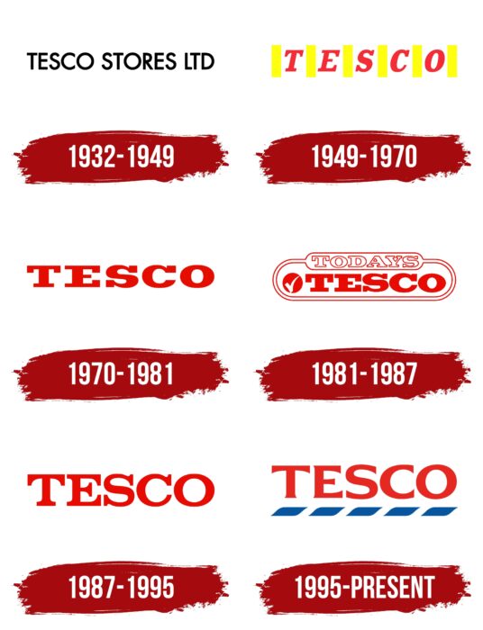
For more than 100 years of the brand’s existence, the company has changed it many times. Each new version updated the previous one, adding new elements conveying the desired retailer’s message. For example, in the early years, the company was limited to a classic black logo that featured the name “Tesco Stores LTD.” It had a simple font with all capital letters. After the rapid development of the brand, management began using typographic logos. At the same time, the color scheme changed as well, as, since 1970, red has become the predominant color in the logo. The last variation of Tesco was introduced in 1995; in addition to the classic red name, there are five blue horizontal stripes under each letter.
If we disregard the original version of the logo, the key color has always been red, which most people associate with the color of strength and passion. Tesco tried not to use any additional details, making the main accent on minimalism and brevity. The author’s main task was to make the logo recognizable not only on the territory of Great Britain but also beyond its borders.
What is Tesco?
The leader in grocery sales in the U.K., ranked among the world’s top 10 most successful retailers by revenue. The company’s assets exceed 80 billion U.S. dollars, and the total number of employees in all stores of the network (they are 2700) is approaching 500 thousand people.
1932 – 1949
The first version was presented in 1932 and lasted for 17 years. The company decided not to use a bright color scheme, presenting concise black lettering without serifs to the general public, made in large capital letters. The neat lines and the distance between the characters conveyed the strength and ambition of the company.
1949 – 1970
In 1949 the company decided to change the appearance of the logo fundamentally. The gloomy shades were changed to a bright red-yellow color palette. The company name was done in red, with a vertical yellow line between each symbol. The letters in the name “Tesco” had a bold serif font. This update was meant to convey the emotions of happiness and energy to the company’s customers.
1970 – 1981
In 1970, the decision was made to remove the yellow stripes between the letters in the name. Now the red company name on a white background was the only element of the logo. Each symbol was written in bold capital letters with serifs. Because of removing the yellow stripes, the distance between the characters in the name was greatly reduced.
1981 – 1987
The most noticeable changes in the logo occurred in 1981. The main name remained unchanged, written in bold red letters. However, the logo itself was enclosed in a double red frame. Its corners were slightly rounded. “Todays” was added at the top of the name to indicate the relevance of the network. Additional lettering was circled in red and used an outline font. The letters themselves were white. In addition, a “checkmark” image was added to the left of the company name, in white, inside a red circle.
1987 – 1995
In 1987, the company returned to a variant with no additional elements besides the brand name. The letters in the lines were much thinner, while the serifs became lighter and clearer. The distance between the letters became much larger than in the 1970-1981 version. In this way, Tesco management tried to make the lettering stylish, spreading the message that the brand had power. As a result, a sense of timelessness was created.
1995 – today
The company introduced the current version of the logo in 1995. A sans serif font was used to create it. Compared to the previous variation, the lines of the letters were slightly wider towards the ends, with the edges somewhat cropped straight. In addition to the main name, there were five horizontal lines in bold, blue color below it. At the same time, customers of the store were supposed to get the impression that the white space between the blue blocks separated the symbols from each other.
Font and Colors
The latest variations of the Tesco logo are close to the Aviano Flare Black and Arpona Semi Bold fonts. The authors made only minimal changes in the structure of the lines. By using bold font, the logo looks modern and stylish. Thus, the company indicates to the target audience that it is ready to work on all the components of a successful business, including identity.
The current version of the Tesco logo consists of a palette of colors, including red, blue, and white. It can be noted that these very colors are also included in the flag of Great Britain, which can be a reference to the state, thus showing the strength and ambition of the company. Previously, black and yellow were also relevant, used in earlier versions.
Tesco color codes
| Lust | Hex color: | #e52922 |
|---|---|---|
| RGB: | 229 41 34 | |
| CMYK: | 0 82 85 10 | |
| Pantone: | PMS Bright Red C |
| Medium Electric Blue | Hex color: | #0855a0 |
|---|---|---|
| RGB: | 8 85 160 | |
| CMYK: | 95 47 0 37 | |
| Pantone: | PMS 2945 C |
