The Tetra Pak logo represents its groundbreaking approach to packaging that has significantly transformed how food products are stored and distributed globally. The symbol is recognized for its innovations in packaging that ensure the safety and quality of products, making them accessible and safe for consumers everywhere. The logo highlights the company’s commitment to sustainability and environmental protection, utilizing advanced technologies to minimize its impact on nature.
Tetra Pak: Brand overview
Tetra Pak, a company founded in Lund, Sweden, in 1943 by Ruben Rausing and Erik Wallenberg, started as a small enterprise with big ideas. They chose the name “Tetra Pak” to reflect the innovative packaging they specialized in, with “tetra” indicating the geometric shape and “pak” for packaging. Their journey began with developing the Tetra Classic packaging system in 1951, a tetrahedron-shaped package that allowed milk to be stored and transported without refrigeration.
As the company progressed through the 1960s, it introduced new packaging solutions like Tetra Brik and Tetra Rex. These were designed to improve the storage and transportation of various liquid foods, marking a significant advancement in the food packaging industry.
By the 1970s and 1980s, Tetra Pak had expanded its operations globally, setting up manufacturing plants and offices worldwide. This period also saw the company branching into new food and beverage categories, including fruit juices, soups, and sauces. A breakthrough came with the adoption of aseptic processing and packaging technology, enabling long-term storage of liquid food products without refrigeration.
The company continued to innovate and expand in the 1990s and 2000s, introducing new products like Tetra Prisma Aseptic and Tetra Recart. During this time, Tetra Pak also focused on environmental sustainability, using renewable materials and promoting recycling.
Tetra Pak operates in over 160 countries and is a food processing and packaging solutions leader. It has embraced eco-friendly packaging innovations, such as plant-based paper straws and renewable coatings, and has leveraged digital technologies to improve operations and customer service.
Tetra Pak’s story is one of continuous innovation, global impact, and dedication to sustainability. Its success is built on strong research and development, a global presence, and strategic partnerships. The company remains committed to addressing the challenges of food security, sustainable development, and climate change with innovative and responsible packaging solutions. With a rich history and a commitment to innovation and sustainability, Tetra Pak is poised to continue playing a key role in the global food processing and packaging industry.
Meaning and History
What is Tetra Pak?
Tetra Pak is a Swedish company that leads the packaging production of food and beverages. It is renowned for its cardboard packages, widely used for milk, juices, yogurts, and other liquid products. Tetra Pak provides solutions that safely transport and store products, extending their shelf life without preservatives.
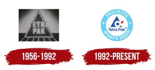
1956 – 1992
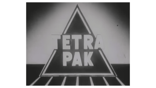
Founded in 1956 and actively growing until 1992, Tetra Pak introduced an innovative solution in food packaging with its triangular milk cartons. This design quickly became a symbol of the brand and set the stage for its future growth. The company’s logo includes an image of a triangular carton inside a refrigerator on a white rack, emphasizing its role in maintaining the freshness of the product.
The company name, Tetra Pak, reflects the tetrahedron shape of the packaging, showcasing the product’s uniqueness and innovative approach to packaging. The brand name is displayed over the carton image, with some letters extending beyond its edges, symbolizing the company’s ambition to push beyond traditional food packaging ideas.
The logo uses white lettering, a nod to milk and cream, and is the first product to use Tetra Pak’s triangular packaging. White conveys purity and freshness, aligning with the essential qualities of the company’s products.
1992 – today
The company’s modern logo combines its rich traditions with a contemporary, innovative approach to product packaging. It has a round shape similar to a seal, symbolizing quality and trust. The words on the blue border reinforce this idea, proclaiming superior product protection.
The logo’s color scheme is also meaningful. The predominance of white suggests sterility and freshness, essential qualities of the company’s products. Blue represents a commitment to modern technologies and commemorates a significant company event—the 1991 acquisition of Alfa-Laval AB. This merger introduced advanced technologies that enhance the aseptic protection of products.
The central element of the logo features a package in a white space inside the circle, creating the impression of an antimicrobial sterile chamber, symbolizing protection and reliability. The tetrahedron shape of the package recalls the company’s original cardboard packaging and its role in pioneering future innovations.
Furthermore, a stylized symbol resembling a letter pays homage to Alfa’s contributions to pasteurization technologies and the overall reliability of the packaging process. The image of milk flowing into the Tetra Pak through a tube underscores the company’s key role in ensuring food safety and quality. A red tip extending from the package warns of bacterial dangers, while the white contents highlight the sterility and safety provided by the company’s technologies.
Font and Colors
The Tetra Pak logo utilizes a clean font to ensure easy readability and foster instant brand recognition. The text below the triangular symbol is designed in a neutral style without excessive embellishments. This minimalist design emphasizes the brand’s professionalism and functional ethos, reflecting its commitment to providing innovative packaging solutions.
The logo’s color scheme is carefully selected to represent the brand’s attributes. The main element, a triangle, is in deep blue, symbolizing reliability and stability—core principles of Tetra Pak’s business and product. Inside the triangle, stylized elements in white and red inject dynamism and vigor, highlighting the company’s focus on innovation and progress.
The outer ring of the logo is soft and light blue, which gives the visual image a fresh and airy feel. This lighter shade contrasts with the deeper blue, creating a layered look that boosts the logo’s visual appeal. This color combination visually distinguishes Tetra Pak and underscores its commitment to reliability, innovation, and sustainability.
FAQ
What is Tetra Pak’s color code?
Tetra Pak uses two main colors in their brand, each with a specific color code. These colors are used in everything from their logo to their packaging.
The blue color, with the code #000099, is a deep blue, almost like the night sky color. RGB, a way to describe colors in digital design, comprises no red, no green, and a lot of blue. This deep blue is chosen because it gives off feelings of trust, reliability, and professionalism. It also looks good against lighter colors, making it a great choice for anything Tetra Pak wants to stand out.
The red color, with the code #FF0000, is a bright, pure red. RGB is all red with no green or blue mixed in. This kind of red is lively and energetic, making people feel passionate or prompting them to take action. It’s good for catching someone’s eye, so Tetra Pak uses it for the most important parts of their designs, like the buttons you’re supposed to click or the special deals.
These colors are a big part of what makes Tetra Pak easy to recognize. They help the brand leave a lasting impression on people, ensuring Tetra Pak products grab your attention while browsing online or through a store.
What is the motto of Tetra Pak?
Tetra Pak’s slogan, “PROTECTS WHAT’S GOOD,” isn’t just a catchy phrase; it’s at the heart of everything they do. It’s tied closely to their brand, showing their promise to keep food safe, support people’s health, and look after our planet.
This slogan means Tetra Pak is all about more than just packaging. They’re committed to ensuring food is safe and easy to get, and they do it in a way that’s good for the environment. When Tetra Pak introduces a new product or service, they use this slogan as a key part of their marketing. It’s not just about letting people know what they sell; it’s about showing the values and promises that Tetra Pak stands for. The slogan reminds everyone that Tetra Pak is dedicated to innovation, being responsible, and improving the world for everyone. “PROTECTS WHAT’S GOOD” sums up Tetra Pak’s goal to ensure the food we eat and the world we live in are as good as possible.
What does Tetra Pak mean?
Tetra Pak’s name combines “TETRA” from “tetrahedron” and “PAK” for packaging. The name points to their start with a unique carton shape and their focus on innovative packaging. The tetrahedron, a shape with four flat sides, was used in the first carton for liquids like milk and juice. This design changed how foods were safely stored and transported. “PAK” shows the company’s aim to create packaging solutions for food and drinks. From their first carton, Tetra Pak has been creating new ways to package products efficiently and sustainably, always looking to protect what we eat and drink, the environment, and our future.
Is Tetra Pak a trademark?
Tetra Pak is a trademark of a Swedish company that works in food packaging and processing. They’re known for creating innovative and sustainable packaging solutions. Their trademark is recognized and protected worldwide, keeping their name and reputation safe wherever they do business.
Tetra Pak uses “TETRA” at the start of their product names. This helps tell their products apart and shows off their brand. They choose names that highlight what makes each type of packaging special so customers can find the best fit for their needs easily. Tetra Pak’s approach to branding goes beyond just names. They focus on marketing, new ideas, and being eco-friendly to show their value. They aim to be leaders in their field by ensuring food safety and availability everywhere.
