


![]() The Beatles Logo PNG
The Beatles Logo PNG
The legendary Liverpudlians did not ponder long over their emblem and made ‘The Beatles’ logo as a script of their band’s name. In the emblem’s graphic design, emphasis was placed on the first syllable to play on the word “beat,” reflecting the brand’s essence.
The Beatles formed in Liverpool in the late 1950s. John Lennon started the Quarrymen in 1956, met Paul McCartney in 1957, and soon George Harrison joined. By 1960, the group adopted the name The Beatles, inspired by Buddy Holly and the Crickets. Ringo Starr replaced Pete Best, completing the lineup.
Between 1960 and 1962, the band played extensively in Hamburg, building stage discipline through long nightly sets. Back in Liverpool, performances at the Cavern Club led their manager, Brian Epstein, to reshape their image. After being rejected by Decca Records, producer George Martin signed them to Parlophone in 1962.
The first single Love Me Do reached the charts in 1962, followed by Please Please Me in 1963, marking the start of Beatlemania. The debut album was recorded in one day. In February 1964, the band appeared on The Ed Sullivan Show to a record US audience and soon occupied the top five spots on the Billboard charts.
Competition with The Beach Boys pushed further experimentation. Albums like Revolver in 1966 introduced new studio techniques, and after their final concert that year, the band focused on recording. Sgt. Pepper’s Lonely Hearts Club Band, released in 1967, redefined the album format.
Internal tensions grew after Brian Epstein’s death in 1967. Abbey Road and Let It Be were recorded during this period, and in April 1970, Paul McCartney announced his departure.
Later releases included Anthology (994–1996) and the 2023 single Now and Then, both of which used restored recordings of Lennon’s voice.
Meaning and History
![]()
The Beatles emerged on the rock scene in 1960 with the birth of beat music in London, a new genre that arose on the wave of rock ‘ n ‘ roll. The legendary quartet became the foundation of the so-called British Invasion, associated with the rise in popularity of British rock on foreign charts.
An inventive collective, also known as the “Liverpool Four,” initially imitated the rock ‘n’ roll classics from the USA but then chose their own path. Their creativity influenced many performers, and modern music would be completely different without The Beatles. Although the band disbanded in the 1970s, its logo is known not only by the infamous Beatles. The wordmark, written in black letters with sharp serifs, is well-known to anyone who is even slightly interested in rock history. After all, it adorned the front of the large drum that Ringo Starr played.
What is The Beatles?
The Beatles are a legendary British beat rock band formed in Liverpool in 1960. It is the most commercially successful band in the history of pop music. 15 of its albums topped the country’s charts, breaking all records.
May–August 1960
![]()
The design of The Beatles’ first logo had nothing to do with the strict black script that appeared in 1960. For several months after its creation, the band sought its musical style and identity. Paul McCartney personally experimented with emblems and even created one, with the word “Beatles,” in which the only capital letter was “B,” with upward-diverging lines resembling two antennas. The musician developed the logo from scratch, not using existing fonts. He wrote the group’s name by hand, drawing curls at the ends of some glyphs.
There is a version with separate red letters supplemented by black shadows. In this wordmark, the capital letter “B” has a decorative loop at the bottom and a large rectangular serif at the top. The font is semi-bold italic, imitating handwriting.
1960 – 1970
![]()
The logo of the innovative team appeared spontaneously. Its symbol was not preconceived. Its appearance was preceded by a trip to the tool store for Ringo Starr’s second drum kit. This happened in the spring of 1963, when the drummer and manager, Brian Epstein, went shopping at the London supermarket, Drum City.
When registering the goods, they were asked to write their group name on the drum. But the supermarket owner was absent at that moment, and the seller called him to discuss the details. It turned out that Ivor Arbiter had never heard of the quartet or Ringo Starr but agreed to inscribe the name. As a result, he immediately sketched the logo right on the spot. Then he ordered it applied to the drum. Fans of the “Liverpool Four” later found out that store employee Eddie Stokes had done this. The store received 5 pounds sterling for its service.
Font and Colors
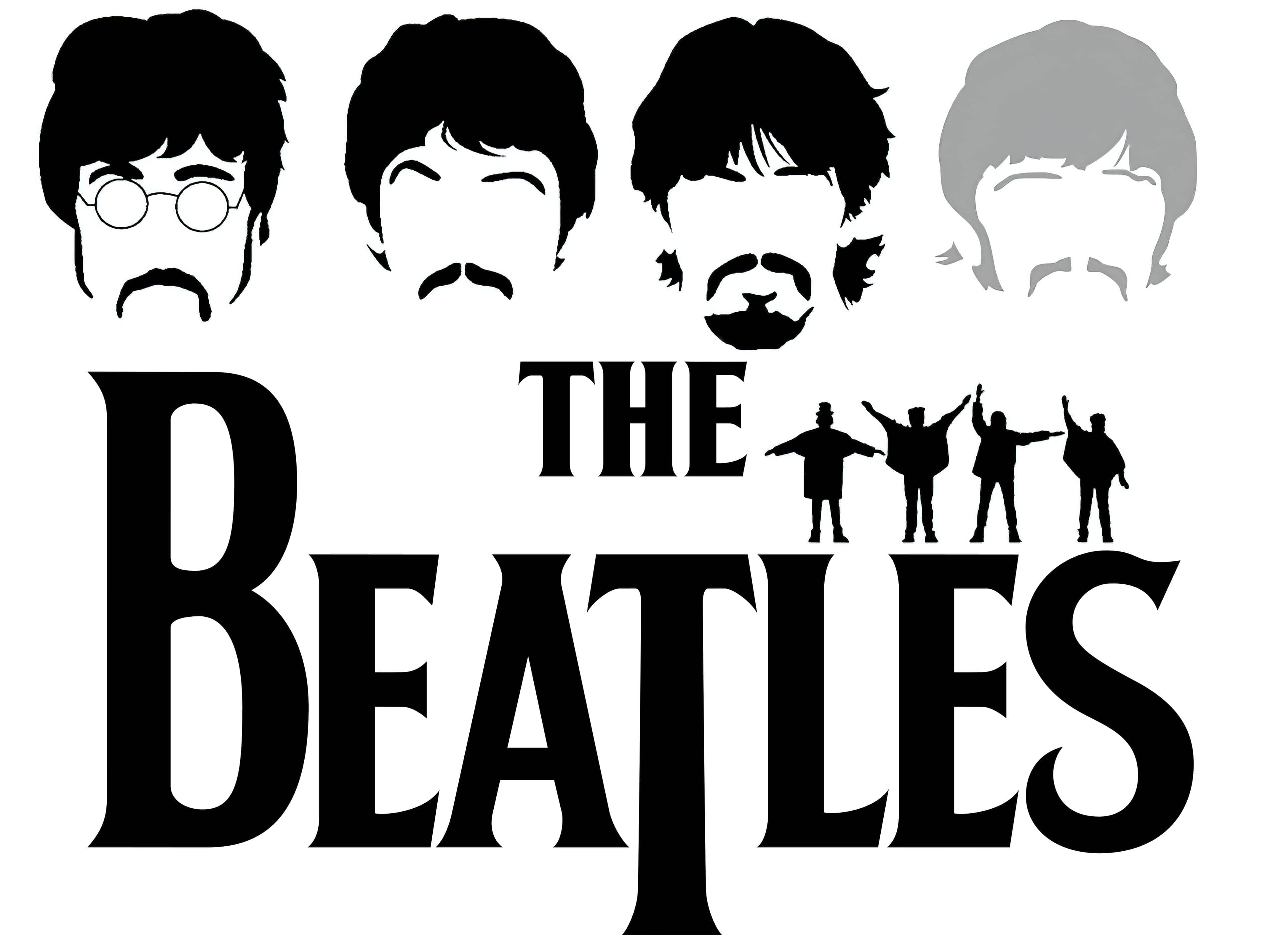
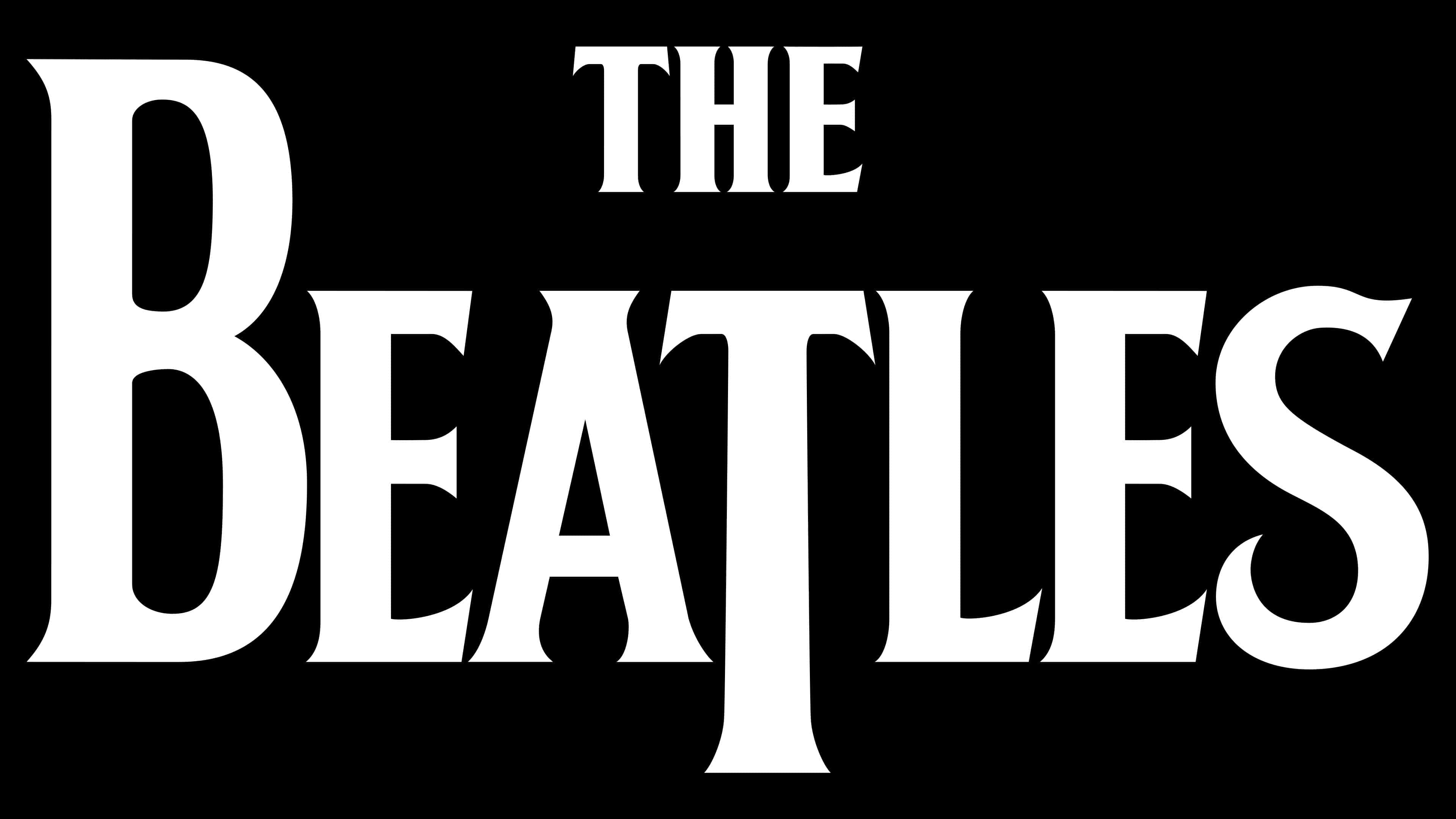
The most unusual sign in “The Beatles” logo is the capital letter “T.” Although it is in the middle of the word, it is larger than all other characters. Its wide-leg design extends beyond the lower boundary. Therefore, the “Beatles” emblem was called “drop-T.” Ivor Arbiter later said that he highlighted it to play on the word “beat originally. ” The emblem also features the word “the,” executed, like the main inscription, in uppercase. But the font is much smaller than the word “Beatles.” The article is centered above the main element.
Surprisingly, the logo was never used on the covers of the original English-language albums. It only adorned concert drums. At the same time, this did not prevent the brand from becoming recognizable, so the musicians decided to make it their logo. In the 1990s, the symbolism of the Liverpool Four became an official brand, complemented by multidimensional graphics (mostly figures of the legendary Beatles).
![]()
The Beatles logo is a typographic sign, unique and clean, devoid of hand-drawn elements. The label creator did not use existing fonts. He worked out each letter from scratch, making the logo authentic and without analogs. Now, this font is called “Bootle.”
The only color used in the original version is black. Its combination with a white background makes the logo classic and closely aligned in spirit with all members of the Liverpool Four. Such a variant is perceived as strict and elegant. Also, according to the principles of color science, black is a mixture of all other colors, which the “Beatles” aspired to in the musical arena.
FAQ
What was the “Beatles” logo like?
The Beatles logo consisted of an inscription in the legendary Drop-T design. This letter was underlined and stood out from the others, with its leg length decreasing. Thus, the author wanted to draw attention to the first part of the word, “Beat”.
Did the “Beatles” have a symbol?
The “Beatles” did not have a graphic symbol; the group used only a word logo. It consisted of the name and the so-called Drop-T, where this letter stood out. It had an elongated leg that went far beyond the lower boundary.
In which store was the “Beatles” logo created?
The “Beatles” logo was created for 5 pounds sterling in the London store Drum City on Shaftesbury Avenue, where only drums and everything for them were sold. Its founder, Ivor Arbiter, also owned the Sound City store, where musicians bought most of the equipment.
Who developed the “Beatles” logo?
It was developed by the owner of a London musical instrument store, where Brian Epstein bought drums for Ringo Starr in 1963. Ivor Arbiter hastily sketched the famous Drop-T design on a piece of paper. And it was applied by Eddie Stokes, a local sign-making craftsman.