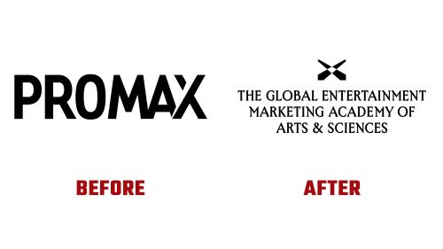
The Global Entertainment Marketing Academy of Arts & Sciences (G.E.M.A.) has introduced a new logo and identity designed by Matchstic. This rebranding aims to elevate the organization’s prestige and align its visual identity with its mission to honor marketing and creative excellence across the entertainment industry, including film, TV, sports, and music.
The new logo features a bold and simple icon resembling an “X,” representing a spotlight shining downwards. This symbolizes the recognition and celebration of talent within the industry. The design connects to the organization’s history while signaling a new direction.
The wordmark uses a condensed, sharp serif typeface that lends a serious and sophisticated tone. The typeface has unique quirks, particularly in the “M” and “N” characters, adding a slight texture. This shift aligns with G.E.M.A.’s goal of positioning itself as a prestigious and eminent organization.
One of the standout features of the new identity is the use of “light flares” and glass-refraction-like gradients. These elements create a vibrant and dynamic visual language, transitioning from blue to green to yellow to orange. These gradients serve as engaging backgrounds in black or add spark-like effects to black-and-white photography, unifying various visual elements.
The primary typeface, Morion, is a sophisticated serif that pairs well with the bright yellow-green color scheme and smooth motion treatments used throughout the identity. While there is a slight disconnect between the serif used in the wordmark and the primary typeface, the overall design remains cohesive and visually appealing.
The new identity includes a multifaceted polygon as a central graphic element. This polygon suggests a spotlight, prism, or gemstone, symbolizing the multifaceted nature of entertainment marketing. G.E.M.A.’s signature yellow is used vibrantly, ensuring the brand stands out and remains memorable.
G.E.M.A. has developed a visual system to differentiate between its various initiatives, such as the Awards and the Academy. The GEM Awards branding leans towards a darker, bolder look with large, impactful flares on black backgrounds. In contrast, the Academy branding is brighter, utilizing smaller, dynamic flares to create a lively and engaging atmosphere.
The rebranding strategy celebrates and continues the education of G.E.M.A.’s diverse membership, which includes creative marketers. By evolving into an Academy, G.E.M.A. aims to create a space for members to connect, collaborate, learn, and grow. This approach elevates the role of marketers in the entertainment industry and highlights the potential of individual members.
The visual identity spotlights entertainment marketers and their contributions, reflecting the organization’s commitment to fostering community and collaboration. The new brand strategy emphasizes the importance of these marketers, who are essential in building and maintaining fan engagement across different entertainment sectors.


