The Guardian logo is simple yet elegant. Encoded in the emblem is the extensive two-hundred-year history of the tabloid, showing its ability to always stay on top, attract attention, and earn the love and trust of its readers.
The Guardian: Brand overview
| Founded: | 5 May 1821 |
| Founder: | John Edward Taylor |
| Headquarters: | Kings Place, London, United Kingdom |
| Website: | theguardian.com |
The Guardian is one of the oldest daily newspapers in the United Kingdom, which has been in circulation since 1821. The newspaper has a daily circulation of around 105,000 copies. The newspaper’s website is considered the most visited among the country’s news portals and has over 180 million readers per month. The style of materials and presentation has been recognized by the most famous awards in the field of journalism: Pulitzer and Webby Awards.
Meaning and History
The newspaper’s logos try to keep up with the times, just like the publication itself. The tabloid is considered a pioneer in using various media innovations: trying out different formats, fonts, and ways of communication. That’s why the emblems, despite being only textual, are very different from each other. Each one symbolizes a strategic period in the movement from the local to international level, mastering modern sources of interaction with readers and increasing the accessibility of news.
What is The Guardian?
It’s a print and online version of a daily news newspaper covering major events in England. The publication supports liberal views and presents materials on politics, economics, sports, and culture. Its editorial team consists of about 1,500 employees. As part of the Guardian Media Group, it belongs to the Scott Trust.
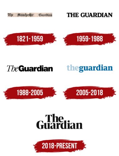
1821 – 1959
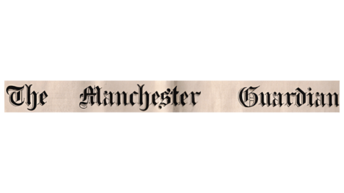
The first logo of the newspaper is the name in Old English font. The publication was initially called The Manchester Guardian, as it was founded in a city in the northwest of England. A large distance between words indicates that the publication covers many issues.
The name Guardian was chosen to convey fundamental liberal views that support equal economic opportunities, education, healthcare for real freedom, and the supremacy of the individual. The state should organize all this to combat poverty. The newspaper’s goal was to ensure that the interests of any social group were not infringed upon.
1959 – 1988
In 1959, the name was slightly shortened, removing Manchester. A renewed version of the logo was created for the new name – the name in large capital black letters. The outdated font was removed to demonstrate the newspaper’s modernity.
The removal of the word Manchester showed a drive toward globalization and expansion on a nationwide scale. The removal of geographic attachment was a strategy of the newspaper, which later moved on to cover international news.
1988 – 2005
By 1988, the newspaper had abandoned advertising on the front pages in favor of interesting news. Also, it expanded its team of international correspondents to provide detailed coverage of events in England and worldwide.
This update led to a rebranding of the publication’s appearance and its logo. For the first time, the name is written together with The, but a separate font is used for each word. This approach demonstrated global reach and a focus on covering multiple events on the pages of a single publication.
Bold glyphs also illustrate the expansion and increasing significance of the publication among the media.
2005 – 2018
In 2005, The Guardian switched to the Berliner format: 12.4 x 18.5 inches. This distinguished it among the national daily newspapers. The reduction in size was also reflected in the publication’s logo. The name is written in lowercase for the first time and is colored. Sometimes the logo was used in blue, and sometimes in white-blue on a blue background.
The small symbols, like the continuous writing, spoke about the format. The choice of color and font is connected with launching a new website and the publication’s aspiration to keep up with the times. The updated logo looked more like an internet version and presented the newspaper as a simple, modern, and accessible source of news.
2018 – today
Since 2018, the newspaper has switched to the tabloid format (A3), even smaller than the previous one. However, its logo has grown to reflect the global nature of the publication, which owns two international websites and the American section, The Guardian America. Elegant letters with glyphs of different thicknesses and serifs convey the mastery of the word—the ability to describe events, highlighting important points interestingly.
Font and Colors
Black is the main color of the logo. It personifies English precision, honest and truthful coverage of events without any omissions. The color also speaks about the fundamentality and long existence of the publication. Black rules out the idea of tabloid sensations. It conveys a calm, thoughtful journalistic style.
The shade exhibits dominance: the newspaper is recognized as the most reliable and readable publication, trusted by 84% of the surveyed Englishmen. The color reflects confidence and independence. The Guardian’s work is secured by a special trust fund (since 2008 by a company) that earns money and invests all profits in the newspaper. Therefore, political forces and the government do not influence the coverage of events in the tabloid.
The logo font is Empira Black with elegant elements of calligraphic writing. The style is a synthesis of print and script fonts, emphasizing the journey from 1821 to 2023.
The Guardian color codes
| Smoky Black | Hex color: | #121212 |
|---|---|---|
| RGB: | 18 18 18 | |
| CMYK: | 0 0 0 93 | |
| Pantone: | PMS Black 6 C |
