The Thomas and Friends logo ensures brand recognition. It serves as a means of identification and distinguishes the animated series from others. Moreover, the emblem evokes associations with friendship, adventures, and the world of childhood, which are the main values of the franchise.
Thomas & Friends: Brand overview
Meaning and History
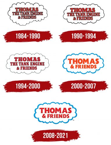
The story of a blue steam engine with a human face and a live mimic is known worldwide. Therefore, a logo that imitates a cloud of steam is well-known to children and adults from many countries. It was used for the original animated show and various products, including stickers and toys. The emblem has changed many times because it had to match the evolving graphics of the animated series. Its font became clearer each time, and the colors became brighter and more attractive. The most noticeable redesign took place in 1999 when the series was renamed. Before that, it was called Thomas the Tank Engine & Friends.
What is Thomas and Friends?
Thomas and Friends is a popular children’s TV show about trains that live on the fictional island of Sodor. It promotes mutual aid and teamwork. The animated series first aired in 1984 and is a TV adaptation of Wilbert Vere Awdry’s books. It has become one of the largest preschool media franchises, including movies, toys, amusement parks, and much more.
1984 – 1990
The first episode was released in 1984. It used the same logo introduced in the 1983 pilot episode: a red inscription “THOMAS THE TANK ENGINE & FRIENDS” in a white cloud with black contours. The text was divided into three lines and centered. The bold font with rectangular serifs looked exactly like the Beton typeface.
1990 – 1994
The designers changed the shape of the cloud, making it symmetrical. If previously the left side protruded significantly downward, the redrawn version corrected this flaw. The base of the word mark became more balanced, while the inscription itself did not change.
1994 – 2000
In 1994, the emblem developers reduced the letters to solve the main problem—the lack of free space, which caused all the words to merge. The cloud was further aligned, and the thickness of its black contour decreased.
2000 – 2007
In 1999, the name of the animated series was shortened to Thomas & Friends, so the inscription on the logo also shrunk. In the new version, the phrase occupied only two lines. Designers set it in a clear font with sharp serifs and removed the dark contours that previously existed around each letter. The outer outline of the cloud became bright blue, and the red color of the text acquired a scarlet shade.
2008 – 2021
2008, the Thomas and Friends logo was changed, giving it a more modern and attractive look. This update included the addition of three-dimensional contours with a gradient, which creates visual depth and volume. Now, the emblem corresponds to the graphics of the animated series and harmoniously complements it. The main colors became darker, making the inscription and the cloud more visible on different backgrounds.
Font and Colors
The Beton font with rectangular serifs was used in the early versions of the word mark. This was likely an adaptation by Letraset, which slightly modified the capital letters of the Bold Condensed and Extra Bold subfamilies. It differed from the original with curved legs of “R” and “K.” When the animated series was renamed, its logo font changed to Flange BQ Bold by Leslie Usherwood. Now, the glyphs have sharp and short serifs.
The 2008 emblem’s main colors are red, blue, and white. This combination is designed to attract children’s attention. Designers added gradient outlines of different shades to make the image voluminous.
