![]() Thor Logo PNG
Thor Logo PNG
The superhero movie series is recognizable for its bright, modern emblem. The Thor logo embodies sublimity, pathos, and solemnity. But it doesn’t seem serious because the designers used a cartoonish style that hints at the show’s entertainment, sci-fi, and comedy elements.
Thor is a cinematic tetralogy about the superhero of the same name. It is based on the Marvel comics and includes four parts, released in 2011, 2013, 2017, and 2022 (with the fourth scheduled for release in the summer). Marvel Studios is producing, and Paramount Pictures is distributing. Kenneth Branagh directs the film. Casting took place in 2009, and shooting took place in January-May 2010. The main action was filmed in New Mexico and California. The first film in the film cycle premiered in Sydney and received critical acclaim across several categories: theme, characters, acting, and special effects. Each successive Thor motion picture received a logo that was unique and out of keeping with the overall style.
Sam Raimi decided to create a new type of superhero back in 1991 when the movie Darkman came out. He presented his concept to 20th Century Fox Studios, but they rejected his idea, and it was forgotten for several years. But when the MCU (Marvel Cinematic Universe) began to develop, that company remembered the project because it fit their themes. Searching for writers, producers, and directors led to a series of films with an unusual format: the superhero is not a man with supernatural powers but God. The innovation of the creators of Thor is that the highest deity has shifted from the Old Testament to the New Testament.
However, preparations for the filming lasted much longer than the filming process itself. It ran from January to May 2010. The footage was converted into 3D before the presentation. Thanks to the combined contributions of talented individuals, the film was a financial success, garnering nearly $450 million in box office revenue. This was the reason for further work on the subject and led to sequels: Thor: The Dark World (2013), Thor: Ragnarok (2017), and Thor: Love and Thunder (2022).
Meaning and History
![]()
With each successive version, the visual identity of the tetralogy’s parts evolved. At the same time, it did not maintain the general trend: a new episode received an emblem in an individual style, so the posters differed in design.
What is The Thor?
Thor is a movie cycle consisting of four independent parts. They are united by a common character named the same. The beginning of the film was based on Marvel-themed comic books. Filming took place in 2010, and in 2011 the first film in this heroic series was released. It was directed by Kenneth Branagh.
2011
![]()
For the debut film’s logo, the artists chose a laconic, restrained, simple, clean design in cool colors. It harmoniously combines minimalism and power, as evidenced by the letters’ “metalized” surface. The inscription is divided into two lines. At the top is the manufacturer’s name, “Marvel Studios”; at the bottom is the word “Thor.” The first row is set in a small, sans-serif font, and the second row in a large serif typeface with wide inter-letter spacing. This emphasizes the breadth of the protagonist’s character, steely will, and power. Between the upper and lower parts runs a thin stripe. The “T” and “R” are slightly larger than the other capital characters.
2013
![]()
The Thor logo from this period features a massive inscription in wide, bold letters. The glyphs in the overall cycle name are equal in height due to the gold-colored trim lines. However, there are significant differences: for example, the “O” is flattened at the top and bottom, as if it were an anvil for forging iron, while the “R” has a flat top. Inside, the symbols are decorated with silver embossing with a magical ornament. Above the central inscription is the classic Marvel tag: a red rectangle with the movie company’s name. Below the word “Thor” is the phrase “The Dark World” in the same font as the main text. The glyphs have miniature serifs.
2017
![]()
This version of the logo is much more colorful than the previous ones. It has breadth, dynamics, and power. The grouping is similar: the text is divided into three lines. At the top is the name of the film studio that led the shooting. The word “Marvel” is in the red rectangle, “Studios” between the two lines. In the center is the general name of the series, after a god from ancient Scandinavian mythology. It is large, yellow, with a narrow rim, and without serifs. At the bottom, the second part of the movie title is placed under the thin line. The inscription “Ragnarok” is shaped as an “A” with a semi-arched left foot. The glyphs are decorated with thin stripes that transition to a solid blue fill.
2022
![]()
This Thor logo is the most gigantic. The center line is in a custom font in which the “O” looks like a rhombus. The “T” and “H” are connected, and the “R” has an extended right foot. The glyphs are geometric, with solid stripes and a thin outline. The letters are colored red, blue, and blue with a gradient transition. The bottom row contains the title of the fourth film in the tetralogy, Love and Thunder. It consists of uppercase symbols with varying side thicknesses. Another essential element of the logo is the shining star on the “T” hat on the left. All of the symbols have wide shadows, so the lettering appears three-dimensional.
The visual identity of the Thor cinematic series has evolved from a simple form to a complex one. Each time the letters grew wider, the lines thickened, and the lettering grew more massive. The same pattern is observed in the color design: while the first logo uses only a metallic shade of gray, the fourth logo uses a broader palette.
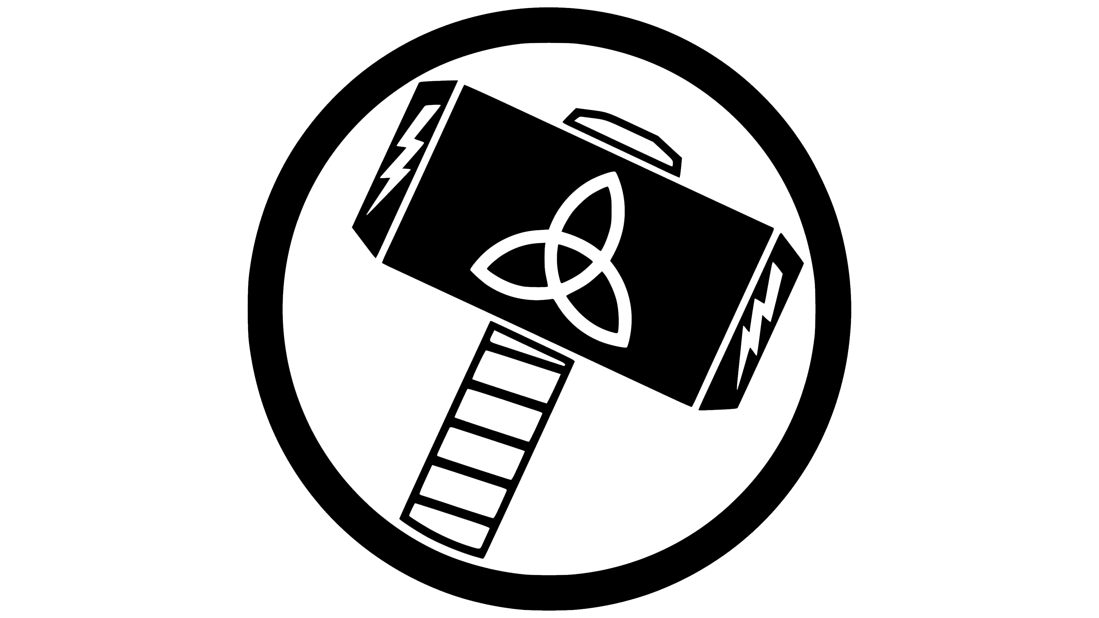
In addition, the main character has his sign with a weapon, which he uses according to the legend. It is associated with the myths of the ancient deity Thor, so it passed to the movie’s character of the same name. The emblem depicts a large hammer. To its right and left are drawn lightning bolts, as they are an attribute of the god Thunderer.
The flail consists of a horizontal rectangle and two small trapezoids on the sides. In the center is a complex geometric figure composed of three “petals.” This is a triquetra, the sacred symbol of the Scandinavian peoples. The white handle is covered with thin black lines. A narrow band of the wedge is visible on top. The weapon is held in a solid ring, emphasizing its importance to the protagonist.
Font and Colors
Across all Thor logos, the lettering features distinct elements. The fonts were created specifically for the film to reflect its concept. The debut version uses the thinnest letters, the second uses slightly wider letters than before, and so on in ascending order. In the last logo, the glyphs are very large. It is predominantly antiqua with miniature serifs. The color palette includes several shades of silver, gold, red, white, and blue.