The Tide logo represents a powder that hits the target of the problem and gives users the joy of perfectly laundered clean clothes. As the emblem shows, it’s all about the scientific approach to formula development.
Tide: Brand overview
| Founded: | 1946 |
| Founder: | Procter & Gamble |
| Headquarters: | United States |
| Website: | tide.com |
Meaning and History
The line, which has gained worldwide recognition thanks to its successful logo, has several identity modifications. The author of the first version of the logo, which served as a prototype for everyone else, is Donald Deskey, an industrial designer, architect, and artist. He worked on it as part of his agency, which specialized in graphic design.
What is Tide?
Tide is an American brand of laundry detergent. It was introduced in 1946 and is part of the Procter & Gamble corporation. Over time, this cleaning product brand became the best-selling detergent worldwide among competitors. In 2020, it received the Environment Possibility Award.
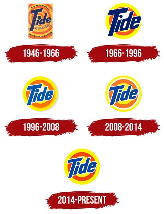
1946 – 1966
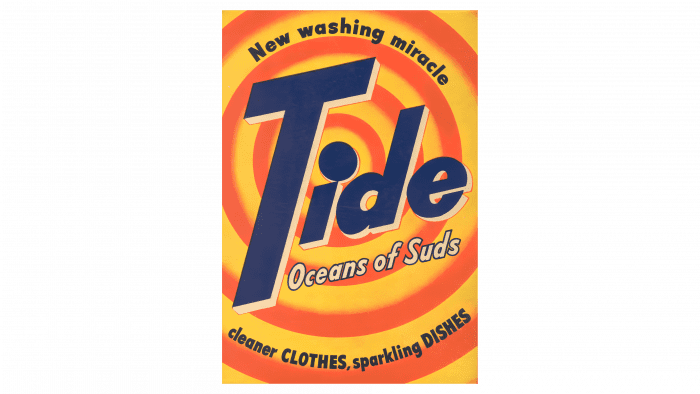
The debut emblem created a furor in the advertising field because the author of the logo took an innovative approach to the process and expanded the scope of the usual visual signs. He made something like a target – with wide contrasting circles running from the center to the edge. Some of them were labeled with basic information about the product. The “apple” (middle) was the dot above the dark blue “i.” Then there was an alternation of yellow and red stripes with a gradient transition between them.
A third of the logo space was occupied by the word “Tide.” It was located diagonally and was made with printed signs. To make room next to the “i” point, the designer made the letter “T” incredibly large: due to the long leg, the upper bar does not cover the adjacent symbol. Thanks to this technique, the author created the effect of a target with concentric circles. The letters were also supplemented with light strokes on the right side, which gave them volume.
1966 – 1996
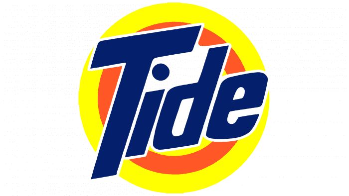
In 1966, the management approved an updated version, in which the dot above the “i” is no longer the “bull’s-eye.” The developers slightly changed the target’s center: instead of a dark circle, they used a neutral white spot. Overall, they made the design easier by removing many rings and leaving only two – one yellow and one red. The color palette was also changed – it became much brighter and more expressive.
The inscription has also undergone some changes. The uppercase “T” had a shortened leg, the “i” reduced the point, the “d” increased the internal clearance, and the “e” was made a little larger than the previous one. Also, “d” and “e” are now rectangular.
1996 – 2008
After the redesign, the emblem began to look more accurate and was closer to the debut version. The designers added one inner ring to it, so the logo again got the shape of a target – only with a center in the form of a white circle. They also enlarged the dot above the “i.” The color palette was shifted to pastel shades, so the colors became faded as if powdered with white.
2008 – 2014
This version introduces additional circles to enhance the target’s effect. The developers painted the central part yellow, and the outer circle was divided into two – yellow and white with a gradient transition. The rest of the rings remained the same. Corrections were also made to the text. The adjustments resulted in slightly elongated and pointed ends at the “T” and “d.” The word “Tide” is now the same dark blue color.
2014 – today
Now the logo is used with a retouched palette of colors – muted and dusty. The navy blue is now just blue, and the double outer ring is solid (yellow). There is still a white dividing border around the inscription.
Tide: Interesting Facts
Tide, a top laundry detergent brand by Procter & Gamble (P&G), has led the market since 1946 with its strong cleaning power and recognizable orange and yellow packaging.
- Groundbreaking Launch: In 1946, Tide became the first heavy-duty synthetic detergent, quickly dominating the U.S. market.
- Clever Marketing: “Tide’s In, Dirt’s Out” was one of its first marketing slogans showcasing what Tide does best.
- Ongoing Innovation: Tide owes its success to continuous research, leading to new products like detergents for sensitive skin and eco-friendly options.
- Wide Product Range: Tide now offers liquids, powders, pods, stain removers, and fabric care products to meet all laundry needs.
- Tide Pods: Since 2012, the convenient Tide Pods have combined detergent, stain remover, and color protector. Despite early safety concerns, they’re popular for their effectiveness.
- Eco-Friendly Moves: Tide has focused on reducing its footprint with concentrated formulas and the Eco-Box, which uses much less plastic.
- Worldwide Presence: Tide is loved in many countries beyond the U.S., and it adapts its products and marketing to each market.
- Helping in Disasters: Tide’s Loads of Hope offers mobile laundry services to disaster-struck areas, providing clean clothes to affected families since 2005.
- Cultural Icon: Tide is a part of American culture, sponsoring NASCAR and featuring in TV shows and movies.
- Scientific Praise: The original Tide formula was so revolutionary that the Smithsonian National Museum of American History recognizes it.
From the first synthetic detergent to a global leader, Tide’s story showcases its dedication to innovation, environmental care, and community support. It consistently meets evolving consumer needs and standards while delivering excellent cleaning.
Font and Colors
In the logo design, the brand owners have always adhered to the concept presented at the very beginning by the architect-artist Donald Deskey. Its variant has been won so far, which is why the emblem adopted for the fiftieth anniversary of the launch of the original product is currently in use. It echoes the debut version. Also, the Day-Glo palette was used on Tide packaging for the first time in the industry’s history.
The text is given the same attention as the graphics, so they reflect the product’s idea equally. The style of the inscription changed several times but always remained within the usual framework. The main emphasis is on the capital “T,” which the designers have lengthened, then shortened. The rest of the letters are lowercase. In general, the word “Tide” is in a custom sans serif font and has slightly pointed ends at two characters. Signature colors include yellow, red, white, and blue.
Tide color codes
| Cadmium Yellow | Hex color: | #fff400 |
|---|---|---|
| RGB: | 255 244 0 | |
| CMYK: | 0 4 100 0 | |
| Pantone: | PMS 3955 C |
| Orange Red | Hex color: | #f24505 |
|---|---|---|
| RGB: | 242 69 5 | |
| CMYK: | 0 71 98 5 | |
| Pantone: | PMS 1655 C |
| Cobalt Blue | Hex color: | #0043a2 |
|---|---|---|
| RGB: | 0 67 162 | |
| CMYK: | 100 59 0 36 | |
| Pantone: | PMS 661 C |
