


![]() Titos Logo PNG
Titos Logo PNG
Tito’s logo showcases a unique handcrafted recipe for alcohol. The emblem focuses on natural ingredients, special storage containers, distillation technology, and the strength of the final product.
Tito’s Handmade Vodka began with Bert Butler “Tito” Beveridge II, a Texas native whose background was far from the liquor trade. After studying geology and geophysics at the University of Texas at Austin, he worked as an oilman, seismologist, explosives expert, driller, and geologist before returning to Austin.
In 1992-1993, while working in the mortgage business, Beveridge began making flavored vodka as gifts. The idea gradually turned into a serious project, but Texas had no private legal distilleries at the time. He spent years working through legal barriers and learning distillation, first studying moonshine methods and then refining the product for a cleaner taste.
Commercial production began in 1997, when Beveridge founded Fifth Generation, Inc. and opened Mockingbird Distillery, the region’s first legal distillery. Tito’s was distilled six times, bottled at 40% alcohol, and first made in copper pot stills. The first year produced about 1,000 cases. By 2007, output had reached 160,000 cases.
The brand gained wider attention in 2001 after Tito’s Handmade Vodka won a double gold medal at the San Francisco World Spirits Competition and received four stars from Spirit Journal. In 2007, it earned another four-star rating. By 2017, Tito’s held 7.1% of the US vodka market. United Airlines began serving it exclusively in 2013, and during the COVID-19 pandemic, the company added hand sanitizer production.
Meaning and History
![]()
The Titos logo is a graphic representation of vodka production. The company used an artistic technique to show the product’s sustainability, which is made in an old-fashioned way. The classical technique involves only a distillation vat, a coil, and a container for filling. Nothing extra. These elements are represented on the emblem. These symbols change from one year to the next, indicating a commitment to a long tradition.
What is Titos?
This is an Austin, Texas, alcohol brand that has gained attention for its original approach to corn-based spirits. The brand’s vodka is known for its exceptional smoothness and clean taste, achieved through a six-time distillation process in custom-made copper stills. The unique production method uses only corn as the raw material, making the vodka gluten-free and imparting a subtle sweetness that sets it apart from vodka made with wheat or rye. The brand follows a craft philosophy, producing each batch in small quantities and closely monitoring quality at every stage of production.
1997 – 2010s
![]()
The logo is an oval with triangular rays directed in all directions. Inside, a strip with the phrases “Award Winning” and “Distilled 6 Times” appears at the top and bottom. To the right and left, they are separated by pointed white lines with a star on each. The heart of the emblem is a distillation apparatus demonstrating the vodka production process. Above the elliptical icon is the italic brand name. It is typed in large characters with one-sided strokes. There are two more lines at the bottom. The first of them exactly repeats the style of the inscription in the top row.
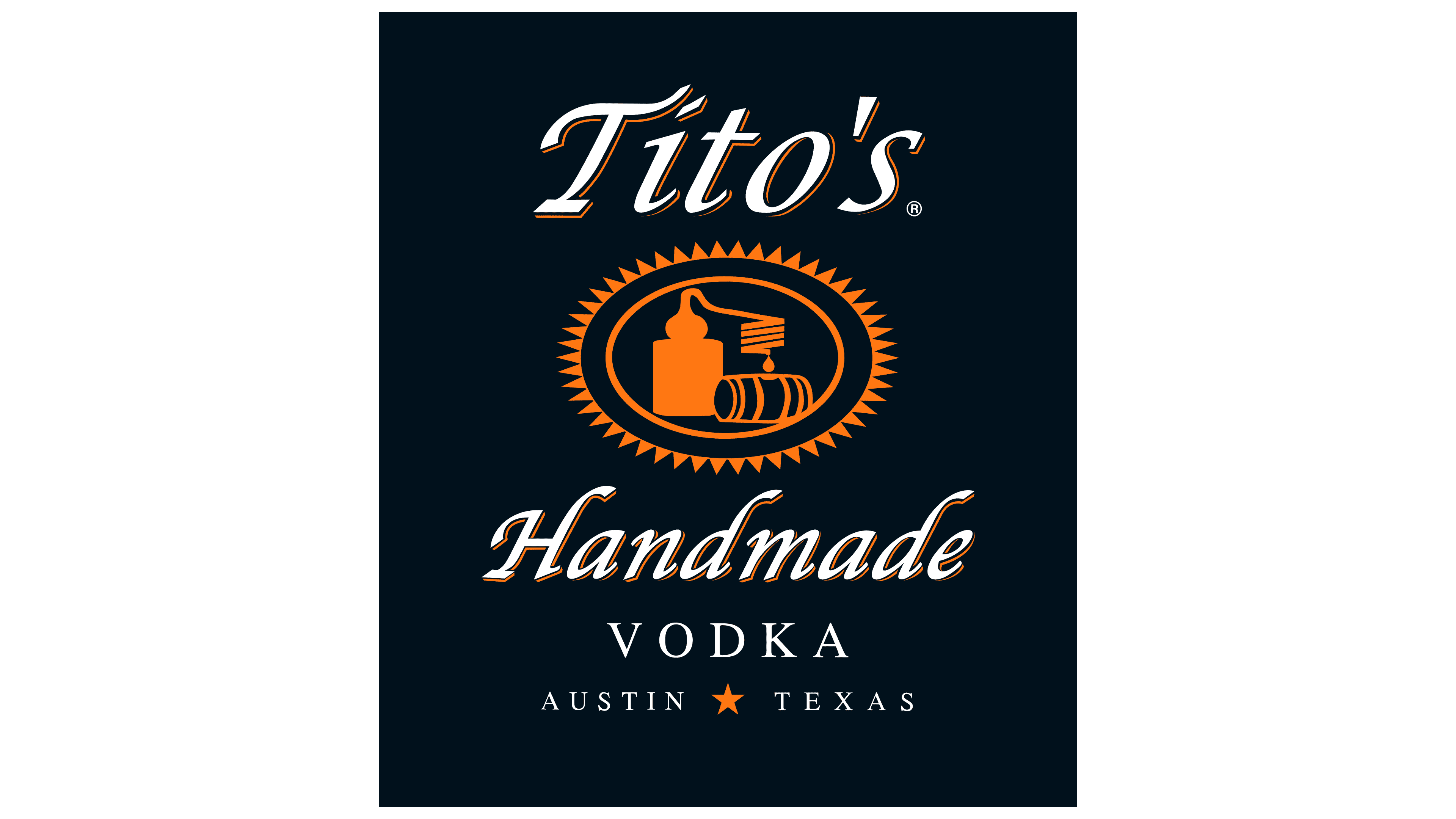
2010s – today
![]()
The personal logo (aka bottle label) combines graphics and text. The original icon occupies the upper zone. It depicts a black oval with points along its perimeter. They are orange, so they contrast well with the main element. Inside is an apparatus for distilling alcohol. Moreover, Bert Butler Beveridge II does not use potatoes or wheat for this, but corn grains. The coil and alcohol collection tank equipment is in the center, colored orange, and outlined with a medium-thick stripe.
Below is the informational part of the text. The words are arranged in three lines. The upper one states the product’s production method: Handmade. The middle indicates the type of product being produced – Vodka. The lower one marks the location of the brand Austin, Texas. The first inscription, “Handmade,” is in italic letters with a rightward slant. Among them, “H” and both “d” are highlighted. Despite the difference in the case, they are visually similar and the same height. Each symbol has a thin orange line on the right. The second word, “Vodka,” is in block type with capital letters. It is decorated with serifs. The third row contains a star that stands between Austin and Texas. At the top is the name “Tito’s,” set in handwritten text with a one-sided edge.
Font and Colors
There are three typefaces used in the emblem: Trade Gothic (we can change it to Heebo), Clarendon (we can use Lora instead), and Sign Painter (it looks like Lucida Calligraphy and Apple Chancery).
![]()
Signature colors include orange (Copper and Dark Copper), white, black, and Kraft, which serve as the background. They are directly related to the production process. For example, distillation of raw materials is still carried out in copper boilers, and the first labels were printed on a light beige recycled paper.
