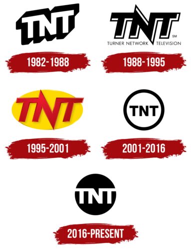
The American basic broadcasting channel has a logo TNT consisting of an abbreviation formed from the phrase Turner Network Television. The expanded version is its first name, dominating until 1995, after which the cable network officially adopted a version with the three-letter acronym.
TNT: Brand overview
| Founded: | October 3, 1988 |
| Founder: | Warner Bros. Discovery |
| Headquarters: | Atlanta, Georgia, U.S. |
| Website: | tntdrama.com |
The time of origin of the television broadcasting service is 1982. Its founder was Ted Turner. The current owner is Warner Bros. Discovery. The location of its headquarters is in Atlanta, Georgia (United States). The channel broadcasts sports programs (NHL, NCAA, NBA, AEW Rampage matches), series, and movies, the rights for which it has purchased.
The Turner Broadcasting System preceded TNT’s inception. It created and distributed content with various sporting events. A stripped-down version of Turner Network Television was launched in 1982 to showcase the NFL Players Association (NFLPA) during the NFL strike. In 1988, a full-length television channel appeared. It began on October 3 at 7:55 p.m., kicking off with a showing of Ted Turner’s favorite movie, Gone with the Wind.
Initially, this cable TV network was positioned as a network focused on mini-series, documentaries, major TV events, sensational specials, sporting events, and Metro-Goldwyn-Mayer-produced movies. In fact, for the first decade, it was dominated by classic movies, sitcoms, and TV shows for which the channel acquired the rights. Then it started launching its content.
Meaning and History
It was in 1995, when the cable network introduced a sports format for its programming, that a major change in identity occurred. A global rebranding followed, reducing the long name of Turner Network Television to an acronym. Then the channel’s programming included match broadcasts and WCW Monday Nitro. The next crucial phase in TNT’s operations was in 2001. During that period, the slogan “We Know Drama” was introduced, which boosted the transition to dramatic content.
In 2008, the company redesigned its visual identity and introduced an updated logo. It was mostly served in a silver or gold bevel. At the same time, the emblem could be repainted depending on the themes of the programs. In 2014, the channel switched to the “Boom” slogan. Detectives, fantasy, suspense series, and sci-fi appeared in its programs. They have weaved well into the scheme of crime dramas. The television network’s logo has changed four times but has always stayed within the familiar format: an acronym on a contrasting background.
What is TNT?
TNT is an American cable TV channel that broadcasts nationwide. Its full name is Turner Network Television, but it has abandoned it, opting for a shorter version. The founder of the television network is Ted Turner. The time of its inception was 1982. Warner Bros. Discovery now owns it. The location of its headquarters is the city of Atlanta, Georgia. The TV service covers sports events, shows, feature and documentary films, and TV series.
1982 – 1988
TNT’s debut logo is in white letters with black shadows. The text is in the upper-case font. The lettering is arranged at a slight angle, that is, diagonally. All characters are connected at the upper point: the connecting link is the right and left sides of the central glyph, the “N.”
1988 – 1995
The second version of the logo appeared simultaneously with the final launch of Turner Network Television. The designers slightly tweaked the format of the visual mark, placing it horizontally. They kept the close connection between the letters but pulled out the angled sides of the “N” so it looked like a lightning bolt. And the black and white colors were swapped: now the printed characters are in black, and the shadows are in white. This contrast makes each glyph appear to have a thin border line around it. At the bottom is the full version of the name of the network. It is typed in small and thin gray letters.
1995 – 2001
In 1995 Turner Network Television abandoned its old identity and switched to a new, shortened version of the name. The three-letter acronym was stripped of its thin border but was given a gradient with a three-dimensional effect. The logo also got a horizontal ellipse in caustic yellow. The letters became red, with precise angles. This modernized design is related to the change in the channel’s theme – it began to show WCW Monday Nitro.
2001 – 2016
The transition of the parent company of the television network TNT to America Online resulted in a major rebranding. As a result, a revamped logo was unveiled – simple but conceptual. It consists of a wide ring with an abbreviation on a white space inside. The black letters stand out clearly against the light background. However, the original is not always dominated by monochrome: there are also versions in a silver and gold palette. The glyphs are no longer connected and stand-alone, although there is minimal distance between them. The font is chopped, geometric, and bold. The long sharp corners of the “N” were removed, and the designers chose the traditional way of writing. The authors of this variant are the specialists of Trollbäck & Company.
2016 – today
The current emblem has a modern style. It’s also a circle, but with a solid fill and without a frame. The name of the cable channel is colored white, so it’s as if it’s formed from a negative space. The company first used this logo in promos and social media to avoid shocking viewers with the update. The letters in it are enlarged and fused. The two “T’s” reach the circle’s edge and connect to the adjacent space. This graphic symbolizes unification with the world – subscribers, viewers, and events taking place. Its developer is the TBIK Design studio. The network presented this version at the annual international Screen Actors Guild event.
TNT’s logo changed depending on the programs or when transitioning to new content. But as it has evolved, it has retained its basic design as a three-letter acronym for Turner Network Television. Details and the surrounding background have changed, but the glyphs have always remained printed, geometrically proportioned. And experiments with their shape usually ended with traditional writing.
Font and Colors
The inscriptions in TNT emblems at different times were made in several fonts: Futura, Helvetica Neue Bold, and TNT Uncut (individual). The corporate palette is low-key: it mainly consists of a combination of black and white. However, the logo can be painted in silver or gold. In addition, the 1995 version features red and yellow.
TNT color codes
| Black | Hex color: | #000000 |
|---|---|---|
| RGB: | 0 0 0 | |
| CMYK: | 0 0 0 100 | |
| Pantone: | PMS Process Black C |


