


![]() Toblerone Logo PNG
Toblerone Logo PNG
The Toblerone logo once featured a triangle, referring to the shape of its signature chocolate. It evoked the Swiss Alps and highlighted the brand’s origins. This symbol became one of the most recognizable elements in the brand’s history. Today, it retains its distinctive lettering and color scheme but has become more minimalist.
Toblerone traces its origins to 1868, when Jean Tobler began selling confectionery in Bern. In 1899, he opened the factory Bern Tobler & Cie, laying the foundation for a dedicated chocolate business. About a decade later, a new product entered the range, developed by Theodor Tobler and his cousin Emil Baumann.
In 1908, they introduced a chocolate bar with a distinctive triangular shape and named it Toblerone, combining the family name with the Italian word “torrone,” meaning nougat. The brand was registered in 1909, and its red-and-yellow packaging helped establish recognition.
During the 1920s and 1930s, Toblerone gained popularity as a high-calorie snack for outdoor activities and expanded beyond Switzerland into European markets. In the 1970s, the logo incorporated the Matterhorn, along with a hidden bear referencing Bern.
In the late 20th century, the brand was acquired by Kraft Foods, now Mondelez International. This period brought new product lines, including Toblerone Pralines and Crunchy Salad Toblerone, as well as broader global distribution.
In the 2000s, the range expanded with white and dark chocolate, almond, raisin, and sugar-free variants. In 2016, a redesign in the UK increased the gaps between peaks, reflecting rising ingredient costs and prompting public criticism.
Today, Toblerone is sold in more than 120 countries, maintaining its recognizable form and strong association with Swiss chocolate heritage.
Meaning and History
![]()
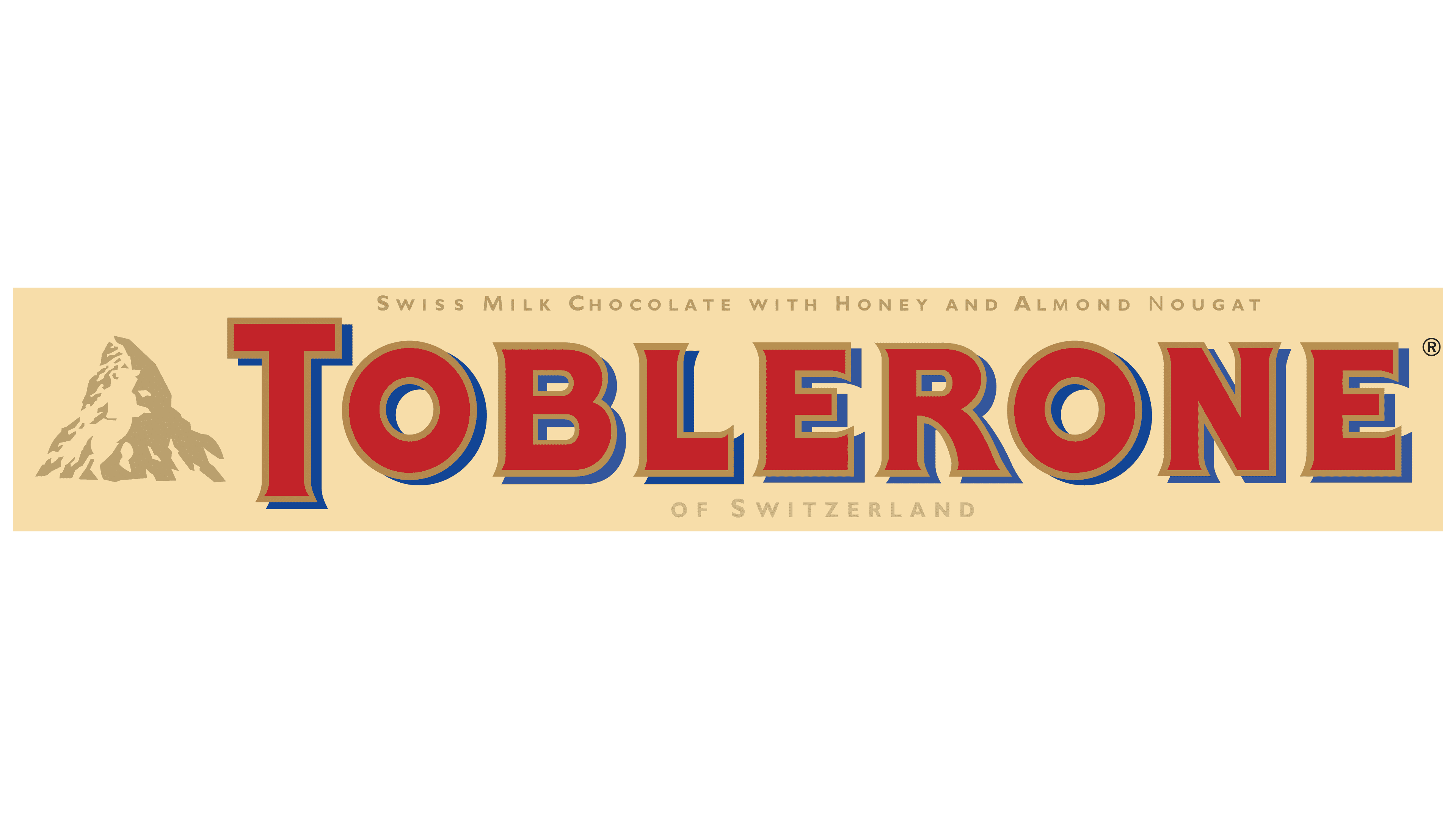
The triangular chocolate bar’s packaging features its logo: the snow-covered peak of the Matterhorn and the red inscription “TOBLERONE.” The name comes from the surname Tobler and the Italian word “torrone,” a treat made from roasted nuts, egg whites, sugar, and honey. A similar almond nougat is found in Toblerone candies. Mondelez International Inc. retains the rights to the brand and visual style.
What is Toblerone?
It is a popular Swiss chocolate consisting of interconnected pyramids. Besides the classic varieties, there are coconut, almond, and honey bars, individually wrapped pieces, and flat chocolate bars.
1908 – 1999
![]()
Toblerone has always been a chocolate recognized by its shape, and the brand’s advertising posters are recognized for their brightness and visual ideas. The brand poster features a mountain whose outline resembles the Matterhorn in Switzerland. Its silhouette matches the shape of an opened Toblerone chocolate bar. This creates a vivid, unusual play of associations, combining the mountain peak and the triangular chocolate pieces into a single image.
The bar is partially unwrapped and packaged in beige. The triangular segments are deliberately emphasized with light and shadow, making the chocolate appear three-dimensional and textured. Each piece looks realistic and appetizing.
At the center of the poster is the word TOBLERONE. The brand name is set in a large, unconventional typeface with Art Deco elements. The letters are heavy, geometric, and slightly curved. A light inner outline and a dark outer shadow enhance their rich orange-red color. This creates the effect of the lettering rising above the surface, emphasizing the brand’s premium character.
The background conveys the atmosphere of the Alps at night. The mountains are shown mainly in blue and white tones, contrasting with the deep night sky.
The packaging colors follow the familiar brand palette. It features a warm beige with red and dark brown text. The color scheme is kept soft, highlighting the sense of comfort and rich flavor for which Toblerone is known.
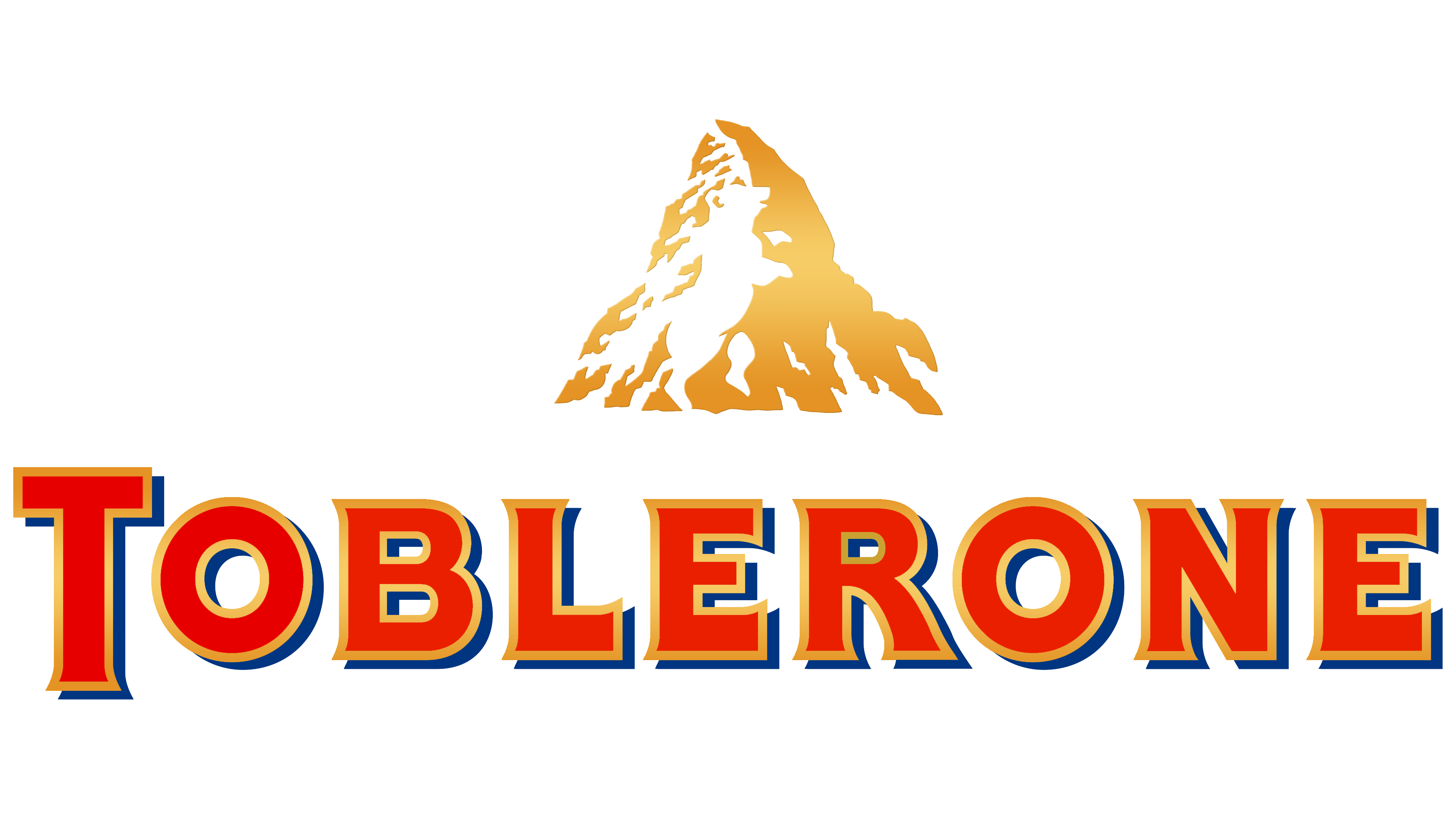
1999 – 2022
![]()
When Toblerone updated its logo, the brand moved away from the familiar smooth letterforms and focused on sharp lines and volume. The word TOBLERONE is now presented in straight, even glyphs with pointed ends instead of traditional serifs. The first letter T is emphasized by size, extending above and below the baseline and becoming a separate accent.
The text is red, with a thin yellow outline along the contours, and a wide blue shadow on the right. The letters gained volume and appear bold and massive.
The logo is complemented by a yellow mountain silhouette resembling the Matterhorn’s profile. The brand went beyond the obvious, subtly embedding the image of a bear standing on its hind legs in the mountain’s negative space. The animal is clearly visible through its leg and head outlines and its pose. The bear references the city of Bern, the birthplace of Toblerone, strengthening the brand’s historical connection to Switzerland.
The mountain silhouette contrasts with the bright wordmark, creating a harmonious visual balance. In this way, Toblerone emphasizes its roots and history, relying on symbols that are familiar to anyone who knows its chocolate.
2021 – today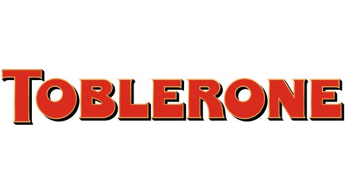
The Toblerone logo underwent a minimalist change in 2021. The company entered a new stage in its brand identity, abandoning the Matterhorn visual symbol. The reason was Swiss legislation that allows national symbols to appear only on products of local origin containing at least 80 percent Swiss ingredients. The entire chocolate production process was moved to Slovakia, and these requirements were no longer met.
The updated logo became text only. It is now the brand name written in uppercase letters on a single line. At first glance, the letters seem unchanged, but small differences are present. The lines gained subtle breaks and slight angles, giving the wordmark a more severe appearance.
The Tobler typeface, created by the Bulletproof agency, retained its previous mass and uniform stroke thickness. The outline of each character is emphasized with a double line. The inner outline is thin and yellow, while the outer outline is black, wider, and slightly offset. Because of this detail, the lettering appears three-dimensional and high-contrast.
The color became calmer. Instead of a saturated red, a muted brick shade is now used. This color change did not affect overall brand recognition. The brand remains recognizable, and the logo continues to express its style and character.
Font and Colors
The confectionery factory’s trademark contains its name and a graphical element: the white-yellow peak of the Pennine Alps. In most cases, the word appears to the left of the image, but there’s also a horizontal version in which the inscription is reduced and placed below the image. This variant is found on the sides of the packaging.
Everything in Toblerone has a hidden meaning, from the bar’s appearance to its emblem and the symbols encrypted within. The most important element of the brand’s concept is the triangle, since the chocolate is cut into precisely this shape. As far as we know, the peak of the Matterhorn looks like a four-sided pyramid. It’s depicted on the logo and occupies much of the packaging.
If you look closely, you can see a white silhouette of a bear on the snow. It stands on its hind legs, its head raised as if trying to climb the mountain. This image was not accidental; designers intentionally used it to emphasize Toblerone’s connection to its native region.
Bern is the factory where the chocolate bars with almond nougat were first produced. The Swiss capital is known as the City of Bears. Historically, even its coat of arms resembles a heraldic shield featuring a bear.
The font for the word “TOBLERONE” was specially developed for Jean Tobler. It vaguely resembles Memo Medium or Serif Gothic Black but is not identical. The emblem’s palette includes blue (#001e62), red (#da291c), white, and gold (#8c714c). The inscription’s color palette is predominantly red, with a small amount of blue and gold.