 Traxxas Logo PNG
The Traxxas logo is dynamic and expressive, designed to evoke a sense of speed, which is crucial for radio-controlled devices. The emblem conveys a drive for progress, presenting the text as a unified, indivisible, and balanced structure.
Traxxas began in 1986 in Plano, Texas, when RC enthusiast Jim Jenkins founded the company to build durable, affordable radio-controlled vehicles. Its first model, the 1/10 scale TRX-1, was a four-wheel-drive electric car. In 1987, Traxxas released the Cat, a lower-cost model for beginners, and in 1989, it entered the nitro market with the Nitro Hawk.
The early 1990s moved the brand toward stronger performance. The Sledgehammer appeared in 1992 as a 1/10 scale four-wheel-drive monster truck built for speed and durability. In 1994, Traxxas introduced the Top Qualifier radio system, giving drivers better control and reliability than many standard systems of the period.
The T-Maxx, launched in 1999, became one of the company’s best-known models by combining nitro power, monster-truck strength, speed, and wide customization options. In 2001, Traxxas added the electric E-Maxx. The Slash short-course truck arrived in 2003 and helped popularize short-course RC racing, followed by smartphone control via Link in 2007 and the electric E-Revo in 2008.
Traxxas expanded its range through high-speed cars, off-road trucks, boats, and learning projects. The XO-1 appeared in 2010 with speeds above 100 mph, Summit followed in 2012, and the DCB M41 Widebody boat came in 2014. Later releases included X-Maxx in 2016, the expanded X-Maxx line in 2017, Slash 4×4 Ultimate in 2018, M41 Widebody growth in 2019, telemetry tools in 2020, E-Revo Green Series in 2021, the RC STEM Program in 2022, TRX Pro Series in 2023, and Neural Link control in 2024.
Meaning and History
What is Traxxas?
The American company designs and manufactures high-performance radio-controlled (RC) vehicles. It offers a wide range of RC products, including cars, trucks, boats, and drones. The company is known for its ready-to-run (RTR) models, which come assembled and equipped with everything you need to get started, making them accessible to beginners and experienced hobbyists alike. RC cars are popular for their durability, speed, and advanced features, such as waterproof electronics, powerful motors, and sophisticated suspension systems.
Old
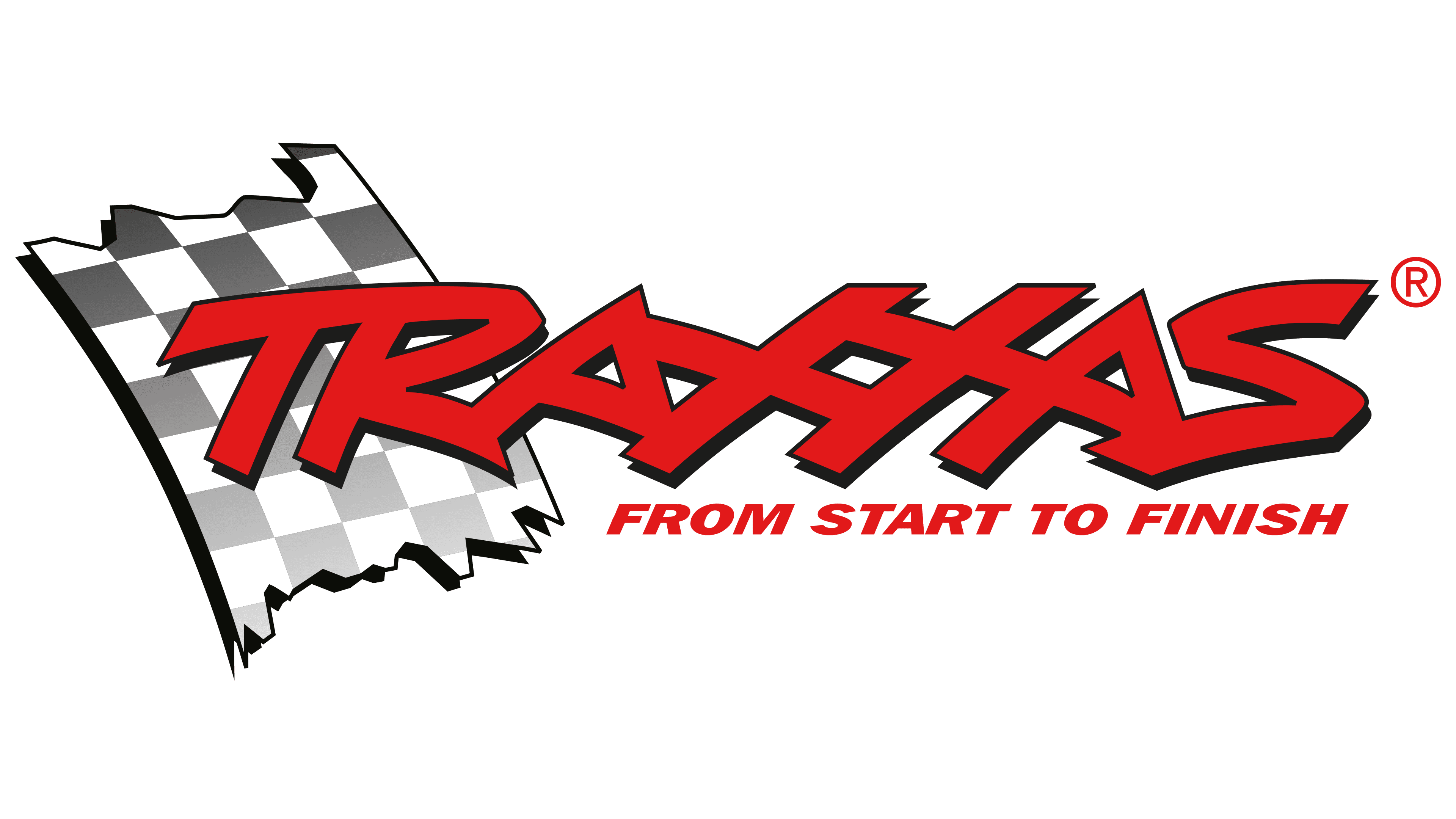
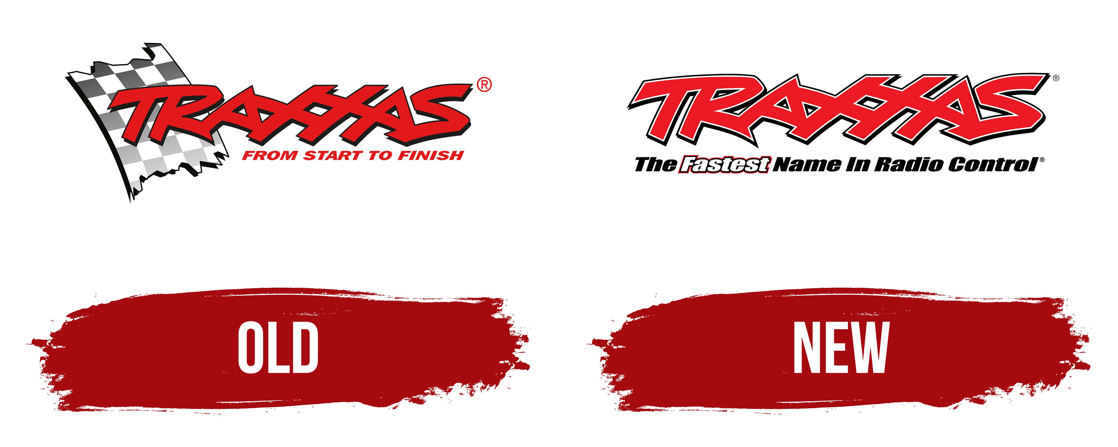
The Traxxas emblem from this period reflects speed. The company focused on the latest technological advancements, aiming to quickly introduce them to customers so they could enjoy the innovations and stay excited for a long time. As a result, the visual identity is dynamic and powerful. These qualities are conveyed through every element, from the shape to the font.
The logo consists of three parts, each appearing distinct yet interacting with the others. For example, a section of a black-and-white checkered finish flag serves as the background for the name and ties into the slogan. It is displayed diagonally, hanging from top to bottom at a slight angle. The edges are uneven, as if it’s a torn piece of fabric.
There is also a horizontal inscription, “encoded” intriguingly. The name is so intricate that it seems like a graphic experiment. The designers interconnected all the letters to achieve this effect, making the font continuous. Although the glyph boundaries are blurred, they still appear strikingly sharp. The transition is evident in the varying heights, giving the characters a Kabbalistic-symbol look. However, those familiar with the brand can easily “decode” the name.
The font chosen for the emblem is geometric. The capital letters feel innovative with straight edges, reflecting the hidden energy the company seeks to harness and control. There are no serifs; instead, there are connections and sharp diagonal cuts at the ends of the glyphs. Moreover, the letters are arranged chaotically, evoking a sense of disorder. This design is aimed at young people and those who favor active pursuits.
Beneath the name is the manufacturer’s motto: “From Start to Finish.” Unlike the upper line, this text is orderly: it’s neat, clear, and straightforward. Its expressiveness is conveyed only through the italic style. With its red color, it embodies the peak of forward motion. The font chosen for the slogan is small but also capitalized. Thanks to the absence of serifs, the text is highly legible and catches the attention of interested viewers.
The black-gray-white palette harmoniously balances the deep red, so it’s perceived as expressive rather than aggressive. The black shadows that outline each letter in the name add a striking contrast. The same dark outlines are on the torn piece of the finished flag. However, there are no outlines on the bottom line. At the same time, the red also represents leadership, as the company is considered a leading figure in radio-controlled technology.
New
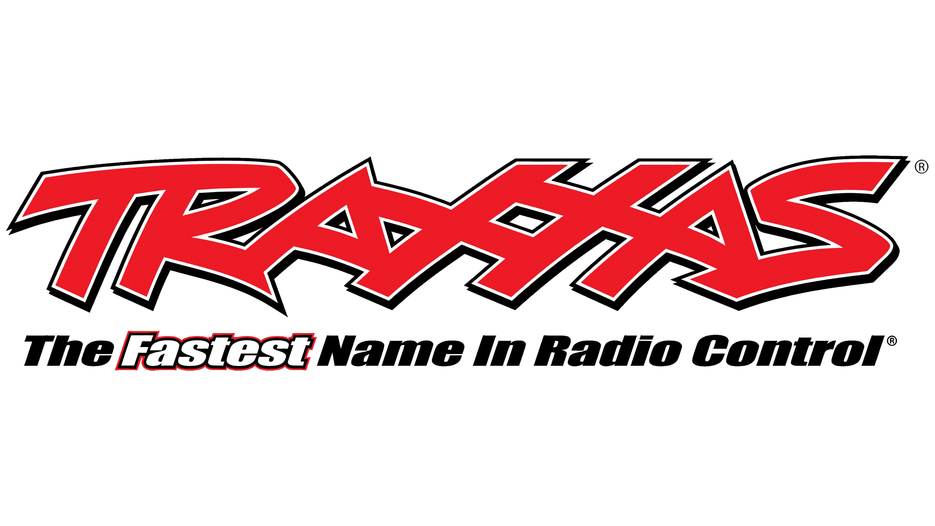
The “Traxxas” inscription, rendered in all capital letters, retains its distinctive font, characterized by broad strokes and angular shapes. Like before, there are no serifs, which makes the grotesque style appear light and relaxed despite the incredibly complex glyphs. The letters are closely connected, creating a sense of unity that is dynamic yet balanced.
The bold lines almost merge, but the text remains readable. Despite the nearly nonexistent inner and inter-letter spacing, the inscription does not look like a solid block. The double outline of the glyphs achieves this visual effect: each letter is bordered by one black and one white line. The sharp ends jutting out in various directions and the slant add to its expressiveness. The slant, in particular, injects the logo with the sense of movement essential for a manufacturer of radio-controlled cars and drones.
The letters are so unique that they bear no resemblance to traditional printed characters. They are characterized by chaotic layering, sharp height variations, abrupt transitions, zigzag strokes, and pointed ends. The linkage between the two adjacent “X” s is of particular interest, forming a grid-like structure tilted to the right. Overall, the slant is present throughout the design, distinct in some areas, subtle in others, symbolizing a powerful surge forward.
The lower line is a stark contrast to the upper one. It features the slogan “The Fastest Name In Radio Control,” reaffirming the company’s reputation as a leader in the industry. The motto is written in small type, with neat, extra-bold letters. The first letter of each word is capitalized, while the rest are lowercase. This demonstrates the brand’s attention to detail and responsibility. It aims to show that it adheres to the rules precisely, assuring customers of the quality and reliability of its products.
The word “Fastest” is intentionally highlighted. It’s white, outlined by a thin red line that emphasizes the product’s key attribute: speed. The emblem’s bright red color energizes it, while the black-and-white outline enhances the clarity of the text, allowing it to be placed on any background. This color scheme embodies dynamism and power, reflects energy, demonstrates the value of innovation, and shows the company’s drive to move forward.