The emblem seems hidden among the green leaves and the ripe fruits from which the company’s juices are made. The Tropicana logo is full of naturalness and freshness. Indicates that the product is obtained from freshly harvested raw materials and delivered immediately to customers.
Tropicana: Brand overview
| Founded: | 1947 |
| Founder: | Anthony T. Rossi |
| Headquarters: | Chicago, Illinois, United States |
| Website: | tropicana.com |
Meaning and History
When Anthony T. Rossi was just a young man who came to the U.S. from Italy, he tried several business areas, settling on making gift boxes of fresh fruit. He shaped them and sold them through New York’s Macy’s and Gimbels stores. The boxes mostly included citrus fruits, which made up most of Florida’s agricultural income.
After moving to Palmetto, the enterprising Rossi concurrently began producing jars filled with fruit slices for sweet salads. This event dates back to 1947. Rising in business, he moved to a larger community and changed the name of his company Manatee River Packing, to Fruit Industries. That’s when he added fresh frozen concentrated juices to his product line.
To expand his citrus beverage business, Anthony T. Rossi bought the company Grapefruit Canning in 1952. Then he gave up making fruit kits because orange juice was bringing him a lot of income. Two years later, he introduced the technology of instant pasteurization, which allowed to preserve the natural taste of fruits in the packaged drink. He named his juice Tropicana Pure Premium and made it the flagship line.
At the same time, the entrepreneur paid a lot of attention to his company’s identity. Especially for the fresh orange juice, he ordered a label with a girl on it. It was a native with citrus fruits on her head and dressed like a skirt made of palm leaves. She was named Tropic-Ana. But gradually, she became less printed on packages, and in the 1980s, she discontinued altogether.
Since the trademark juice from Florida citrus fruits was a success among customers, the owner decided to rename the company and give it a name in tune with the flagship drink. As a result, the Tropicana Products Corporation was born in 1957. It has seven basic marks of individual identity, and two more logos remain unknown (the earliest).
What is Tropicana?
Tropicana is an American fruit beverage brand that originated in 1947. It was founded in Bradenton, Florida, by Anthony T. Rossi, an entrepreneur from Italy. Rossi. Until recently, this company was a subsidiary of PepsiCo, but in 2021 it moved to the structure of the French corporation PAI Partners. The brand is headquartered in Chicago, Illinois.
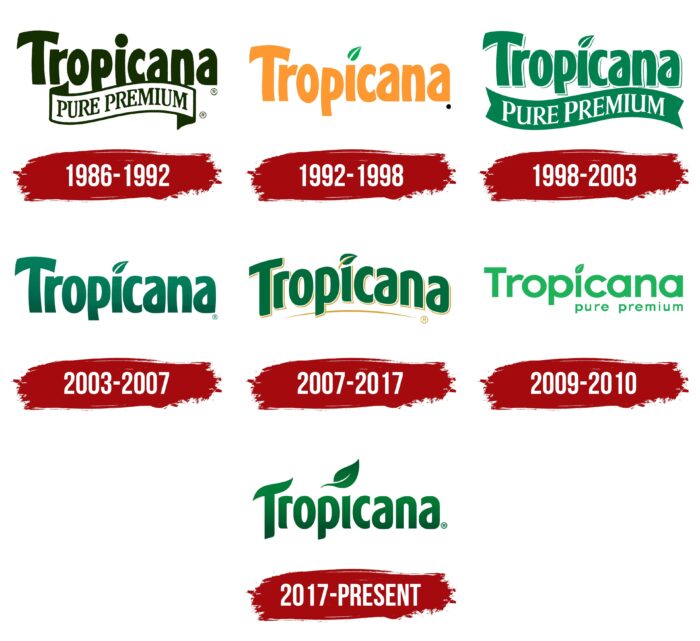
1986 – 1992
The logo for pasteurized fresh juice consisted of its name placed in two rows. The word “Tropicana” occupied the top. Its letters were capitalized, bold, large, and sans serif. The lower row contained the word “Pure Premium,” arranged on a wide curved ribbon and typed in fine antiqua. The characters in the first row were also slightly bent. They had white as a background: the green elements looked distinct and austere on it.
1992 – 1998
The main adjustment in the emblem was a change of color. Designers repainted the letters orange to remind them of oranges, from which juice is produced. Green was the leaf that took the place of the dot over the “i.” It was arranged diagonally, which, according to the creators, resembled a beverage tube (along with the bottom straight element).
1998 – 2003
This logo was light green. Next to each letter was a thin stroke of the same color, making the inscription seem three-dimensional. The developers brought back the lower ribbon with bifurcated ends. It had the phrase “Pure Premium” in white font. Its style was retained, as well as the orange tree leaf.
2003 – 2007
A dark green gradient dominated this version. The side strokes of the juice producer’s name were removed, so the lettering turned out to be two-dimensional. In addition, the designers removed the ribbon.
2007 – 2017
The lettering in the Tropicana emblem was arched and highlighted with a thin gold line. Similar lines were placed around each letter (like a frame) and at the leaf (as a cutter). The color was retained as in the previous version, but the gradient disappeared. The typeface received roundings, which were visible in “a,” “r,” and “n.” The designers aligned the feet of the letters.
2009 – 2010
Tropicana used an experimental logo for some time: it had a different color and font. The lettuce letters had a simple shape – flat, with a rounded top and no serifs. At the bottom, small lower case letters said “pure premium.” This design was canceled due to protests from customers, who did not accept the new version and demanded the return of the familiar emblem.
2017 – today
Currently, the logo with smooth lettering, which is dominated by soft accents, harmonious lines, and light transitions in height, is in fashion. Specifically, it is an improved version of the 2007-2017 emblem, but in a horizontal rather than arched form. They have an identical style, except for the first letter: the upper element of the “T” now looks like a curve that repeats the shape of the leaf above the “i.”
Font and Colors
The most unfortunate period in the history of Tropicana logos was the scandalous version proposed by the Arnell Group agency in 2009. In just a few months of its use, the juice producer lost 20% of its sales. So sharp were the protests of customers dissatisfied with the redesign. They wanted to see the familiar style. Subsequently, the company’s management brought it back, tweaking it to match modern trends, leaving it well recognizable.
A distinctive feature of this brand is the bold font, in which the letters are slightly curved. The smooth arc-shaped lines without serifs indicate that this is a Hobo D. At the same time, they resemble two other types of typefaces: the Linotype Spitz Pro Black and the Kandira Extra Black.
The color scheme is dominated by a green-orange palette that reflects the brand’s concept: natural orange juice taken from nature itself. This combination evokes confidence in the product and a sense of reliability.
Tropicana color codes
| La Salle Green | Hex color: | #007d39 |
|---|---|---|
| RGB: | 0 125 56 | |
| CMYK: | 100 0 55 51 | |
| Pantone: | PMS 355 C |
| Evergreen | Hex color: | #025029 |
|---|---|---|
| RGB: | 2 80 41 | |
| CMYK: | 987 0 49 69 | |
| Pantone: | PMS 7727 C |
