


 University of Rochester Logo PNG
The University of Rochester’s logo has had a distinctive appearance over the years, with a unique individual charm. The modern version is no less significant than its predecessors. It also carries deep meaning, emphasizing the prestige of the private institution, its high status, and the fundamental knowledge represented across various fields and disciplines. Today, the University of Rochester employs more than 3,000 faculty members who uphold the organization’s traditions, are dedicated to their calling, and help students surpass themselves by laying a solid foundation in theoretical and practical knowledge.
The stylish and authentic logo stands out due to its detailed elements, which are memorable and enhance its recognizability. The logo is always noticeable among the identities of other educational and research institutions. It is unmistakable, as the logo’s symbols harmoniously blend colors, and the combination of dynamism and stability creates a unique visual image.
The University of Rochester was founded in 1850, when Baptist leaders established a new college in Rochester, New York, to serve a growing city and its educational needs. It opened on November 1 with only 60 students, and classes were first held in the United States Hotel. Martin Brewer Anderson became the first president and led the institution until 1888, guiding it through early financial pressure with help from local donors, including John Wilder.
In 1861, the university moved to a campus on Prince Street, giving it room for new academic work. A women’s college was created in 1877 and later joined the university. In 1900, the Eastman School of Music was established with support from George Eastman, founder of Kodak. In 1925, his major gift helped start construction of the River Campus on the Genesee River.
The 20th century brought wider research activity. The Medical Center opened in 1930 and grew into a major part of the university. After World War II, the GI Bill increased enrollment, while wartime research shaped several academic fields. In 1955, the Laboratory for Laser Energetics was founded and later became one of the key centers for laser technology.
From the 1970s onward, the university invested in visual science, medicine, optics, humanities, arts, laboratories, housing, and digital media. After 2000, new projects included the Meliora Challenge, clinical research buildings, the Center for Innovation and Entrepreneurship, the Data Science Institute, Golisano Children’s Hospital, Wegmans Hall, AI healthcare research, and cancer immunotherapy work. The Rochester Yellowjackets represent the university in NCAA Division III sports.
Meaning and History
What is University of Rochester?
A private research university is known for its emphasis on research. It offers undergraduate and graduate programs in several disciplines, including business, engineering, medicine, the arts, and the sciences. The university is home to the esteemed Eastman School of Music, which is often ranked among the top music programs in the country. Rochester’s unique open curriculum gives students much freedom to create academic paths. The institution operates the Rochester Medical Center, an important center for patient care and medical research. Rochester’s small, riverside campus offers cutting-edge resources for learning and research in a friendly community atmosphere.
2007 – today
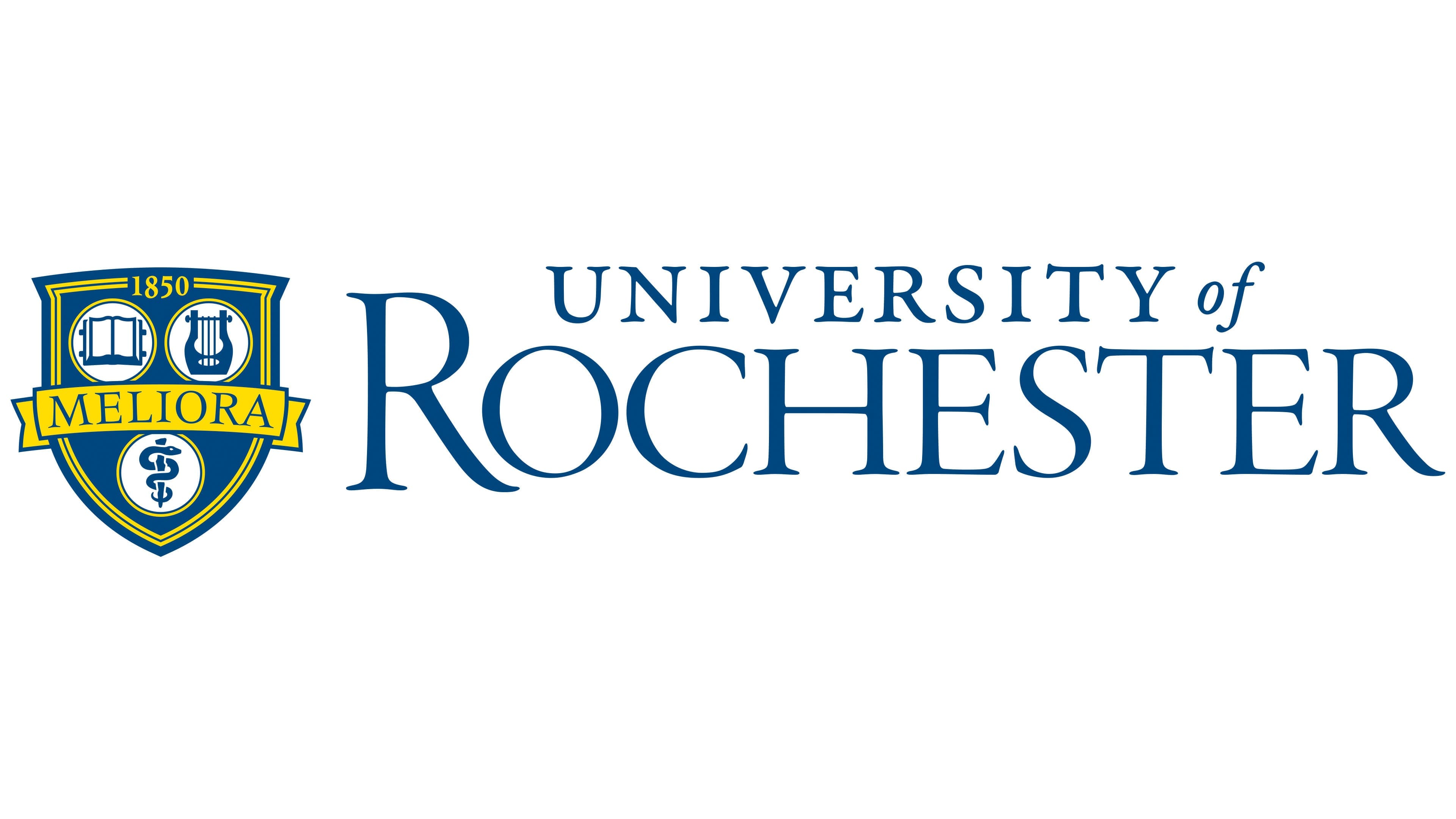
The University of Rochester’s logo is based on its heraldic seal, emphasizing continuity and identity. This is fitting, as the seal and logo should convey a unified idea and shared meaning.
The original shield with a double outline and symbolic images is placed to the left of the university’s name. It represents a collection of symbols carrying key significance. At the shield’s center is the motto, a single word, “Meliora,” proclaiming: “Ever Better!” Blue letters on a beautiful yellow ribbon shine like the sun, lighting the way for those seeking truth. This word indicates the challenging path where the right choices must be made.
At the top of the shield, the founding year, 1850, splits the outline. The color of the numbers matches the outline’s shade, giving the blue background a mystical beauty. The shield is visually divided into three separate sections. Along the horizontal line, in light circles, are a book (on the left) and a harp (on the right). In the lower section of the shield, also in a circle, is a caduceus, the messenger’s staff.
The university’s name is highlighted in blue against a white background. Two font types are used, creating additional emphasis on the identity. The word “University” is placed above “Rochester” and written in elegant capital letters. Italics are used for the preposition “of,” which is aligned with the word “University.”
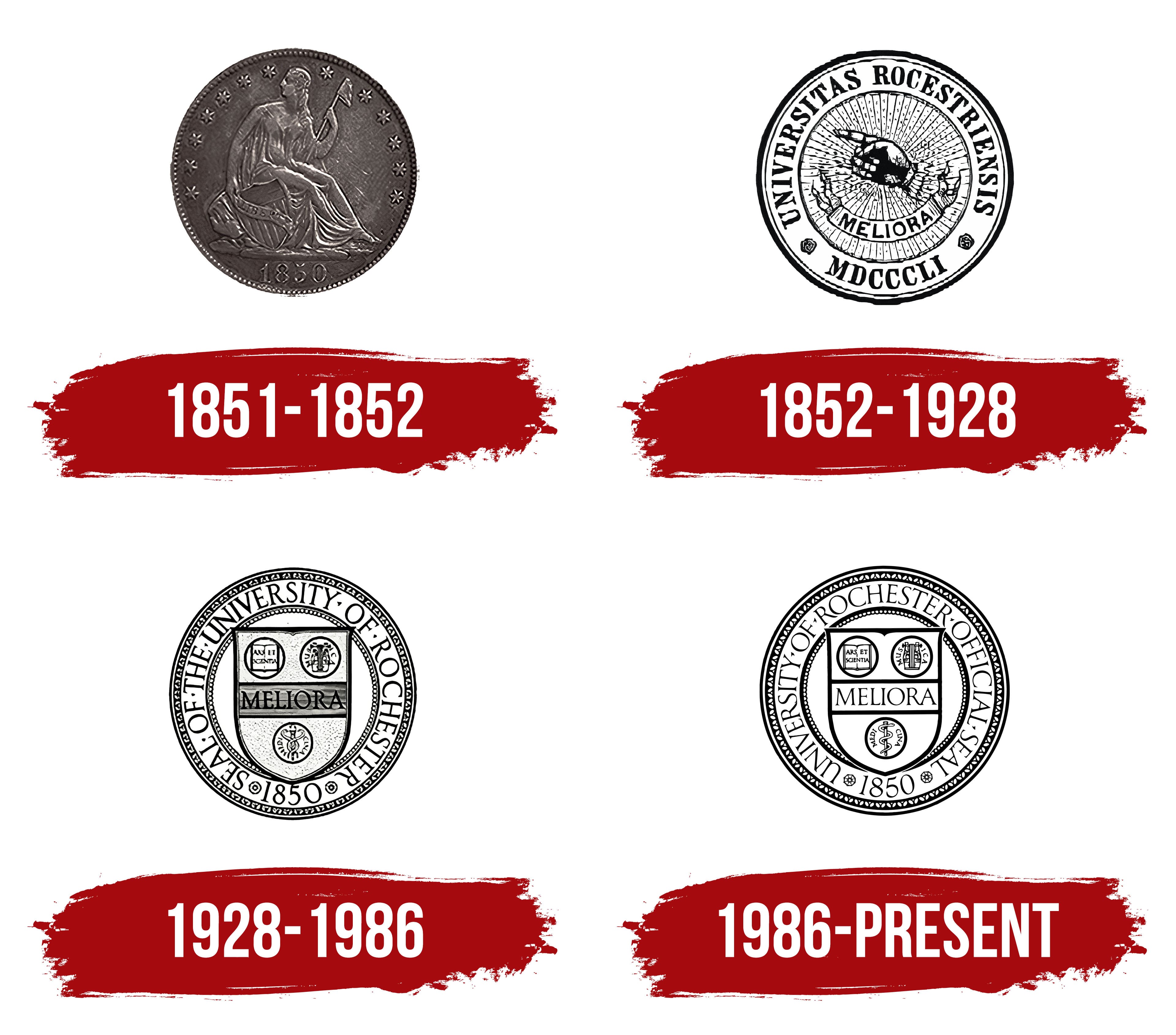
The University of Rochester seal has been modified four times, with each new version gaining unique features and an original appearance. The latest variation is considered the most distinctive, combining traditional symbols with innovative elements that have significantly transformed the modern seal.
The Seal
1851 – 1852
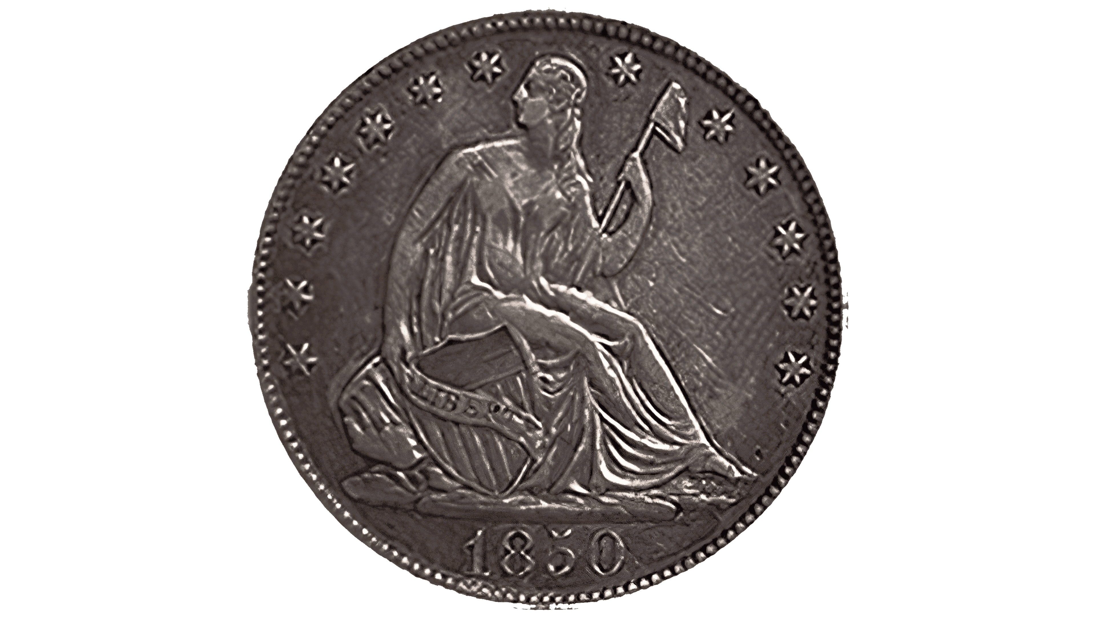
The first seal of the University of Rochester was introduced in 1851 and had a traditional round shape. It appeared original, featuring a symbol of liberty in the center, which had already been used on one of the circulating currency notes. The image was sharp and realistic: a figure holding a flag that indicated the university’s connection to a specific territory.
Small stars adorned the seal in a circular pattern, evenly spaced. The year of the private American institution’s founding, 1850, was displayed at the bottom of the seal.
1852 – 1928
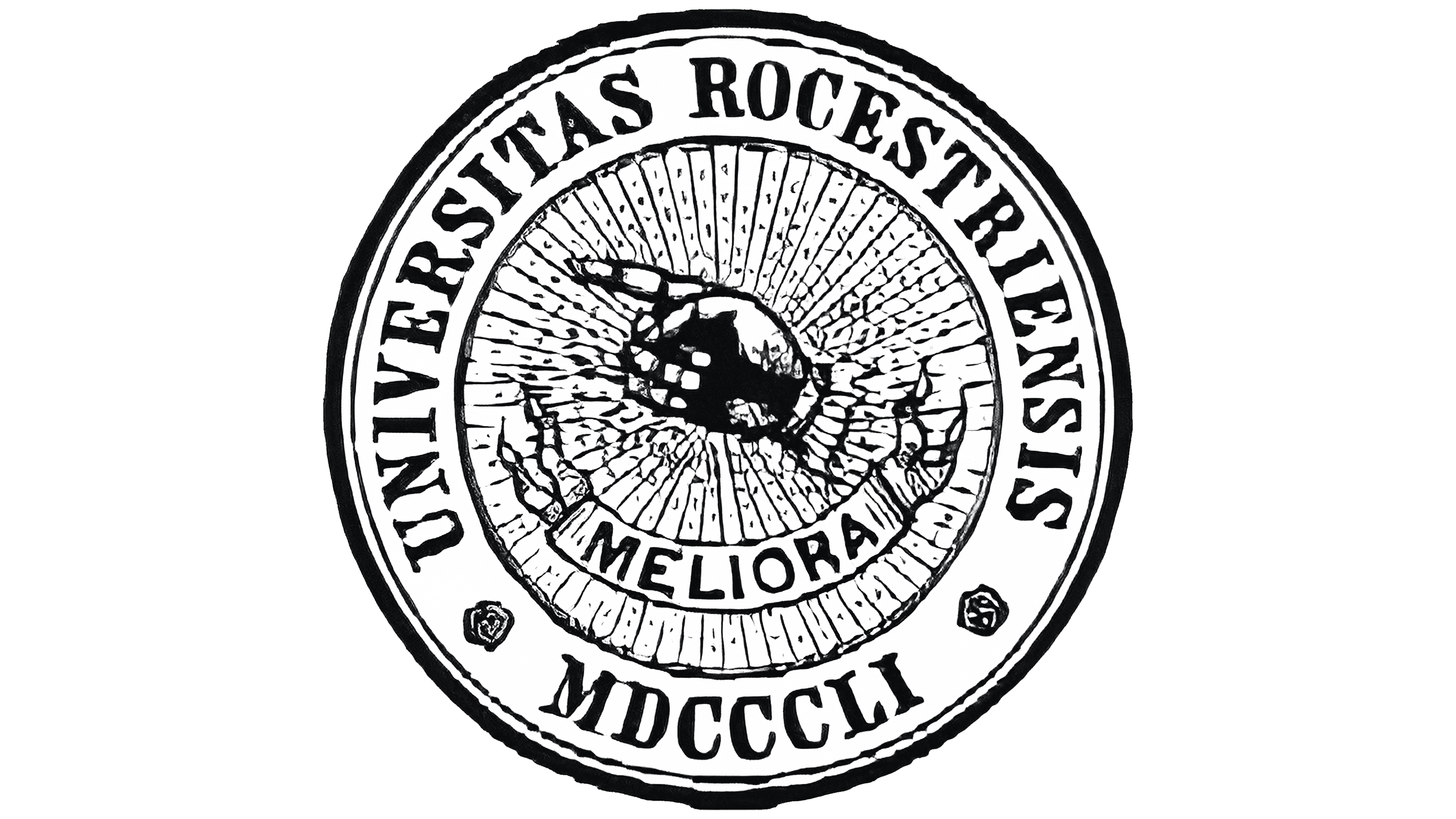
In its new transformation, the seal took on a completely different appearance. It became richer in detail, forming the foundation of its content. The textual element was written in Latin with bold letters. Along the upper edge of the seal, the text was surrounded by two black outlines. The lettering was black on a white background, which served as a base for all the seal elements. Around the circle was the name of the educational institution.
At the center of the seal was a realistic depiction of an upward-pointing hand with an index finger raised. The meaning of this gesture remains a mystery to this day. It could have symbolized a quest for truth or emphasized the importance of key moments. For the first time, the motto “Meliora” appeared on the seal, set against a ribbon that drew attention harmoniously. The motto underscored the symbolism that knowledge is the foundation of existence.
1928 – 1986
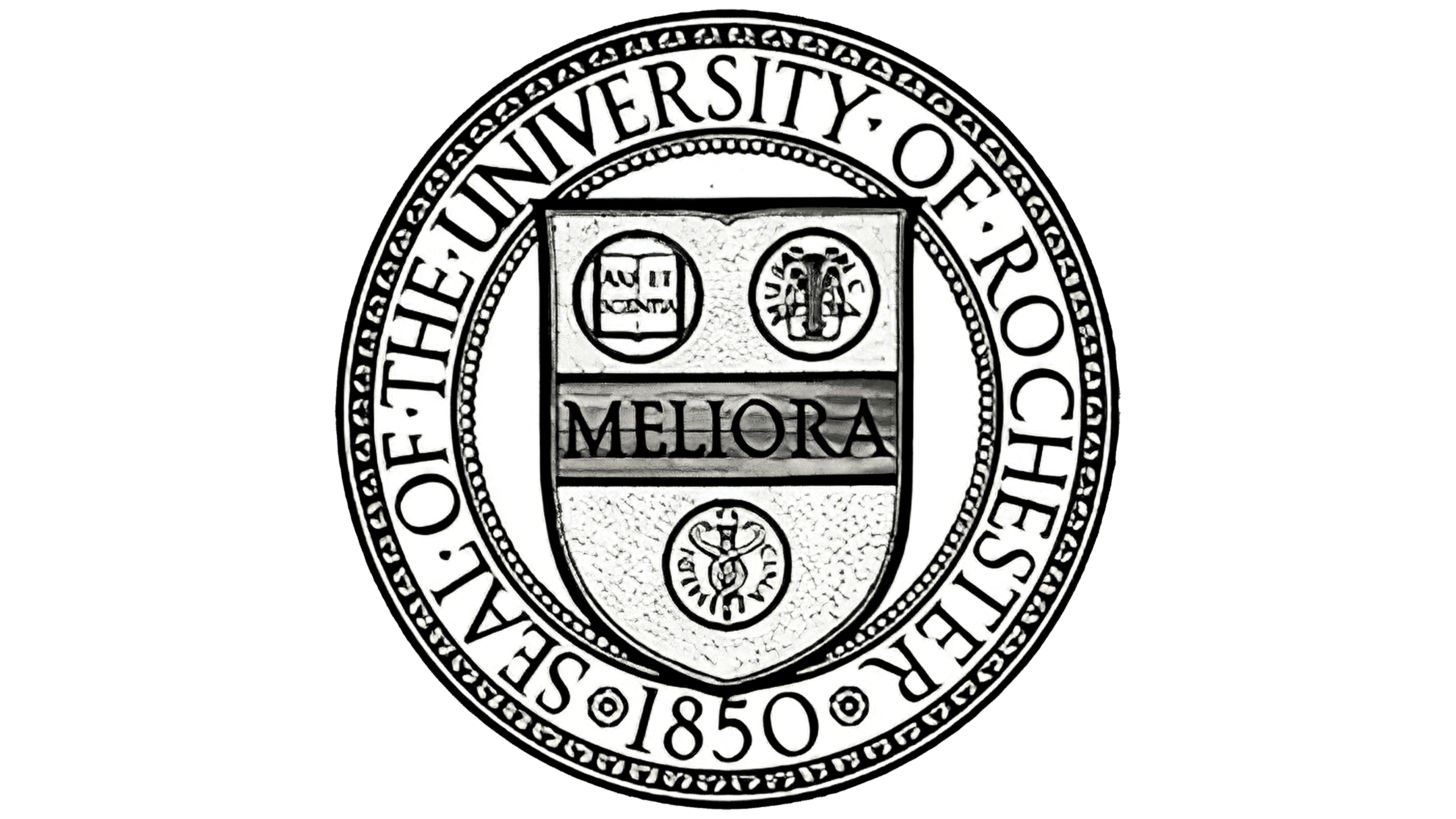
In 1928, a seal was introduced that would serve as the foundation for various versions over the coming decades. Compared to its predecessors, this seal is the most informative, conveying the key principles of the university’s mission. Its content emphasizes the importance of knowledge and includes symbols representing the expansion of academic programs and fields of study. Including a book, a harp, and a symbol of medicine highlights the diversity of the disciplines taught.
The seal contains five outlines, each drawing attention to specific images. At the center is a shield, the main element of the seal. Elegantly inscribed in its center is “Meliora,” a motto that would become integral to future seals and the university’s logo. The shield and the other images create a harmonious and balanced composition, emphasizing the university’s foundation and stability.
1986 – today
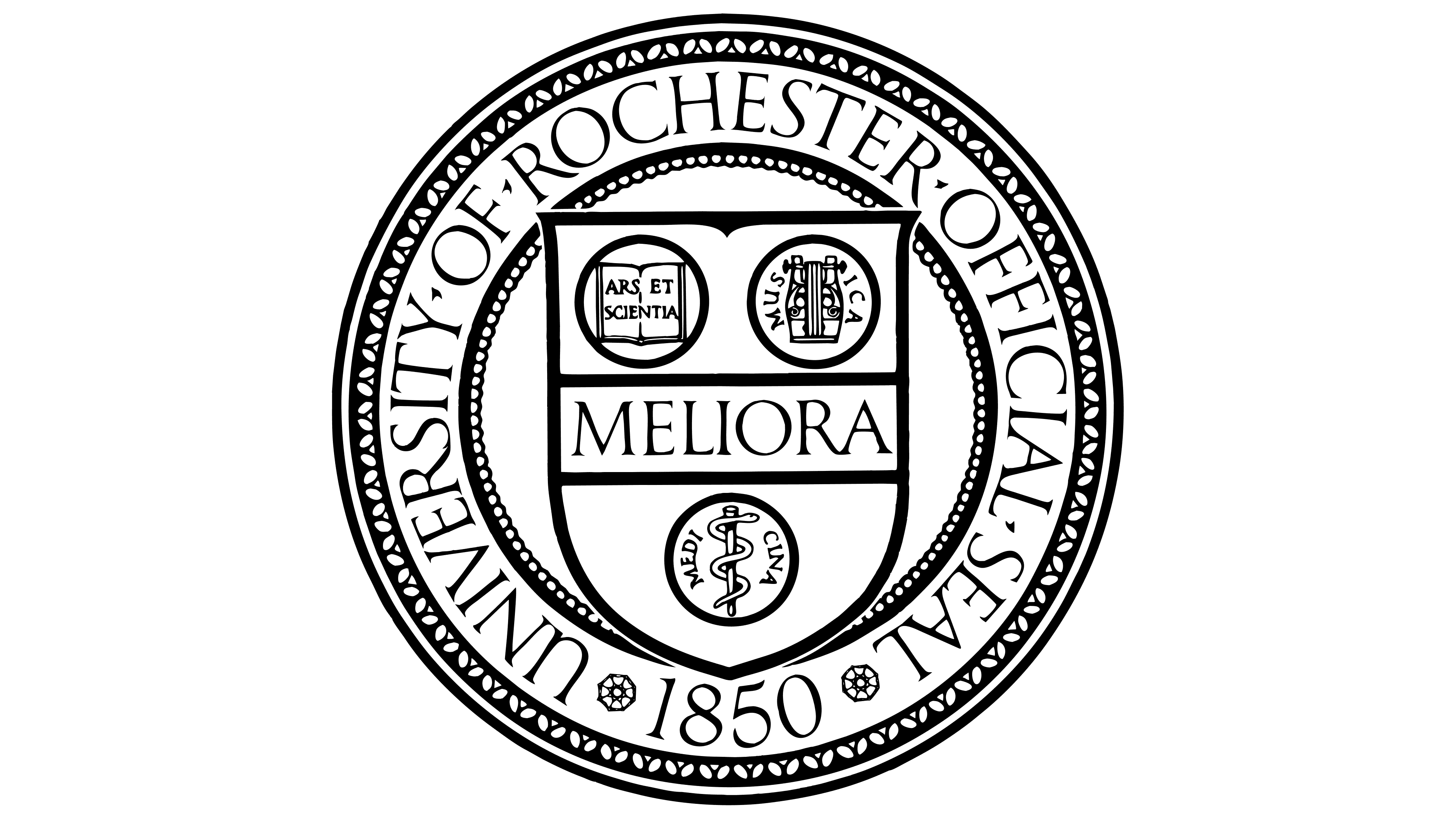
The seal introduced in 1986 remains relevant today. It reflects the university’s core principles and stands out for its original graphic design. At the same time, it is more concise than previous versions.
The seal is characterized by the simplicity of its presentation, expressed through textual elements and illustrations. The design features five different framed outlines, with both the outer and inner contours adorned with ornamental elements. The seal’s multilayered and multifaceted nature is its main strength.
The textual elements include the university’s name and motto, rendered in graphic, superscript letters. At the center of the seal, the shield is prominently featured, incorporating symbolic images representing various fields of knowledge. The book, harp, and symbol of medicine, which have been consistent elements in the university’s past two seals, occupy a central place on the shield, emphasizing their importance and the continuity of tradition.