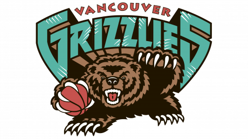
The Vancouver Grizzlies logo is fierce and intimidating. The emblem creates an image of a difficult team to compete with. The players defend the hoop like an enraged beast, making their territory one to avoid.
Vancouver Grizzlies: Brand overview
The Vancouver Grizzlies roared into existence in 1995, part of the NBA’s bold expansion into Canada alongside the Toronto Raptors. Arthur Griffiths, already the owner of the Vancouver Canucks, spearheaded this venture.
The team’s debut NBA season in 1995-1996, under the guidance of head coach Brian Winters, began with high hopes. The expansion draft brought in players like Greg Anthony, Blue Edwards, and Bryant “Big Country” Reeves, the latter becoming a beloved figure for the team. Their inaugural game saw a victory against the Portland Trail Blazers, finishing 92-80, though the season ended with a challenging 15-67 record.
The following seasons brought continuous struggles. The team drafted Antonio Daniels fourth overall in 1997 and Mike Bibby second overall in 1998, with Bibby emerging as a key player. The 1999 draft brought controversy when Steve Francis, picked second overall, refused to join the team, leading to a trade to the Houston Rockets and damaging the franchise’s reputation.
Financial pressures led Arthur Griffiths to sell the team to Michael Heisley in 2000. After the 2000-2001 season concluded with a 23-59 record, Heisley announced the team’s relocation plans. In March 2001, the NBA approved the move to Memphis, Tennessee.
During their six seasons in Vancouver, the team never reached the playoffs, ending with a cumulative record of 101-359. They left an indelible mark on Vancouver’s basketball culture despite their struggles.
Key players during this period included Bryant Reeves, Shareef Abdur-Rahim, Mike Bibby, and Antonio Daniels. The team’s teal, bronze, and red colors became iconic, and their roaring grizzly bear logo remains a collector’s favorite.
The Grizzlies played at General Motors Place (now Rogers Arena), shared with the Vancouver Canucks. Despite their on-court difficulties, the team had a dedicated fan base and often drew strong attendance.
The franchise faced challenges in attracting and retaining star players, with Vancouver’s geographic location, high Canadian taxes, and history of losses making the team less appealing.
After the move to Memphis, the team kept the Grizzlies name but adopted new colors: navy blue, light blue, and gold. The team succeeded in Memphis, making regular playoff appearances throughout the 2010s.
Meaning and History
What is Vancouver Grizzlies?
It was a former professional basketball team that represented Vancouver, Canada, in the National Basketball Association (NBA). Home games were played at General Motors Place. The team was founded as part of the NBA’s expansion and symbolized the cultural and sports development of the region. The team later relocated to Memphis, where it continues to exist as the Memphis Grizzlies.
1995 – 2001
The team’s emblem reflects important aspects of the region’s culture and nature. The grizzly bear, a symbol of Vancouver, highlights the team’s connection to local wildlife and nature. Introducing the bear image and using a granite font showcases the team’s strength and resilience. This logo was created to inspire players and fans, emphasizing the team’s determination and fighting spirit, giving their opponents no chance of victory.
The Vancouver Grizzlies logo presents a powerful image, combining the team name and the depiction of a grizzly bear. The team name is written in large letters, seemingly carved out of granite. Behind this strong and enduring element is a bear with bared teeth and extended claws holding a basketball.
Every detail of the logo symbolizes strength, fury, and wildness. The massive letters, appearing to be chiseled from stone, represent the team’s unyielding and steadfast nature. The claw marks on the letters emphasize the grizzly’s wild nature and power. The bear, chosen as the team’s symbol, is the most common animal in Vancouver and embodies immense strength, courage, and ferocity.
The emblem expresses the team’s readiness to fight and drive for victory. The bear with bared teeth and extended claws holding a basketball demonstrates determination and persistence in the game. The basketball in the bear’s paws ties the logo to the sport, making it easily recognizable among basketball fans.
The logo’s font is massive and rigid, creating an impression of strength and unwavering determination. The granite letters look as if carved from stone, enhancing the image of solidity and stability. The bear is depicted in a dynamic pose, highlighting the team’s aggressiveness and assertiveness.
The logo’s color scheme includes the bear’s dark brown, the bright red of its bared teeth and claws, and the green-blue letters of the team name. These colors create a contrasting and memorable image, drawing attention and emphasizing the team’s uniqueness.
