


![]() Vaseline Logo PNG
Vaseline Logo PNG
The Vaseline logo speaks to the brand’s rich history. The ability to use past developments, complementing them with modern developments. The emblem has a pleasant cosmetic consistency and the ability to rejuvenate the skin.
Vaseline began in 1859, when Robert Chesebrough visited oil fields in Pennsylvania and noticed “rod wax” used by workers on cuts and burns. He took samples to New York and spent years refining the substance.
For about 11 years, Chesebrough worked on purification, testing the product on himself to observe its healing effects. In 1870, he patented purified petroleum jelly. In 1872, it entered the market under the name Vaseline and was sold in small glass jars.
Early sales were slow, so Chesebrough used direct distribution, giving free samples through traveling agents. The approach increased demand, and sales reportedly reached one jar per minute at peak.
In 1880, Chesebrough Manufacturing Company was formed to manage production and distribution. By the end of the 19th century, Vaseline was sold in Europe, Asia, and Latin America, supported by active promotion.
In 1911, the company was acquired by Standard Oil, linking the product to a major oil producer. After the breakup of Standard Oil, the business was reorganized as Standard Oil of New Jersey.
In 1955, Chesebrough merged with Pond’s Extract Company, forming Chesebrough-Pond’s and expanding into skincare products beyond petroleum jelly.
In 1987, the group was acquired by Unilever, which developed the brand into a broader product line, including lotions and creams. By the 1990s and 2000s, Vaseline was sold in over 60 countries. In 2011, Unilever launched the Vaseline Healing Project, linking the brand to humanitarian supply efforts.
Meaning and History
![]()
The term and logo arose immediately with the release of the unique Vaseline product. Its production began in the 70s of the last century, and, naturally, the brand’s emblem has undergone several changes since. There are seven main options in the arsenal.
What is Vaseline?
Vaseline is a skincare product line by Unilever, developed from petroleum (hydrocarbons). Chemist Robert Chesebrough invented the product. The brand also offers other cosmetic products, including deodorants, lotions, soaps, and creams. It was introduced in 1872 and was initially manufactured by Chesebrough Manufacturing Company, which merged with Pond’s in 1955. The current owner, Unilever, acquired the company in 1987.
1870 – 1872
![]()
On the labels from those years, the word “Vaseline” appeared with wide letter spacing. The signs were thin and slightly curly – particularly the “e” and “s” with curved lines. The brand name was written “Whit Petroleum Jelly.” The symbols were light and set against a dark background.
1872 – 1928
![]()
The logo received a new font, printed in uppercase with small serifs. The letters became dark and were placed on a light substrate.
1928 – 1969
![]()
The designers returned to the original version of the emblem, slightly changing the “e” shape by removing the curly bend. They also removed the serifs and placed the word “Vaseline” on a yellow-olive background in a horizontal rectangle. Added a circle with a thin border.
1969 – 2004
![]()
After expanding the assortment, a logo redesign was required to avoid visually associating the logo with just one product. Therefore, management approved the tightly spaced serif version. All signs are blue, wide, and classic in shape.
2004 – 2006
![]()
The symbols are light, smooth, and chopped, with a dark blue background.
2006 – 2018
![]()
The designers replaced the rectangle with a semi-oval with non-rounded edges. They also changed the font. The background was made blue with a light highlight below and two gray border lines.
2018 – today
![]()
The developers have improved the semi-oval by adding a gray edging around the entire perimeter and moving the light spot to the center.
Font and Colors
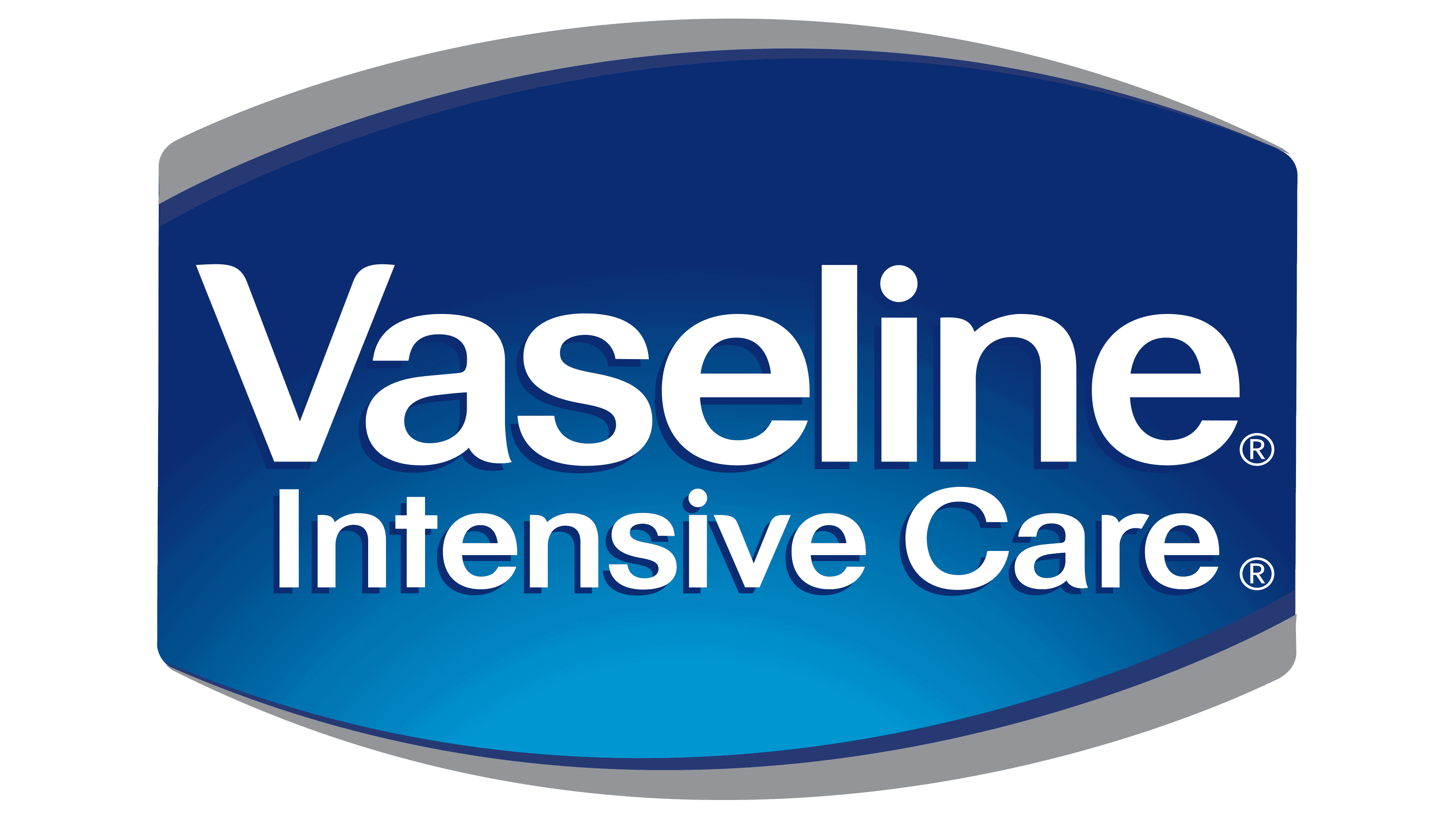
In all versions of the logo, the base element is the brand name. It has been played in several modifications. Most of the changes concerned serifs: they appeared and disappeared. In 2007, a sign with a truncated oval was approved.
The spelling of the word “Vaseline” was almost always classic: the first letter is capitalized, and the rest are lowercase. Modern typography uses a grotesque typeface from the Sans Serif series. Signature colors include white, gray, and blue in several shades.