


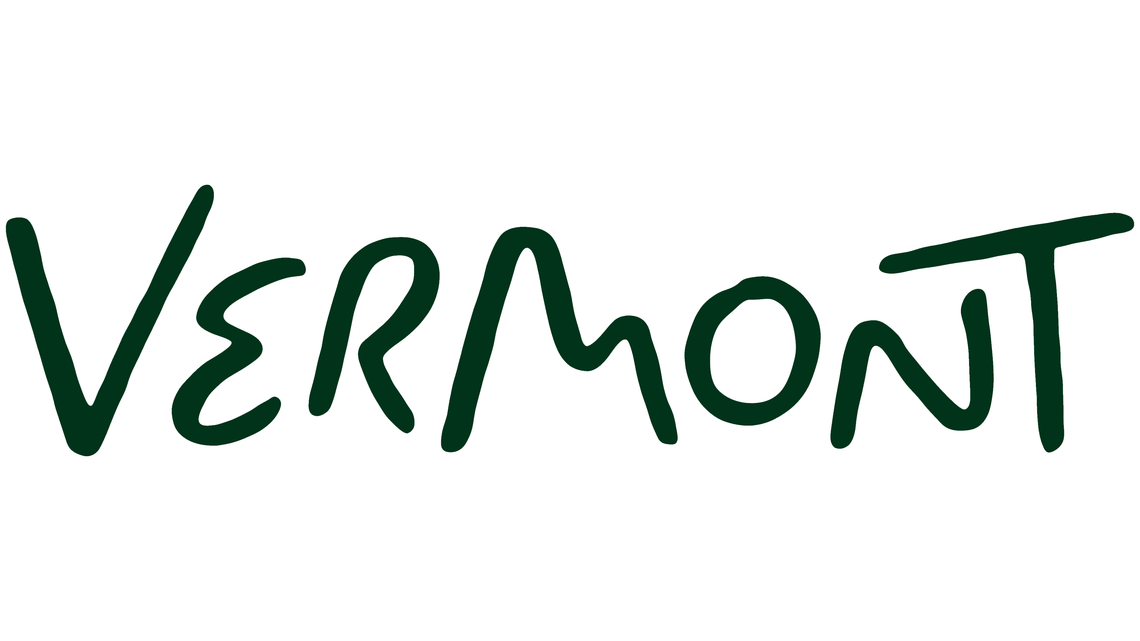
Vermont introduced its first dedicated tourism brand in summer 2026, giving travelers fresh reasons to visit. Commissioned by the state’s Department of Tourism and Marketing, DNCO created a hand-drawn Vermont wordmark that incorporates a road, hills, and the moon into its letters. The logo will appear in tourism materials, while the state government’s emblem will retain its official role.
Research prompted the redesign. Although 79% of respondents considered Vermont a pleasant place to visit, just 15% planned to go. The state ranked 30th nationally for advertising recall. Familiar images of covered bridges and fall foliage generated goodwill, but the tourism department needed to turn that interest into travel plans. It expanded Vermont’s story to include local food, crafts, art, and connections with residents.
The project took 9 months. DNCO’s team from London and New York traveled more than 400 miles through 14 towns. The designers spoke with travelers, residents, and tourism professionals and studied signs at shops, roadside businesses, and farm stands. Hand-painted lettering became the foundation for the logo, connecting it to everyday life in Vermont and the state’s craft traditions.
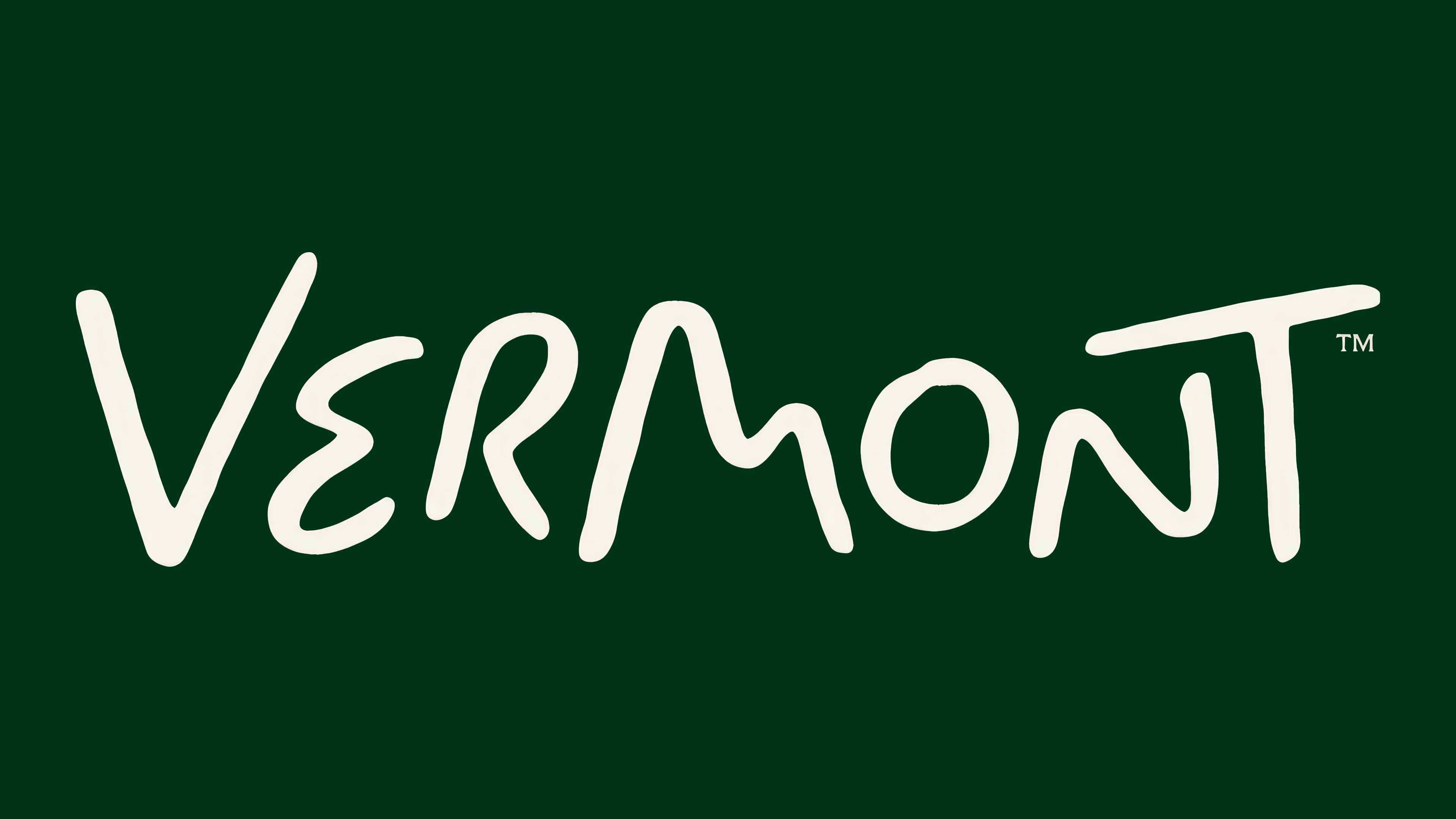
The team hand-painted the first versions of the Vermont wordmark. British lettering artist Rob Clarke then joined the project. Working with him, DNCO refined the letterforms and proportions while preserving variations in height, stroke thickness, and slightly rough edges. Rounded curves and shifting angles retain the feel of hand-painted lettering.
References to nature appear within the name. The curve of the “e” suggests a winding road, the large “m” echoes rolling hills, and the “o” represents the moon above the mountains. The remaining letters complement these forms. In early versions, the “o” sat high above a mountain and was mistaken for an “i.” The designers lowered it closer to the baseline, reserving its upward rise for animation.
The moon carries forward the Moon Over Mountains motif, previously used in tourism branding and still present in the state government’s logo. In the official emblem, a ring representing the moon and a mountain outline with brushlike edges sit above VERMONT. The name appears in uppercase serif letters with contrasting thick and thin strokes. In the tourism version, the mountains and moon become part of the lettering.
The logo is accompanied by “State of Inspiration.” The phrase plays on the two meanings of “state,” referring to both Vermont and the feeling of being inspired. It connects the destination with the traveler’s experience. DNCO developed the theme around experiences that stay with visitors after a trip, from exploring workshops and learning how local foods are made to hearing residents’ stories.
The identity’s colors change with the seasons. Spring brings shades of green, while fall introduces reds and oranges. The new wordmark appears in tourism advertising, printed materials, and the website. The team developed brand guidelines and training sessions for tourism organizations.