The VH1 logo was designed to catch viewers’ attention and connect the channel to the entertainment industry and the world of showbiz. Its modern look reflects a commitment to progress, while the symbolic elements indicate harmony between various music genres.
VH1: Brand overview
| Founded: | January 1, 1985 |
| Founder: | CBS Entertainment Group |
| Headquarters: | New York City, New York, U.S. |
| Website: | vh1.com |
VH1 was launched in 1985 as an appendage to MTV. It had a small budget, and it was not allowed to compete with the iconic music channel. It couldn’t show music videos that appealed to MTV, so it had to focus on pop music rather than rock. The approximate age of its target audience ranged from 25 to 49 years old. Later on, VH1 diversified its content, shifting the emphasis to reality shows. Programs such as RuPaul’s Drag Race, Love & Hip Hop, and Behind the Music were broadcast. The cable channel is broadcast nationwide in the U.S., with its main office located in New York.
Meaning and History
All VH1 logos have been inspired by its name, which comes from “Video Hits One.” Bob Pittman, co-founder of MTV Networks, was involved in the naming process. He wanted MTV to be called TV-1, but the team was against it because old television switches didn’t have the number 1. Bob got back at the new music channel by giving it the name VH1, which was supposed to symbolize primacy and leadership.
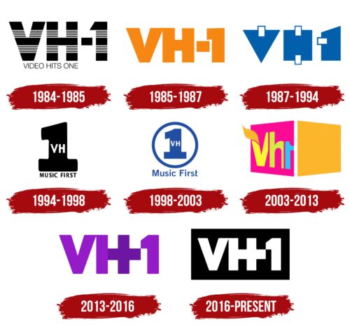
Due to its small budget, the brand’s early logos looked very simple. But as it developed, the design became more complex. In the early 1990s, the channel’s ratings fell, so it had to change its format by adding “Music First” to its name and shifting its focus to entertainment shows. Its logo acquired a more informal style, attracting a younger audience. In 2003, the network underwent another rebranding: it got rid of the phrase “Music First” and introduced a remarkably bright graphic mark with a stylized font. Compared to it, the black-and-white visual symbol of VH1 in 2016 looks very strict and restrained.
What is VH1?
VH1 is an American television channel that stands for Video Hits One. It was launched in 1985 and initially specialized only in music, as it was conceived as a version of MTV for people over 25 years old. However, over time, its content has expanded to include reality shows and other programs aimed at its target audience. The channel is controlled by BET Networks and is owned by CBS Entertainment Group.
1984 – 1985
The focus is on the black inscription “VH-1”, covered from top to bottom with horizontal white stripes. Below it is the phrase “VIDEO HITS ONE,” typed in thin sans-serif letters. The font used is Helvetica.
1985 – 1987
This logo was developed by George Lois (creator of the iconic “I Want My MTV” advertisement) and Dale Pon from the New York design agency Lois Pitts Gershon Pon. They depicted the channel’s name in bright orange to emphasize its entertainment focus. The letters “V” and “H” are very close to each other, so they merge. The hyphen is so wide that it resembles a rectangle. The font, at first glance, looks like Futura Extra Bold. In reality, it is different: there is an additional sharp notch in the center of the “V,” and the horizontal part of the one is slightly inclined downward.
1987 – 1994
The author of this version is Scott Miller. He stylized the inscription in the form of geometric figures in blue: “V” looks like a triangle, “H” – like a square, and “1” – like a trapezoid. Small white rectangles are depicted in those places where indentations should be. During the Christmas period, “V” was turned over and resembled a Christmas tree.
1994 – 1998
In October 1994, the channel decided to focus on a younger age group, expanding its playlist and introducing new programs. As part of the rebranding, the phrase “Music First” was added to its name. It also ended up on the logo – at the very bottom, typed in sans-serif black letters. The central element is now a large dark “1”, and the white “V” and “H” are inside it.
1998 – 2003
Graphic designer Sean Adams from AdamsMorioka helped VH1 not just to remake the emblem but to find a new path for development. He criticized the channel for “cheap repeats of old shows” and “terrible specials” and recommended focusing on American pop music. In his opinion, changing the logo would not affect the ratings. The problem was that VH1 did not have its own identity – it remained an adjunct to MTV.
It was Adams who helped the channel formulate the slogan “Music First.” The designer placed it at the bottom of the visual sign, made in a modified Franklin Gothic Medium font. The blue inscription matches the same blue unit located above inside a ring of a similar color. And inside the number are the white letters “VH.” The primary color is a nod to the blues, the jazz label Blue Note Records, and the rock and roll song Blue Suede Shoes.
2003 – 2013
In 2003, a stylized cube appeared on screens, showing only two sides – bright pink and orange. The left part serves as the base for a yellow “V,” green “h,” and blue “1”, with the digit reversed. A wavy sign resembling a significantly thickened tilde is depicted above the first letter. Later on, the color combinations changed.
2013 – 2016
In December 2012, a logo with the purple inscription “VH-1” was presented. Designers combined “H” and the hyphen to form a plus sign, highlighting it in a darker shade. In this case, the plus (+) represents the combination of various content under one brand, as the channel broadcasts both music and reality shows.
2016 – today
In 2016, the logo turned white and was placed within a black rectangle. The new color scheme made the design more universal. The emblem still reflects VH1’s commitment to modernity and progress in the music industry, as it still contains a hidden plus.
Font and Colors
Designers relied on a massive sans-serif font type Futura Extra Bold to create a unique stylized inscription. The combination of black and white emphasizes a trend toward minimalism, which is currently in vogue.
VH1 color codes
| Black | Hex color: | #000000 |
|---|---|---|
| RGB: | 0 0 0 | |
| CMYK: | 0 0 0 100 | |
| Pantone: | PMS Process Black C |

