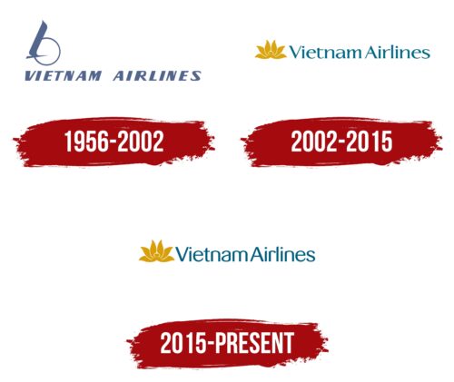
The Vietnam Airlines logo features an image of Vietnam’s main symbol to showcase the beauty of the Vietnamese spirit to the world. The emblem is easily recognizable and suitable for identifying the company as the carrier of the country known for its rice terraces.
Vietnam Airlines: Brand overview
Vietnam Airlines traces its roots back to 1956 when the Civil Aviation Administration of Vietnam was established. The airline officially began operations on January 15, 1956, under the name Vietnam Civil Aviation.
In its formative years, the company primarily served domestic routes with a fleet composed of Soviet-manufactured aircraft such as the Li-2, Il-14, and An-24. Following the reunification of North and South Vietnam in 1976, it underwent a significant transformation and was subsequently renamed. The 1980s marked the beginning of its international ventures, with the inaugural international route launched to Bangkok in 1983.
During the 1990s, the aviation company embarked on an extensive modernization program, gradually phasing out Soviet planes in favor of Western models. This included the acquisition of its first Boeing 767 in 1996. The airline transitioned to a joint-stock company in 1995 while remaining under state ownership.
A pivotal moment in its history came in 2003 when it acquired its first Boeing 777, enabling long-haul flights to Europe and North America. Celebrating its 50th anniversary in 2006, the brand had firmly established itself as Vietnam’s leading airline. In 2010, the carrier joined the SkyTeam alliance, significantly enhancing its global footprint and standing alongside major airlines like Delta, Air France, and KLM.
The airline reached another milestone in 2014 by receiving its first Airbus A350, becoming the second airline globally to operate this aircraft type. In 2015, the airline underwent partial privatization, selling 8.77% of its shares to investors, including ANA Holdings from Japan. 2016, it further enhanced its long-haul service capabilities by introducing the Boeing 787 Dreamliner to its fleet.
By 2018, the airline had expanded its route network to include over 50 destinations across 17 countries. The expansion continued into 2019, with the airline launching new routes, including flights to Sheremetyevo (Moscow) and Bali. Throughout its history, the aviation firm has garnered numerous awards for service excellence, earning a 4-star rating from Skytrax in 2018 and 2019.
As of 2020, the fleet consisted of more than 100 modern aircraft, including the Airbus A350, Boeing 787, Airbus A321, and ATR-72. The airliner remains a pivotal player in Vietnam’s tourism and economic sectors, forging vital connections with key global economic centers and bolstering international tourism to Vietnam. The government of Vietnam holds the majority stake in the airline, and it has strategic alliances with ANA Holdings and Air France-KLM. Employing more than 13,000 people, Vietnam Airlines transports nearly 15 million passengers annually.
Meaning and History
What is Vietnam Airlines?
This is the national carrier of Vietnam, based in Hanoi, known for its role in developing the country’s aviation industry and connecting Vietnam to global markets. The company operates a modern fleet, including Boeing 787 Dreamliner and Airbus A350 aircraft, allowing it to perform long-haul flights comfortably.
1956 – 2002
From its inception in 1956 until 2002, Vietnam Airlines used the image of a crane as its symbol. The crane holds deep cultural and symbolic significance in Vietnam, representing happiness, longevity, and good fortune. This beautiful silhouette of the bird with its majestic wings uplifted visually represented the airline’s aspirations for reaching heights and success in the aviation industry.
The crane is considered sacred in Vietnam, and its image on the logo carries aesthetic value and a deep meaning connected with the hopes and dreams of the Vietnamese people. It was likely chosen for the logo, hoping it would bring blessings and peace to the airline.
On the logo, the crane is depicted against the backdrop of the sun, a common motif in visual arts. This image is poetic and filled with romance, making it particularly appealing. The sun illuminating the bird symbolizes a new beginning and the bright future that the airline strives to build.
The depiction of the crane flying high in the sky conveys Vietnam Airlines’ ambition to become a leader in the aviation market, providing passengers with an embodiment of high standards of service and quality.
2002 – 2015
As part of reevaluating the branding concept, Vietnam Airlines underwent significant changes to its logo, reflecting the country’s cultural and spiritual aspects. The crane symbol was replaced with another significant element of Vietnamese culture—the sacred lotus. This flower, widespread in Vietnam, catches the attention of tourists with its colorful appearance and is deeply rooted in local symbolism. It is associated with purity, spirituality, and enlightenment.
The lotus petals on the logo are depicted in golden tones, highlighting the flower’s connection with Vietnam’s religious traditions, which consider it the country’s soul and heart. This symbolism emphasizes the airline’s aspiration to become an integral part of the national identity alongside other beloved and respected symbols of Vietnam.
The new logo’s concept includes a nod to tradition and a showcase of the beauty of Vietnamese nature and culture on the global stage. The lotus image, with petals unfolding like the sun, symbolizes potential and new opportunities for the company and its passengers.
The accompanying company name is presented in sky blue, creating associations with the expanse of the sky and reflecting the connection of air travel with the vastness of the heavens.
2015 – today
In the latest logo update, introducing a new font for the company name is a significant change. This font was selected to highlight shifts in the airline’s operations, which include an expanded route network. The letters in this new font are taller and feature smoother shapes, visually emphasizing the grace and tranquility of airliners’ smooth and confident movement through the sky.
These modifications in the font enhance the logo’s visual appeal and convey the company’s philosophy. The tall and smooth letters symbolize a commitment to excellence and comfort, emphasizing that flying with this airline can be a relaxing and enjoyable experience. This design detail reflects the deliberate and unhurried movement of the airliners, which, like elegant ships, sail through the sky, providing passengers with maximum comfort and confidence during their journey.
The updated font introduces a sense of sophistication and modernity to the logo. The taller letters with smoother curves represent the airline’s dedication to providing a serene and graceful travel experience. This design choice ensures that the logo captures the essence of the airline’s commitment to passenger comfort and a smooth flight experience. The new font also aligns with the company’s broader goals of excellence and reliability, making the logo reflect its core values.
