The Vikings logo encases sturdy blades, sharp arrows, and precious jewelry. The emblem shows the courage and strength inherent in the heroes of the TV epic. The desire for wealth and fame drives the Vikings, but along with their barbarian beginnings, love, and beauty are not alien to them.
Vikings: Brand overview
| Founded: | March 3, 2013 – December 30, 2020 |
| Founder: | Michael Hirst |
| Headquarters: | Ireland |
Meaning and History
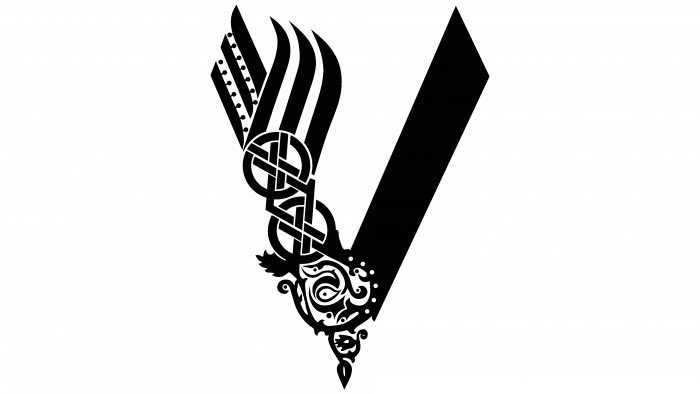
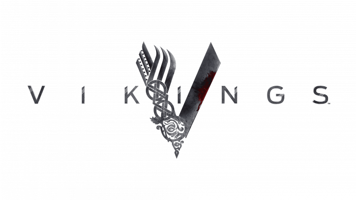
Even though the fictional series is filled with armed conflicts and bloody battles, there is a place for family values and deep philosophy. A striking reflection of this aspect is the logo, first seen by the public in an exclusive Vikings trailer in 2013. Its main element is a large “V,” the first letter of the title of the serial film. It looks metallic and twofold: on the one hand, shiny steel has turned into a work of art, and on the other, it has become a cold weapon.
This impression is created thanks to the work of artists who have achieved maximum realism using computer graphics. In general, the complex structure represents the versatility and ambiguity of the Viking culture. After all, these medieval Scandinavian sailors were not only warlike aggressors but also had a deep spiritual connection.
Their family values, art, talents, and progress are reflected on the left side of the letter “V.” Its top consists of six stripes that diverge in two directions. This is a reference to the technological advancements of the Vikings. A little below is a round ornament with interlacing lines – a symbol of the inextricable connection between blood relatives and brotherhood. At the base of the “V,” there is also a circle with a pattern of leaves. It denotes the spiritual side of life, the desire for continuous growth and development, and the birth of something new.
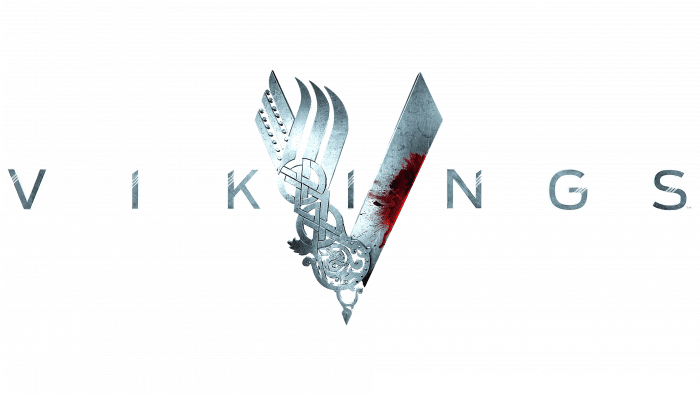
A completely different meaning is embedded in the right side of the letter. She looks like a sharply sharpened blade and represents the cruel customs of the tribes. It is the epitome of armed conflict, death, violence, and hostility. To avoid misunderstandings, the designers painted the middle of the blade crimson. Thanks to such a palette, it becomes obvious that we are talking about the bloody customs of the Vikings and not about their ability to make edged weapons.
The ‘VIKINGS’ lettering complements the V-badge in the same style. Each letter in the series title also consists of blades with thin white edges. They correspond to the general concept and look like works of blacksmithing.
All the symbols used to design the emblem were taken from the everyday life of the Vikings, reflecting a whole layer of medieval culture. For example, the left “V” (forked stripes) segment was inspired by images of real ships of Scandinavian sailors.
Brotherhood symbols also existed in reality. The logo uses modified runic elements, which the designers stylized to adapt to other drawing parts. This is an important aspect of the plot because the main character tries to do everything for his people, educates his son, and loves his family.
The lowest symbol is called the Tree of Life. He is the core of Scandinavian mythology. The Vikings identified the Yggdrasills ash with the universe and believed that the past, present, and future were held on. Evil forces lived between the roots, the world of people was around the trunk, and the gods lived on the branches. The Tree of Life was contrasted with the right side “V” – a sword blade with bloodstains. Abrasions, cracks, and scratches hint that the weapon has already been used in battle. It is the epitome of discord and physical abuse.
Vikings: Interesting Facts
“Vikings” is a TV show that started in 2013 on the History Channel. It’s all about the exciting stories of Norse heroes like Ragnar Lothbrok and his family. The creator, Michael Hirst, mixed real history with old myths to make the story even more interesting.
- A mix of History and Myth: The show mixes true historical events with Norse myths. Ragnar Lothbrok, the main character, is based on a mix of real and legendary stories.
- Where It Was Filmed: The show was filmed in Ireland because it resembles Scandinavia, which helps bring the Viking world to life.
- One Writer: Michael Hirst wrote almost all the episodes himself, which helped keep the story consistent.
- Realistic Details: The show paid close attention to ensuring things like clothes, buildings, and traditions looked like they would have in Viking times.
- Languages Used: To make the show feel more real, characters speak Old Norse, Old English, and Old French.
- Praise from Critics: People liked “Vikings” for its storytelling and acting, especially Travis Fimmel as Ragnar and Katheryn Winnick as Lagertha.
- Boosted Tourism: The show made more people visit Ireland, especially the places where it was filmed.
- Spin-off Series: After “Vikings” ended, the show announced a new show called “Vikings: Valhalla,” which continues the story 100 years later.
- Learning from the Show: Even though the show changes some things for drama, it’s interested many people in Viking history and myths.
- Six Seasons Long: The show wrapped up in 2020 after six seasons and 89 episodes, ending the story in a way that fans liked.
“Vikings” is remembered for being fun to watch and teaching viewers about Norse history and culture through its mix of real events and storytelling.
Font and Colors
The designers created the “VIKINGS” lettering from scratch with their lettering. Each symbol is adorned with three diagonal lines and has oblique cuts at the ends. Based on the logo, user RamaelK created a stylized sans-serif typeface called Vikings.
Both the show’s logo and wordmark are gray. The color palette creates the effect of a steel sheen as if all the elements were made of metal. The gray and silver tones dilute the red splashes that resemble blood stains. The gradation of the red scale is also quite wide—from bright scarlet to maroon.


