The Virgin America logo is a vibrant addition to the Virgin brand’s group of airlines. Its modern image is completely harmonious with the Virgin Group’s flagships in Australia and England, emphasizing a commitment to flying and traveling.
Virgin America: Brand overview
Virgin America Inc. took to the air in 2007 and left an indelible mark on the US aviation industry before being acquired by Alaska Airlines in 2018.
In 2004, Sir Richard Branson and Virgin Group announced the launch of Virgin USA, an American airline.
After overcoming regulatory challenges, Virgin America finally took to the skies in 2007. The first flight departing San Francisco and landing in New York City was a landmark moment in airline history.
Over the years, Virgin America expanded its network to include new destinations across the United States. The San Francisco hub became a gateway to major cities, giving travelers access to popular destinations nationwide.
In 2016, Virgin America announced it was considering strategic options, including a possible sale. Two years later, Alaska Airlines made a major announcement to acquire Virgin America, marking the end of its independent status. The deal was completed on December 14, 2018, ending a remarkable chapter in Virgin America’s history.
Meaning and History
What is Virgin America?
It was an American budget airline headquartered in Burlingame, California. It operated domestic flights throughout the United States, focusing on major cities and popular routes. The airline provided high-quality service at competitive prices, offering a variety of service classes, including Main Cabin, Main Cabin Select, and First Class. The brand was acquired by Alaska Airlines, and its operations were integrated into Alaska Airlines, resulting in the dropping of the Virgin America name.
2004 – 2007
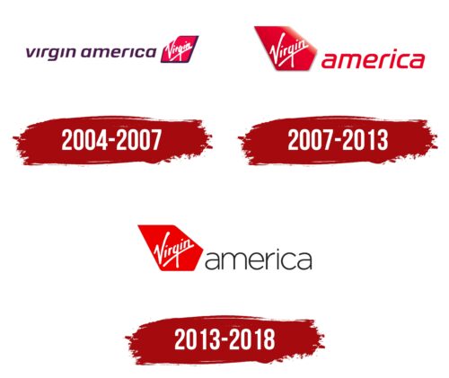
From 2004 to 2007, the Virgin America logo underwent significant changes that reflected the conglomerate’s strategic goals. The purple color of the brand name and the frame around the red sail were deliberately chosen. These elements emphasized the unified strategy of all 29 Virgin Group companies, focusing on the importance of consistency and uniformity in approaches and values that each carrier should convey.
The purple in the logo symbolized the group’s high standards and ambitions, while the red color of the sail remained true to the Virgin’s traditional identity, representing passion and dynamism. The frame encompassing the sail created visual integrity for the composition and symbolized the structure and organization necessary for the successful operation of such a large-scale business.
An interesting feature is the one open corner of the image, which visually resembles a breath of fresh air. This design choice reflects the company’s ambition to transcend traditional Virgin symbolism, offering a chance to showcase uniqueness and individuality. The open corner highlights Virgin America’s readiness for innovation and exploration of new opportunities, which are crucial for an airline aiming to lead the market.
The compactness of the white name within the logo’s frame symbolizes the company’s growing ambitions to seek new paths for development and expand its influence. This element emphasizes the internal drive for expansion and the desire to be more visible and recognizable globally, a key aspect of its strategic planning.
2007 – 2012
The Virgin logo embodies grandeur and innovation, featuring an airplane keel raised above the surface and brightly illuminated by the sun. The bright red color of the keel, dazzling in its brilliance, adds visual expressiveness and recognizability. This design element symbolizes the company’s boldness and ambitions, highlighting its aspiration to lead in the aviation industry.
The logo’s visual impact is enhanced by the red letters of the name, which harmoniously complement the airplane’s image and create a sense of continuity with the airliner. This style of writing facilitates easy recognition of the brand and visually conveys the airline’s essential characteristics of dynamics and speed.
Virgin aims to provide passengers with both fast and high-quality service. The focus on premium service, reflected in every branding element, emphasizes the company’s commitment to offering customers an exceptional travel experience.
2012 – today
The international conglomerate Virgin Group designated its airline with a corporate logo: the word “Virgin” written diagonally and emphasized by an uneven stripe. In this case, the word is colored white and inside a red polygon mimicking part of the aircraft’s tailplane. Next is the gray word “america,” typed in thin lowercase sans-serif letters. The smooth font with rounded elements conveys swift movement and energy.
The diagonal orientation of the word “Virgin” suggests dynamism and forward motion – qualities associated with air travel. The red polygon that serves as the background for the word emphasizes the brand’s energy and appeal. The gray word “America,” typed in a minimalist font, contrasts with the bold “Virgin” lettering, providing a balanced visual appeal and emphasizing the airline’s geographic focus. Combining these elements makes the logo memorable and consistent with the Virgin Group’s overall branding strategy.
