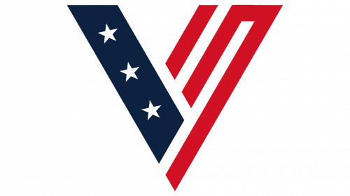
Like the emblems of other U.S. presidential candidates, Vivek Ramaswamy’s logo is designed in a patriotic style. It helps create a recognizable and appealing brand capable of inspiring voters and evoking the desired emotional response. The signature colors and symbols strengthen the image of the candidate for high office.
Vivek Ramaswamy: Brand overview
Meaning and History
The 38-year-old entrepreneur tries in every way to emphasize that he is young and full of energy. This is evident in his provocative behavior and the system of visual symbols used in the campaign. Vivek Ramaswamy’s logo reflects his personality. Firstly, the colors and elements of the U.S. national flag show his dedication to the country. Secondly, the choice of font conveys the candidate’s unique style. The letter corners are deliberately rounded to create a sense of reliability and security.
What is Vivek Ramaswamy?
Vivek Ramaswamy is a millionaire from Ohio who founded Strive Asset Management and Roivant Sciences. Born to Indian immigrant parents, he practices Hinduism. In 2023, the entrepreneur decided to become a politician and ran for President of the United States. Opponents criticized him for mimicking Donald Trump’s behavior. Additionally, Ramaswamy denies the existence of the climate crisis, wants to shut down the FBI, and proposes barring people under 25 from voting in elections.
2023 – today
Since Vivek Ramaswamy uses the emblem as a reflection of his personality, his name takes center stage. It is written in uppercase dark blue letters, with sufficiently wide spacing between them. The bold, sans-serif font is considered classic in Republican campaign branding, although it is not as conservative as serif fonts.
Below is the election year – 2024. The number is center-aligned and colored in a rich red. The horizontal strokes of the twos have characteristic rectangular protrusions pointing upwards. Above the word “VIVEK,” there’s a stylized letter “V” consisting of two parts.
- The left diagonal is formed by a blue trapezoid adorned with three white stars.
- The right side is composed of red and white stripes, resembling a labyrinth.
Thus, the logo incorporates reimagined elements from the U.S. flag. Its modernist style clearly promises change and reforms in the country aimed at the younger generation of voters.
Font and Colors
The candidate’s name is written in a font with rounded corners, giving it a less formal appearance. The designers deliberately softened the letters to make Ramaswamy’s image appear friendly and approachable. The absence of serifs on the letters creates an impression of modernity, minimalism, and simplicity.
The emblem’s palette corresponds to the national colors of the United States. Red, white, and blue symbolize patriotism and American identity. They are often used in the logos of election campaigns.
