Vivo: Brand overview
Founded in 2009 by Shen Wei in Dongguan, China, Vivo was part of the BBK Electronics conglomerate, which also includes brands such as OPPO, OnePlus, and Realme. Initially focused on the Chinese market, the company released its first smartphone after just two years in 2011. A major milestone came in 2014 when Vivo entered global markets, particularly India and Southeast Asia.
Over time, the company strengthened its international presence by establishing manufacturing and research centers, particularly in China and India. By 2015, the company had climbed the ladder, becoming one of the top five smartphone manufacturers in its home country and one of the top 10 worldwide, with a market share of over 5%.
Vivo’s rapid growth was fueled by a combination of smart tactics: a focus on mid-range devices, a wide offline retail network, and celebrity endorsements as a marketing tool. By 2018, the company’s revenue exceeded $7.5 billion, and annual shipments exceeded 100 million smartphones.
Vivo has never been stingy with research and development, which has led to unique features such as pop-up selfie cameras. In 2018, the high-end X-series phones made their debut, showcasing the company’s technological aspirations. With more than 30,000 employees worldwide and a network of 10 research and development centers, Vivo is not about to slow down. Under the leadership of its founder, Shen Wei, the company remains committed to offline retail strategies and continues to target markets outside of China.
Since its founding in the late 2000s, Vivo has become a formidable name in the smartphone arena in China and globally, mainly due to its focus on mid-range models and consistent international expansion strategy.
Meaning and History
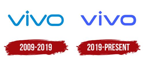
2009 – 2019
2019 – today
The Chinese technology company is interested in a unique and minimalistic approach to its visual identity. Its logo is characterized by simplicity and geometric shapes but with smooth lines and soft transitions. There is only one element on the logo – the name. It is typed in wide lowercase letters with rounded corners. Due to its flattened letters, they seem shorter than they are in reality. This effect is specially created by the diagonally elongated letter “O,” which seems oval. For the letter “i,” a diamond shape is used instead of the classic dot. The lettering is colored light blue.
The light blue color of the logo and the soft, rounded letters give it a friendly vibe. The flattened letter “O” and the diamond shape of the letter “i” add grace, as if winking. The logo is simple, but small changes make it interesting and memorable.
Vivo color codes
| Ultramarine Blue | Hex color: | #415fff |
|---|---|---|
| RGB: | 65 95 255 | |
| CMYK: | 75 63 0 0 | |
| Pantone: | PMS 2736 C |


