Established in 2015, Vocation Brewery in Hebden Bridge, England, has become one of the UK’s largest craft breweries. Founded by John Hickling, a former IT professional, the brewery’s beers quickly gained popularity and now produce 10 million cans annually with a team of about 60 employees. As Vocation enters its next growth phase, it has introduced a refreshed brand identity and packaging system designed by Turner Duckworth’s London office.
The rebrand focuses on Vocation’s commitment to quality brewing and making craft beer accessible. The new visual identity features the iconic eye symbol, updated for better brand recognition and visibility. This eye symbolizes the brewery’s meticulous attention to detail and passion for quality beers. It represents Vocation’s broad view and ‘all-seeing’ presence atop a hill.
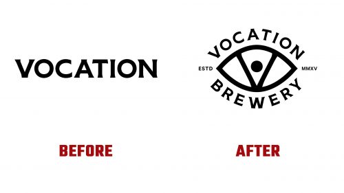
The new logo combines elements from the previous logos, retaining distinctive typography and reincorporating the eye symbol. The typography provides a robust baseline with flared serifs, though it can lose finesse at smaller sizes. The word “BREWERY” is now in the same style as “VOCATION,” reinforcing the brand’s identity.
The eye symbol has been refined with subtle flaring at the corners, enhancing its visual appeal. The pupil’s slightly off-center position might affect symmetry. The logo maintains a strong presence, especially on product packaging.
The new packaging uses more geometric illustrations with thick strokes, moving away from the previous organic style. These illustrations, by Brian Steely, are detailed and adapted to different beer names, drawing consumer attention to the eye symbol.
Unique typographic treatments for each beer name add a playful element, helping to create sub-brands for each beer, which is beneficial for merchandising. This approach introduces additional visual elements, potentially creating a busy appearance.
The new brand identity features a vibrant color palette with bright and bold hues. These colors enhance the visual appeal of the packaging and reflect the brewery’s dynamic and innovative spirit. Combining these colors with detailed illustrations and distinctive typography creates a cohesive visual system.
The new identity emphasizes Vocation’s commitment to quality and innovation, highlighting traditional brewing methods combined with modern technology. This balance is a core element of Vocation’s identity, communicated through the new branding.
The rebranding extends to Vocation’s digital presence, updating the website and social media channels to reflect the new visual identity. These platforms now feature the new logo, color palette, and illustrations, ensuring a consistent brand experience.
Vocation Brewery’s new brand identity captures its commitment to quality, accessibility, and innovation. The refreshed logo, updated packaging, and vibrant visual elements create a memorable and impactful brand presence. This new identity will help Vocation reinforce its position as a leading player in the craft beer industry. Through thoughtful design and strategic implementation, Vocation Brewery is well-equipped for its next chapter, continuing to brew exceptional beers for a broad audience.


