The Wataniya Airways logo conveys the company’s values: reliability, safety, precision, high-level service, commitment to development, and connecting people. The emblem reflects the carrier’s high ideals and international status.
Wataniya Airways: Brand overview
Wataniya Airways, the national airline of Kuwait, operated from 2005 to 2018. The airline was established as a private enterprise in Kuwait in 2005 and began commercial operations in 2009. Its initial fleet consisted of Airbus A320 aircraft that provided regional transportation to the Middle East from a base in Kuwait City.
Over the next few years, Wataniya Airways expanded its network to more than 16 destinations in the Middle East, South Asia, Africa, and Europe. However, huge competition from regional giants such as Emirates and Qatar Airways pressured Wataniya’s operations.
In 2011, due to Wataniya Airways’ growing financial losses, the Kuwaiti government owned Wataniya Airways. Despite these changes, the airline continued to struggle with problems. With neither an acceptable strategy nor a potential buyer, Wataniya Airways ended its operations with its last flight in September 2018, ending its journey after nearly a decade.
During its greatest heyday, Wataniya operated a fleet of more than 10 Airbus A320 family aircraft and served more than one million passengers annually.
Meaning and History
What is Wataniya Airways?
It is a Kuwaiti airline operating scheduled flights mainly to regional destinations in the Middle East. The airline is based in Kuwait City and provides premium travel with a focus on comfort and quality of service. It offers various classes of service, including economy and business class, targeting both leisure and business travelers. The airline improves regional connectivity, supporting tourism and business travel between Kuwait and neighboring countries. Despite operational difficulties and periods of suspension, the company continues to work to re-establish its presence in the aviation market.
2005 – 2011
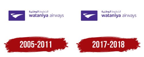
Wataniya Airways, actively operational from 2005 to 2011, chose a logo that fully reflected its aspirations and core values. The central design element consisted of two white triangles on a purple sky background. These triangles, resembling high-speed liners, symbolized the dynamics and speed of flights and the white wings of freedom, highlighting the theme of unimpeded and effortless movement worldwide.
The emblem’s widely spread elements emphasize the company’s ambitious plans and ability to connect people across continents. The triangles, pointing upward and outward, symbolize Wataniya Airways’ aspiration towards new horizons and the continuous expansion of its route network.
The logo’s color palette—purple—was chosen deliberately. Purple is traditionally associated with dreams, expansiveness, and spirituality. This holds special significance in Arab countries, reflecting deeply rooted cultural and spiritual aspects. This makes the logo visually appealing and meaningful on a deeper, symbolic level.
The bilingual rendering of the brand name—in Arabic and English—demonstrates Wataniya Airways’ respect for the diversity of its clients. This decision underscores the company’s intent to be accessible and understandable to passengers of various nationalities, facilitating a cultural bridge and easing understanding among a broad user base, contributing to a comfortable and pleasant atmosphere for all passengers.
2017 – 2018
The Wataniya Airways symbol resembles a paper airplane. It consists of two curved white triangles that serve as abstract wings. The base of the design is a dark blue rectangle with rounded corners. On the right side is an inscription of the same color. The airline’s name is presented in Arabic at the top and English at the bottom. A unique sans-serif font is used for the English text.
The dark blue rectangle serves as a stable and calm background for the white triangles, enhancing their visual impact. White symbolizes purity and clarity, which is important to the airline. The multilingual naming provides greater accessibility and awareness to different consumer segments. The rounded corners of the rectangle make the design less rigid, giving it a more modern and accessible look.
