Wild Oats has returned to the natural foods category with a sharper image. The brand was founded in Boulder in 1987 and played a role in the growth of the natural foods market, back when organic food was not yet a regular part of grocery shopping. After a long pause, the brand returned under KeHE, a major distributor of natural, organic, and specialty products in North America and a B Corporation. SUKLE developed the new identity.
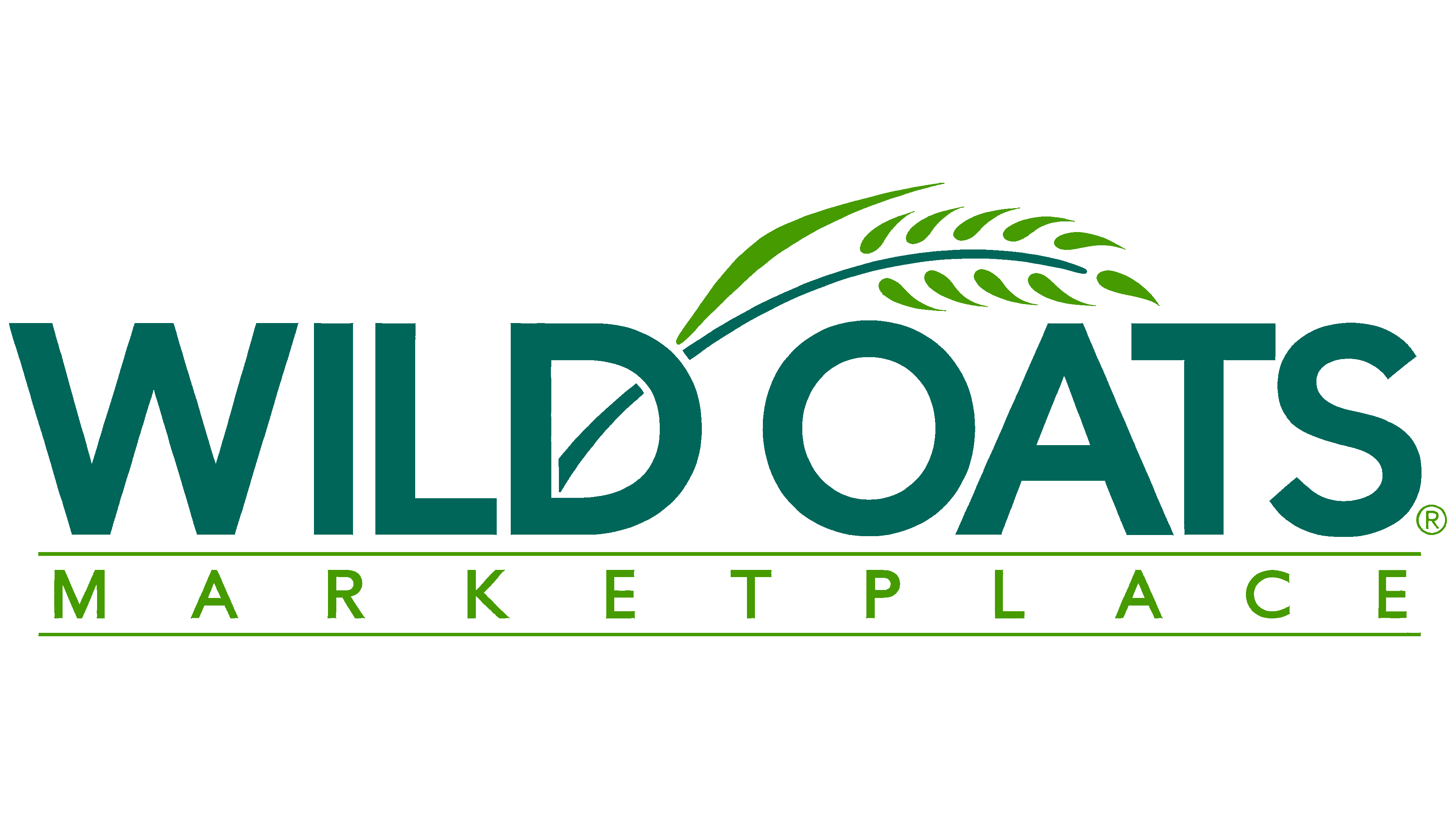
The previous logo dates back to a time when Wild Oats was a chain of natural foods stores. For a move toward Regenerative Organic Certified®, the old mark already felt too soft. The brand needed an image about nature, food, and frustration with how the large agricultural industry is organized. As a result, an angry flower appeared at the center of the new logo.
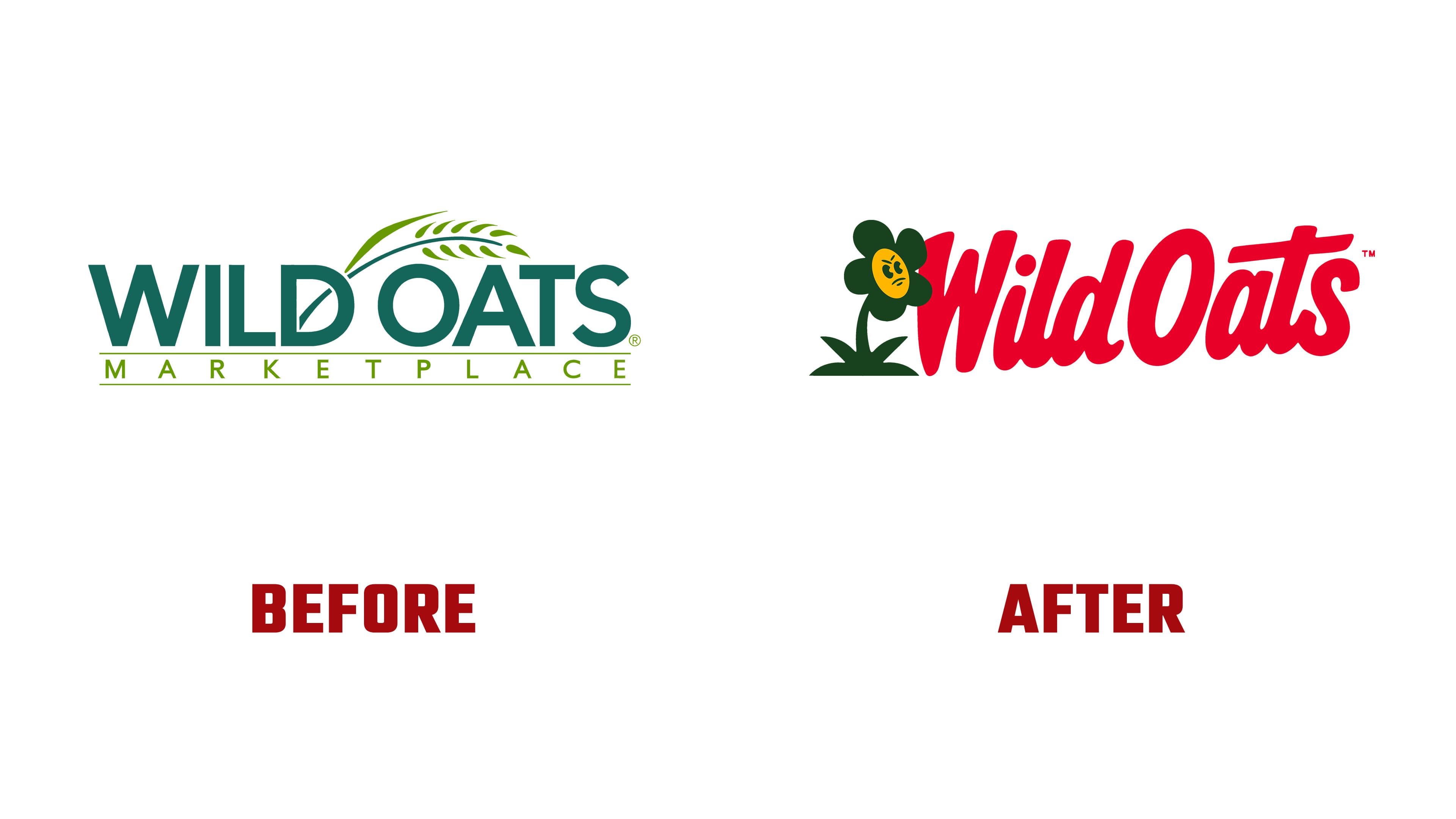
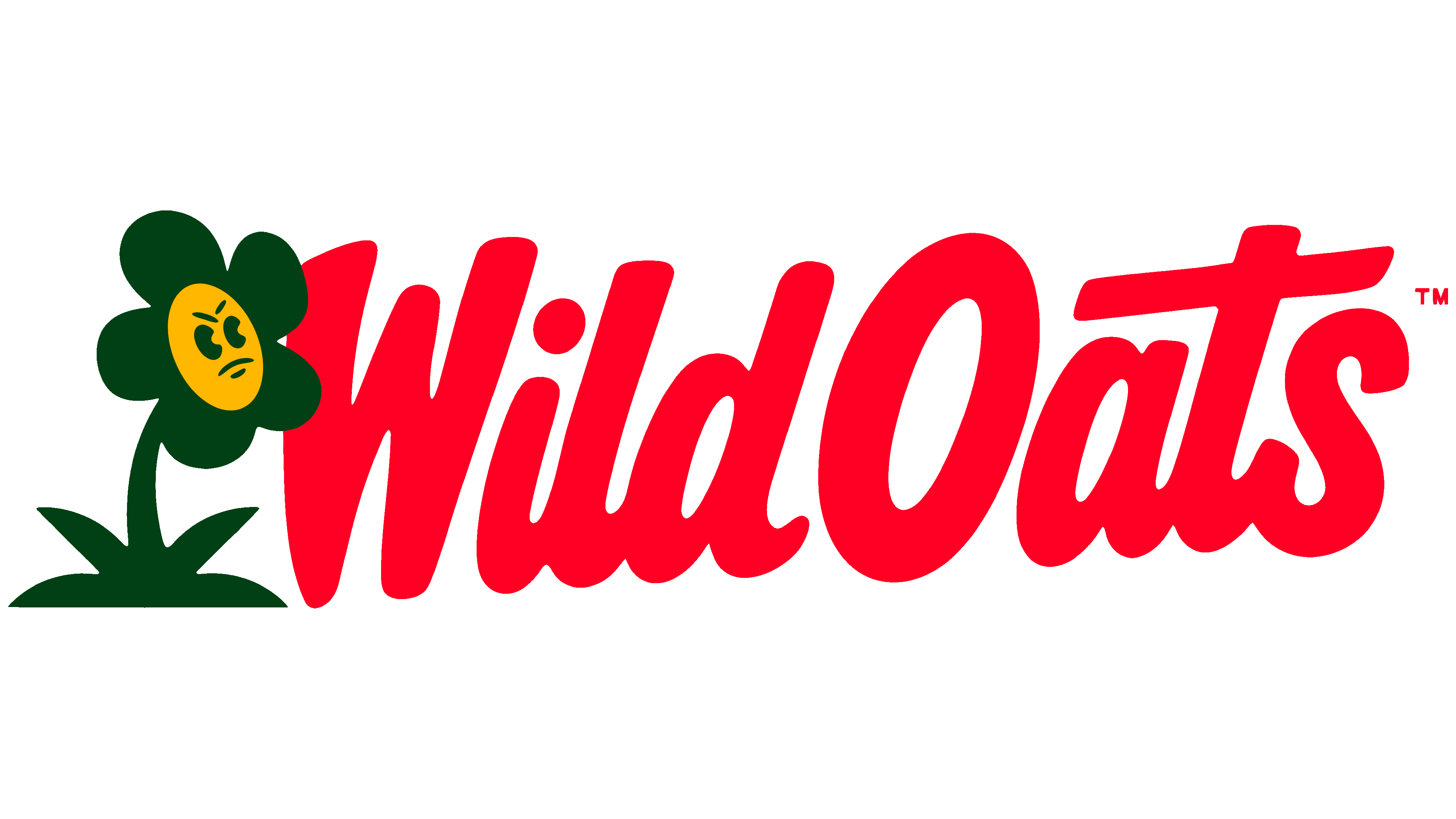
The flower looks almost cartoonish. It has vintage eyes and a tense face. It keeps the connection to soil, farming, and natural food. Instead of the calm smile of a farmers’ market, there is irritation. It is directed toward an industry in which natural food has become part of mainstream commerce.
The wordmark works in a similar tone. Heavy lines, a slight retro mood, and lively letter placement give the logo density and energy. The Wild Oats name can be set on one line or across several lines.
The identity uses the Epilogue and Rosemary typefaces. However, the main role still belongs to the pairing of the flower and the name. Epilogue works in badge-like formats and supports the emblem. Rosemary sets the large-scale tone of the messaging. Red heightens Wild Oats’ protest mood and sets the brand apart from the familiar beige-and-green world of natural foods. For the audience, the symbol appears to be a rejection of the organic aesthetic and a shift toward a conversation about food standards.
The angry flower connects the brand’s history, regenerative organic agriculture, and its conflict with large-scale agribusiness into a single image. SUKLE kept the mark’s natural foundation but removed the softness of the old category.