Willhaben gently updated its identity without breaking away from its previous image. Austria’s largest digital marketplace worked on the project with Mutabor. The main mark became the magnifying glass, already familiar to the audience from the previous logo. The project covered the brand platform, verbal identity, logo, typeface, product interfaces, and a brand hub for storing materials.
In March 2026, the platform had more than 13.7 million listings. The service covers real estate, vehicles, jobs, goods, and services. In Austria, almost everyone knows the brand, so the update was built around a recognizable symbol and the existing connection with the audience.
Research showed that the magnifying glass from the old logo had become the company’s main accent symbol. Mutabor moved it from a small detail into the foundation of the new system.
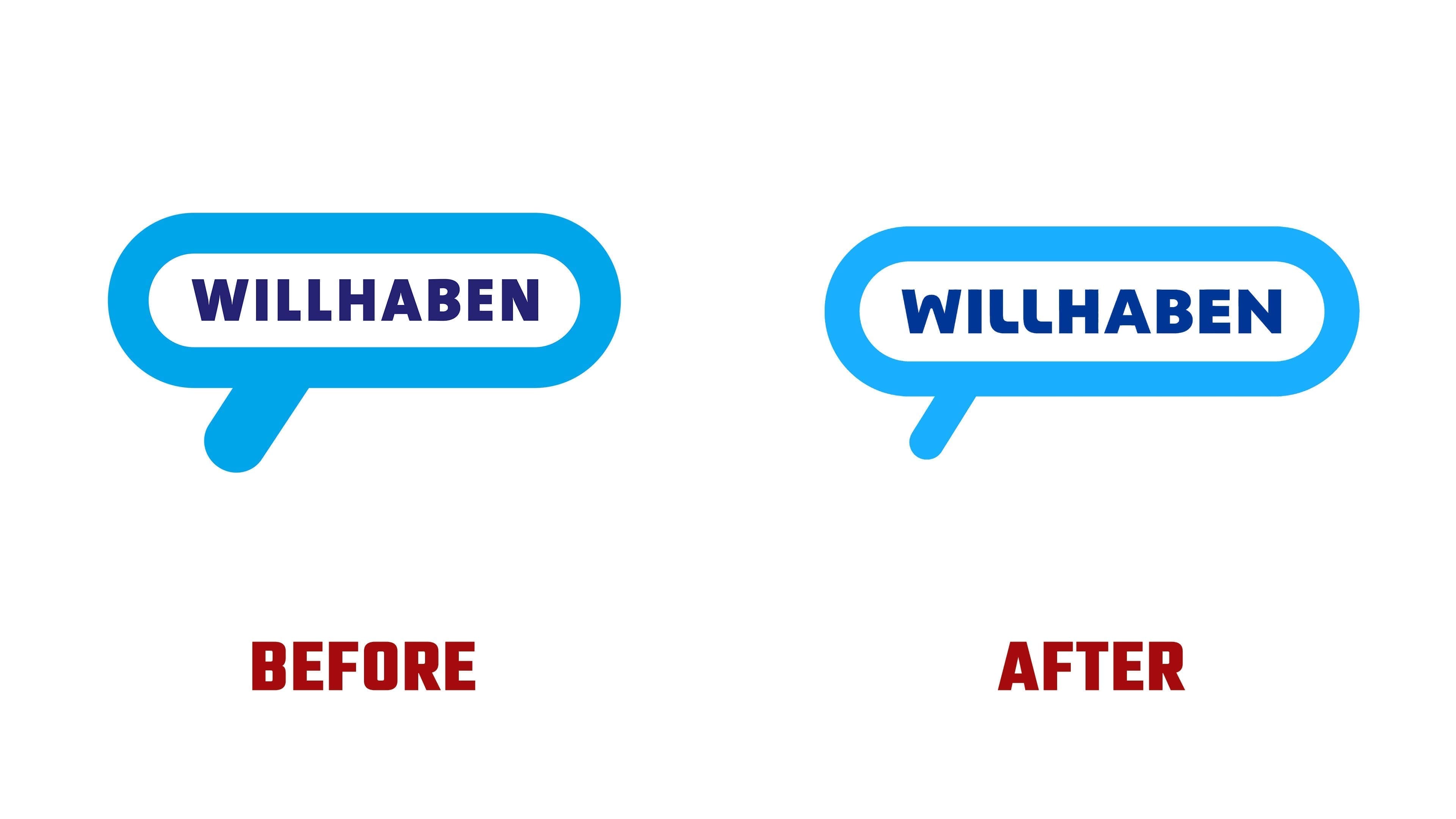
The logo kept its connection to the previous version, but became lighter. The speech bubble remained recognizable, the outline became thinner, the tail was reduced, and more space appeared inside. The old mark looked dense and slightly cartoon-like. The new version became calmer, more mature, and better suited to digital environments.
The magnifying glass is connected with search, choice, and focus. For a marketplace, the symbol feels natural. Users enter the platform, browse listings, compare options, and look for the right item, apartment, car, job, or service.
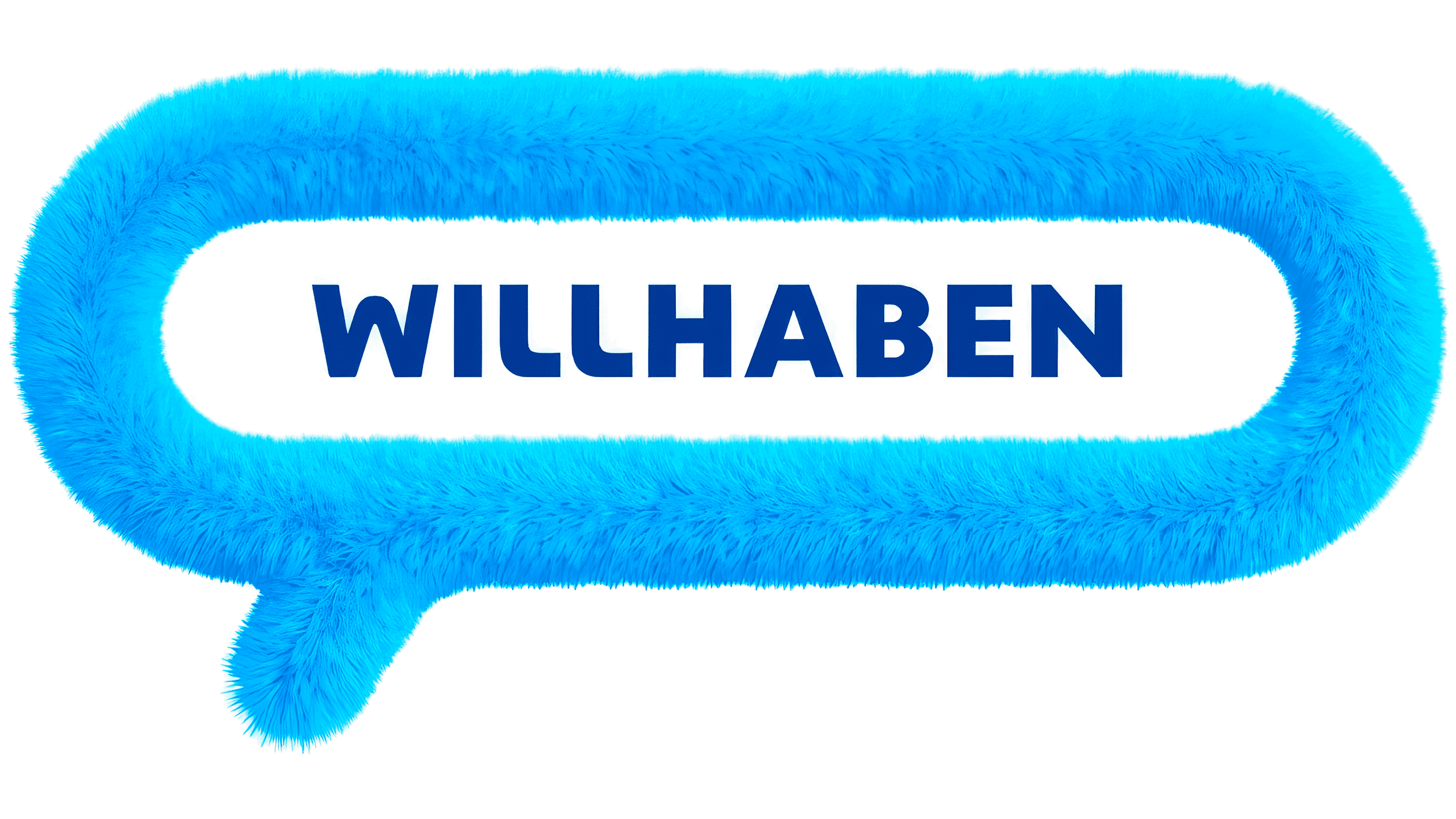
The light blue color was kept as part of the brand’s memory. As a result, Willhaben looks fresher in the app, on the website, in advertising, and in its communication with its audience.
A new typeface was developed for the brand, based on the magnifying glass’s shape. The letters gained large rounded details tied to the main mark. The typeface helps unify the logo, icons, illustrations, and interface into a single system. The wordmark became more even and cleaner. The bold letters kept a soft tone while gaining a looser fit.
For Willhaben, the new logo became a way to preserve the connection with the audience and make the brand more flexible. The magnifying glass connects the scale of the marketplace with the user’s familiar action. The brand looks lighter, more unified, and more precise for digital channels.