


![]() Winnipeg Jets Logo PNG
Winnipeg Jets Logo PNG
Although the Winnipeg Jets logo features an airplane symbol, it currently has no relation to aviation; it is only related to sports. Yet, a nod to history is preserved in the round emblem resembling a hockey puck, whose central element is a supersonic fighter jet against a red maple leaf background.
The Winnipeg Jets name belongs to two different franchises with separate histories. The first team was founded in 1972 and played in the World Hockey Association before later joining the National Hockey League.
From 1979 to 1990, the club used a blue circular logo with a red outline, featuring a rising jet, white “Jets” lettering, and a curved red “Winnipeg.” The “J” formed a hockey stick. In 1991, the background turned white, the text became blue, and the jet trail was simplified.
In 1996, financial issues forced owner Barry Shenkarow to sell the team to investors who planned to move it to Minneapolis. The relocation to Phoenix led to the club becoming the Phoenix Coyotes. In 2009, the franchise entered bankruptcy and came under league control.
A new arena opened in Winnipeg in 2004, sparking discussions about bringing NHL hockey back. Initial focus remained on the Coyotes, but the league retained control and did not approve a transfer at that time.
The second phase began in 2011, when the Atlanta Thrashers were sold to True North Sports. On May 31, 2011, the team was relocated to Winnipeg and renamed Winnipeg Jets after a fan vote.
The Thrashers used a brown thrasher as their emblem, reflecting Georgia’s state bird. After relocation, the new identity was introduced on July 22, 2011, with a logo based on the Royal Canadian Air Force roundel.
Meaning and History
![]()
The name “Winnipeg Jets” fully corresponds to the fighting spirit of the young team. Originally, the team from the USA moved to Winnipeg, the capital of Manitoba, Canada. In 2011, team chairman Mark Chipman noted that the new “Jets” name was chosen as a tribute to the Royal Canadian Air Force.
Like the club itself, the Winnipeg Jets logo has undergone several transformations to acquire its current appearance and status. Previously, it had radically different personal identification marks. After acquiring the franchise, Truth North Sports & Entertainment changed the Atlanta Thrashers’ name and rebranded the team.
What is Winnipeg Jets?
It is the name of one of the National Hockey League teams. It debuted in 1999 as the Atlanta Thrashers. The renaming occurred in 2011 after the franchise moved from the USA to Winnipeg, Canada. The club currently plays in the Central Division and holds home matches in the Canada Life Center.
1999 – 2011
![]()
At the beginning of the 21st century, the Atlanta Thrashers team presented its first logo. It depicted the Brown Thrasher, Georgia’s official state bird, and the team is based in Georgia. The bird in a blue triangle held a golden hockey stick in its tail. The Thrasher bird was drawn in three shades of gold and brown. The entire logo was outlined in yellow.
2011 – today
![]()
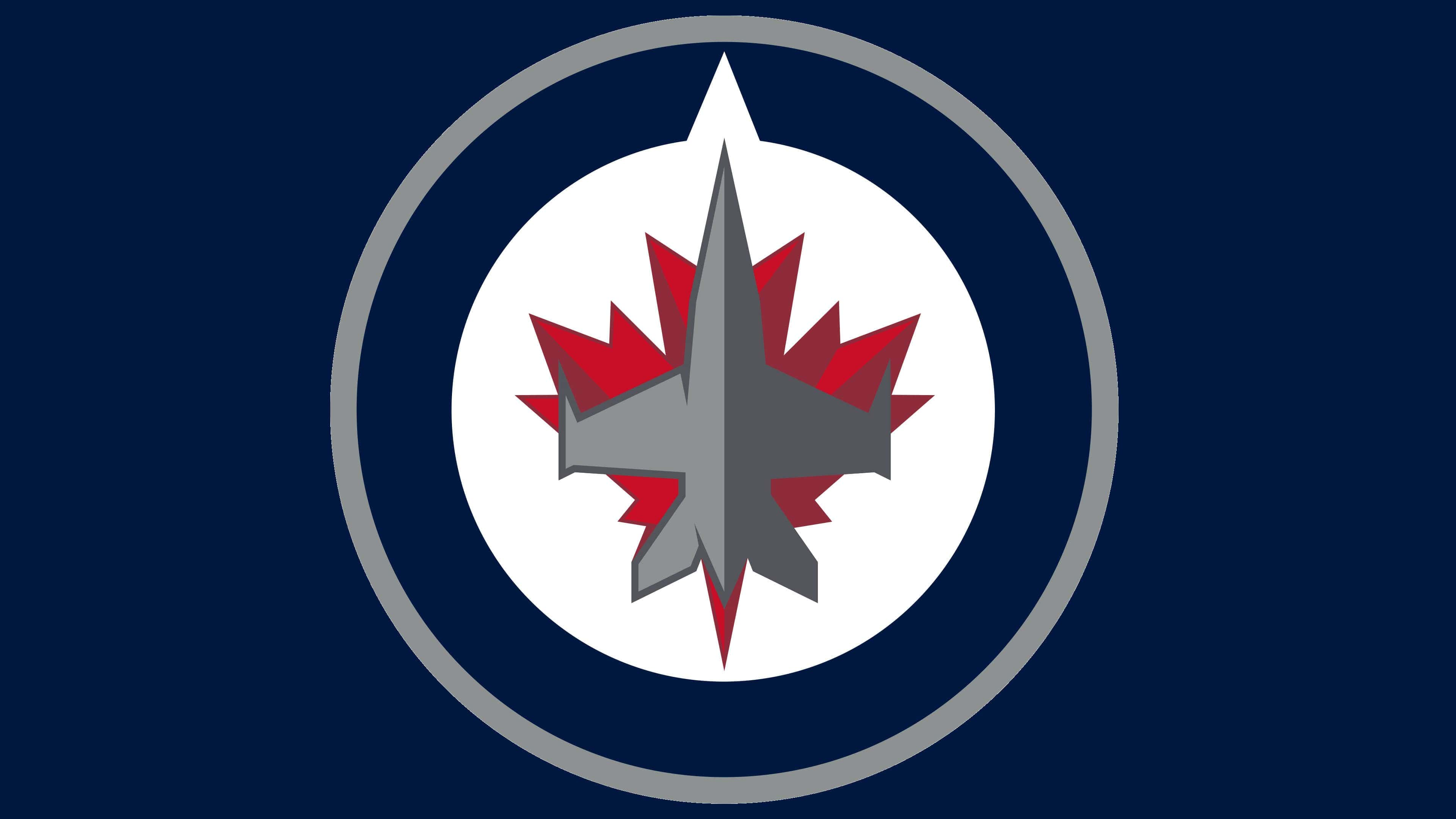
After moving to Canada, the club adopted a new name and logo, developed in conjunction with the NHL. The logo is based on the McDonnell Douglas CF-18 Hornet, with its nose pointed upward. This reflects the original roots of the Winnipeg Jets, reflecting the aviation theme, as an airplane was used in the earliest version of the emblem. The leadership brought it back in 2011, replacing the Brown Thrasher with a fighter jet.
Reebok developed the new logo in collaboration with the NHL. Their partnership resulted in a round sign with a swiftly flying airplane in the center. The background is a red maple leaf turned in the opposite direction. At the top of the double ring is a sharp notch pointing north.
Font and Colors
The decision to update the outdated logo and give it individuality seemed very appropriate to the administration. In its logo, the club paid tribute to Wing Winnipeg, part of the Royal Canadian Air Force. This was emphasized in a speech by Mark Chipman, the team’s board of directors chairman.
The original version consists of the thrasher, the state’s symbol. The anthropomorphic bird is depicted holding a hockey stick, set against a blue triangular background outlined in yellow. Then it was changed to a more suitable version that combined aviation and hockey signs. The developers also adjusted the logo’s shape, making it round.
A separate inscription is arranged in two lines. The word “Jets” is typed in a handwritten font, “Winnipeg” in a regular serrated font.
According to the PMS gradation, all official franchise colors are used in the emblem: white, burgundy 195 C, red 187 C, gray 11 C, silver 429 C, and two shades of blue – Aviator Blue 2945 C and Night Blue 282.
FAQ
What does the Winnipeg Jets logo mean?
The Winnipeg Jets logo contains many symbols. Overall, it mimics the Royal Canadian Air Force medallion, which features a white circle with a red maple leaf at the center and a blue border. At the same time, it features a fighter jet-inspired design. This is a tribute to the RCAF pilots.
What plane is depicted in the Winnipeg Jets logo?
The silhouette of the airplane depicted in the center of the Winnipeg Jets logo was copied from the McDonnell Douglas CF-18 Hornet. It is a military fighter jet of the Royal Canadian Air Force.
Why are the Winnipeg Jets called “Jets”?
The current Winnipeg Jets club is named after a namesake hockey club, which, after several relocations, became known as the Arizona Coyotes. And that, in turn, was named after the New York Jets NFL football franchise.
When did the Winnipeg Jets change their logo?
The team changed its logo in 2011, following a rebrand after moving from Atlanta. That’s when it changed its name to the Winnipeg Jets.