


![]() Wu Tang Logo PNG
Wu Tang Logo PNG
Wu-Tang is like a bird performing a martial arts dance. The Wu-Tang logo hints at entertainment, experience, and pressure. This makes the band’s performances professional and enjoyable for the audience.
Wu-Tang Clan grew out of Staten Island’s Stapleton scene in the late 1980s, when Robert Diggs, later known as RZA, recorded rappers at his home studio. The early core was RZA, GZA, and Ol’ Dirty Bastard. In 1991, GZA’s Words from the Genius on Cold Chillin’ Records and RZA’s Tommy Boy single both failed to keep label support, pushing RZA toward a wider plan.
By fall 1992, Method Man, Raekwon, Ghostface Killah, Inspectah Deck, U-God, and Masta Killa had joined. RZA built the group’s identity around kung-fu films, Five Percent teachings, and comics. The name came from the 1983 Hong Kong film Shaolin and Wu Tang, while Staten Island became “Shaolin” in the group’s language.
In 1992, Wu-Tang released “Protect Ya Neck” on Wu-Tang Records, moving copies through radio drops and car trunks. The single brought label attention, but RZA demanded an unusual deal. The group would sign together, while each member could make solo deals elsewhere. Loud Records, distributed by BMG, accepted.
Enter the Wu-Tang (36 Chambers) arrived on November 9, 1993. Recorded on a tight budget at Firehouse Studio, it used rough soul samples and dialogue from Hong Kong action films. It debuted at No. 41 on the Billboard 200 and reached platinum status by 1995. Solo albums followed through Def Jam, Elektra, Loud, Geffen, and Epic. Wu-Tang Forever hit No. 1 in 1997, but internal disputes later grew. Ol’ Dirty Bastard died in 2004. Hulu released Wu-Tang: An American Saga in 2019, and the group announced The Final Chamber tour in February 2025.
Meaning and History
![]()
According to Lamont member Jody Hawkins (under the pseudonym U-God), they all “grew up in the urban jungle” of New York, which further influenced their creativity. He recalls how their neighborhood turned into a criminal zone, where drugs were freely sold, and people on the streets fired guns and wore bulletproof vests under their T-shirts. During such a challenging time, nine rappers came together to form the Wu-Tang Clan. They were looking for every opportunity to break out of the slums and start life from scratch.
The organizer and ideological inspirer of the project was Robert Diggs (RZA). It was he who invited his best friends and cousins to unite in a hardcore rap group. Many rappers had not only a pseudonym but also a personal emblem based on the Wu-Tang badge. As for the main logo, it appeared overnight in 1993. It was developed by Ronald Bean, nicknamed Mathematics, who began painting graffiti in 1991.
The large, stylized “W” that became the emblem was originally a sticker. It resembles the Batman superhero icon in shape, with wide sides resembling a bat’s wings. As far as we know, the band members adopted it for themselves: Gary Grice (GZA) turned “W” into “G,” and Clifford Smith (Method Man) made “M” out of it. They needed this branding for their solo performances to show their connection to the Wu-Tang Clan. In addition, the “W” has been used as a symbol for the rapper’s Wu Wear clothing line.
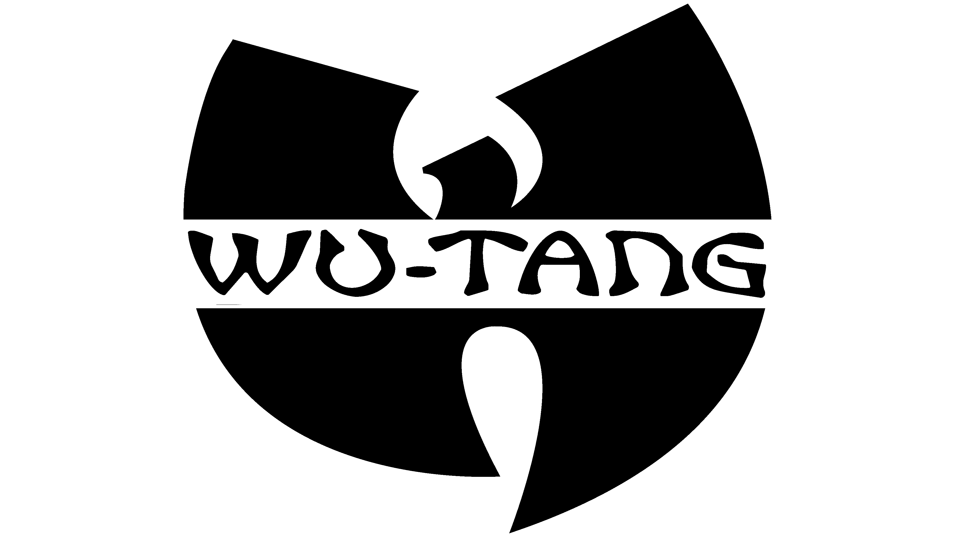
Many see the group’s logo as an imprint of Eastern culture because the word “WU-TANG,” located in a horizontal stripe across the letter “W,” is written in Chinese style. And this is no coincidence, because the name of the musical group was taken from the Hong Kong film Shaolin and Wu-Tang, whose plot centers on the martial art of kung fu. Action heroes fought with swords, and RZA compared them to rappers, whose sword is language and words. By analogy, U-God called the Wu-Tang Clan “lyrical assassins.”
It can be said that many of the band members grew up on Eastern philosophy. In the 1970s, foreign films about kung fu were popular among black residents of the United States because white people were not extolled there, and Asians were a symbol of strength. Therefore, for rappers, especially for RZA, the Shaolin Temple had a special meaning. He often recalled a Shaolin monk who traveled to teach his martial arts style. In his opinion, the Wu-Tang Clan has a similar story: the group rose from the slums to showcase their hip-hop style. So it’s no surprise that her logo looks like an icon from a kung fu comic book.
At first, the corporate symbol had to contain a hand with a severed head because it was created for the single “Protect ya Neck.” But RZA and Mathematics agreed unanimously that the drawing was too bloody. Therefore, they abandoned the original idea and left only the letter “W,” which later became a logo.
Someone sees a stylized CD in the image, while others see a bird with large wings or the Batman emblem. RZA has its own opinion on this matter. The group’s founder claimed that “W” resembles the peaks of the Wudang mountain range, where many Taoist temples and monasteries are located. He saw a giant W-shaped sign upon arriving in Shaolin and climbing the winding roads to Mount Wudang. True, this happened after the logo was created. But RZA found this coincidence very symbolic.
Font and Colors
The word “WU-TANG” that crosses the big “W” is stylized in Chinese handwriting. The jagged lines give the impression that the letters were drawn with a brush. This inscription was invented by Ronald Bean (aka Mathematics) when he created various graffiti versions of the musical group’s icon.
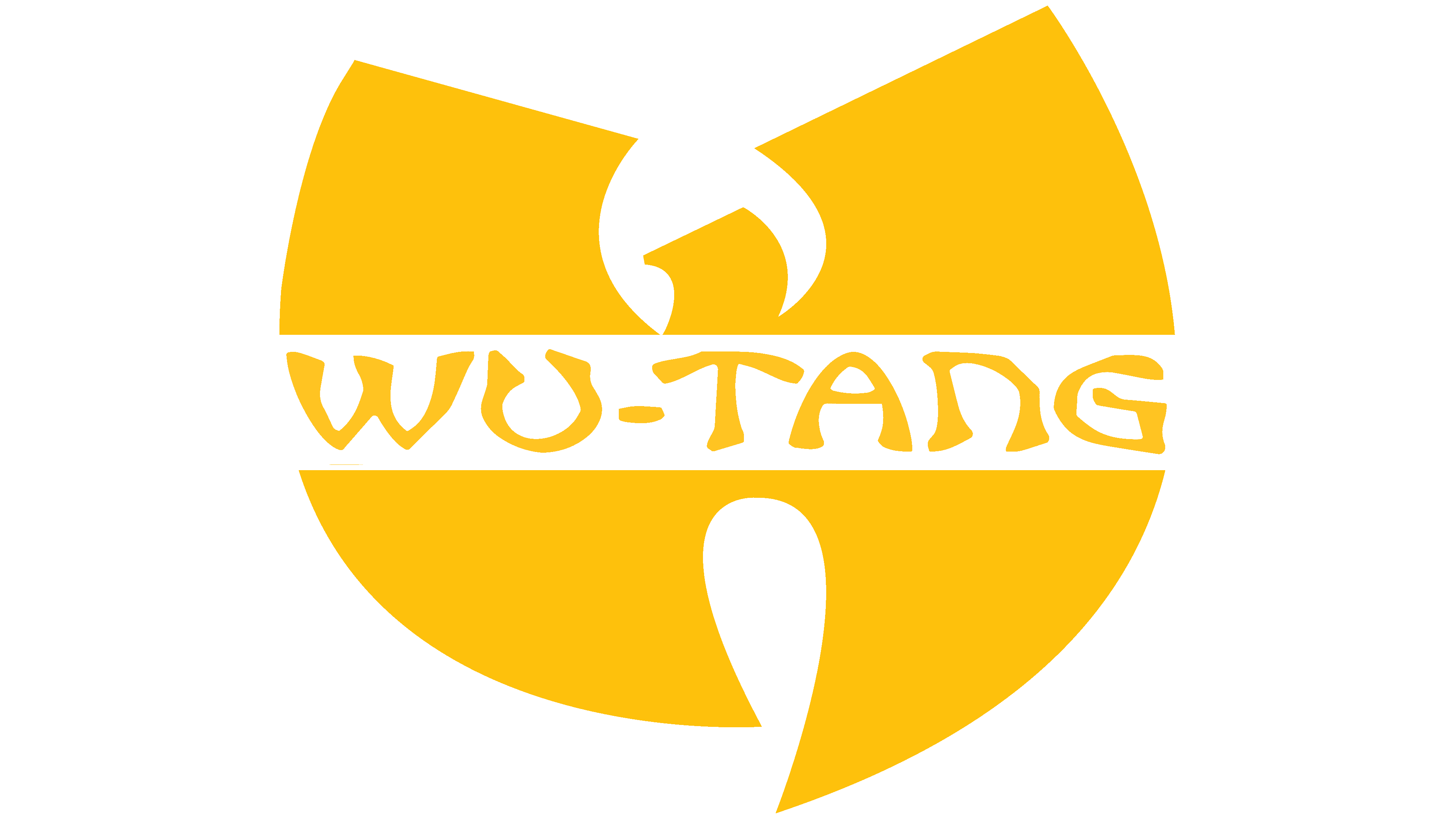
The primary color is yellow, though a versatile black-and-white option works well for use on light, dark, or colorful backgrounds.