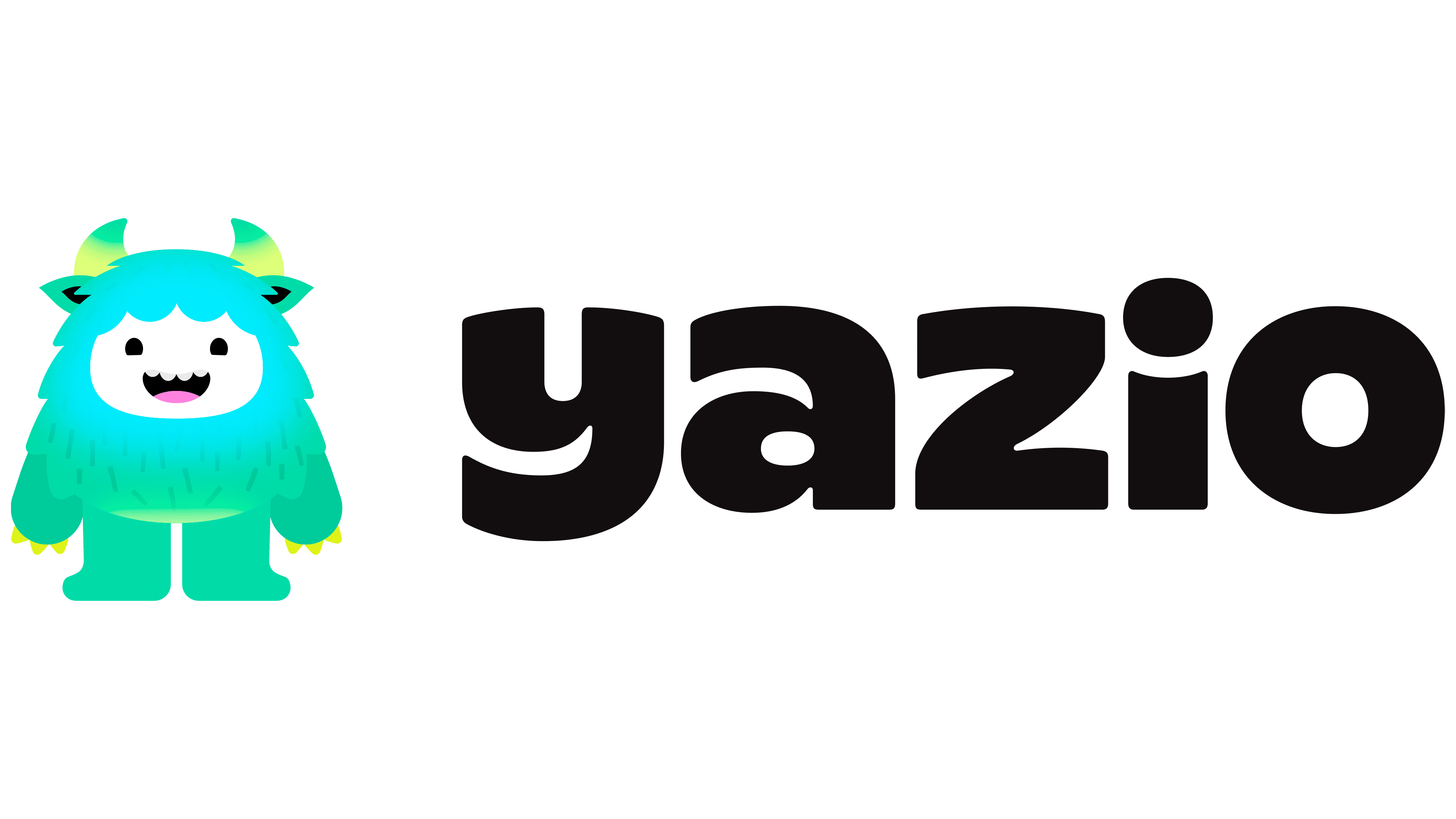
Yazio is moving away from the image of a dry food-tracking app and building a brand around support, play, and healthy habits. The app launched in 2014. It was founded by Sebastian and Florian, who combined an interest in healthy eating with a focus on digital products. Today, millions of people use the service. The update by Koto moves Yazio out of the group of similar trackers and into a warmer, more lively format with a character, a soft tone, and a clear emotional layer.
The old logo showed the nutrition theme too directly. The apple, divided into colored parts, looked fragmented. The wordmark did not give the brand a distinct mood. For an app about habits, motivation, and personal goals, the mark felt cold. It showed the category but did not connect with a person who needs support with everyday food choices.
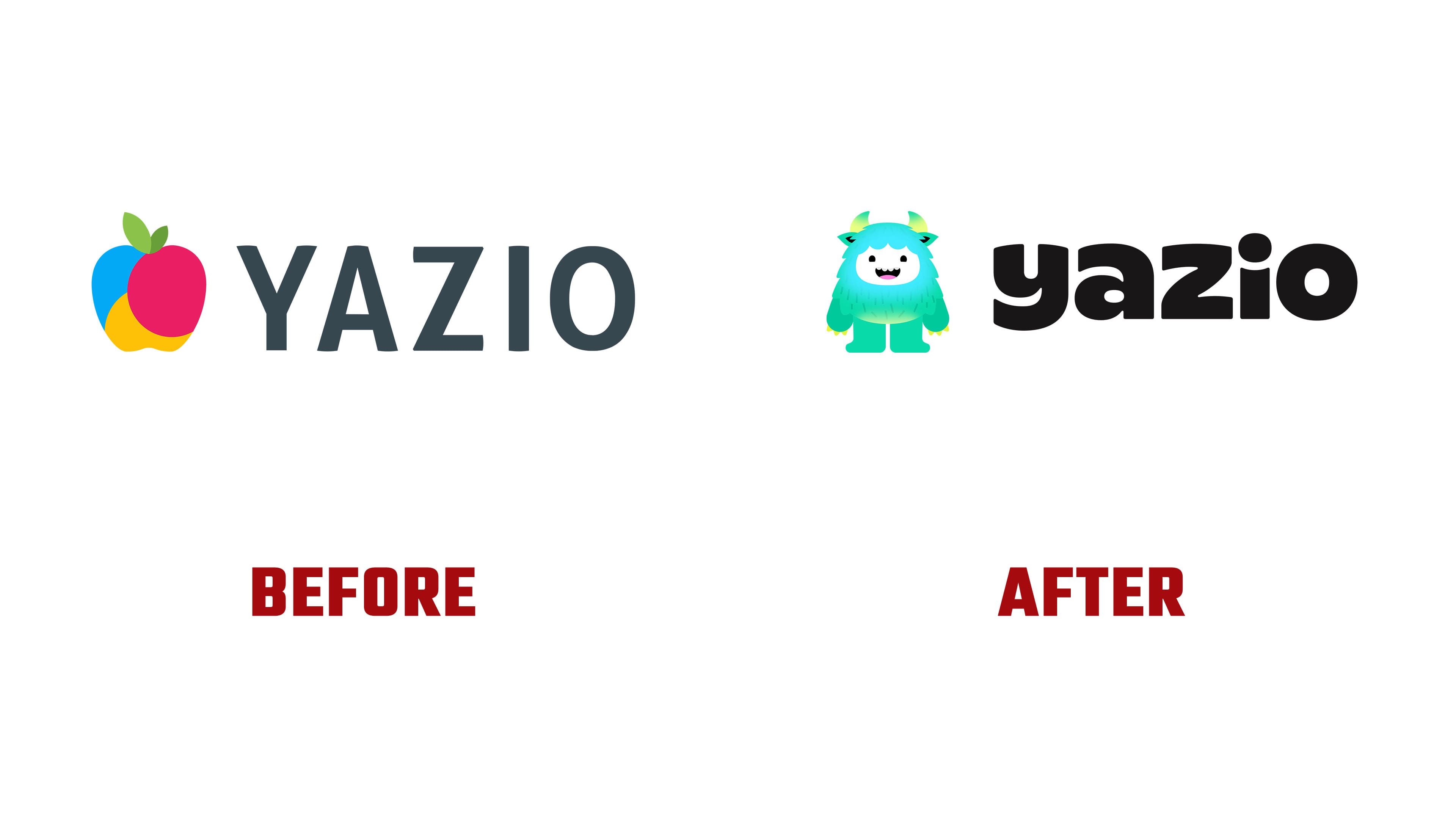
The new logo changes Yazio’s mood through the shape of the letters. The name is set in lowercase, dense, rounded characters. The lines look soft and almost tactile. The arcs in the “y” and “z” resemble a smile. The wordmark conveys the idea of pleasant change, in which healthy eating is connected to a more comfortable pace.
The Yeti became the main image of the identity. It replaced the apple and gave the brand a face for the app, campaigns, and merchandise. For Yazio, the character helps reduce anxiety around health. The Yeti looks like a friendly companion. It accepts different user states. Its silhouette is built around the face shape, the fur outline, and the horns. Gradients in the face and belly area add volume, although the overall presentation remains flat.
Yazio Sans, created by Hottype, extends the logo’s shape into a full typographic system. Rounded contours, dense letters, and closed forms connect the interface with the main mark and the Yeti. Noto Sans is used for practical text. The pair of typefaces helps the brand keep a warm tone in communication and clarity in the product.
Koto built a system in which the logo, name, and mascot work toward a single goal. Yazio no longer looks like an app with a neutral food-tracking icon. The new image makes working with habits easier, warmer, and more personal.