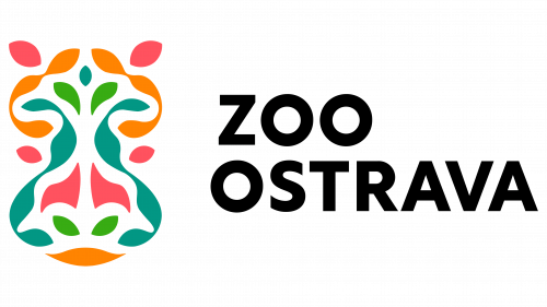
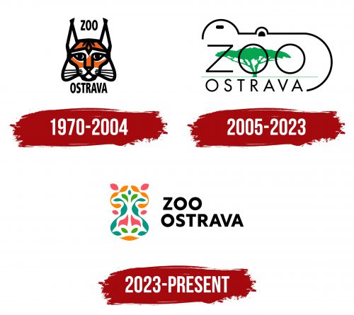
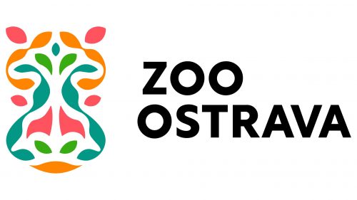
ZOO Ostrava logo has undergone a significant transformation, shedding its monochrome identity for a palette bursting with color. The new emblem features pastel shades of pink, yellow, green, and turquoise, offering a vibrant yet subdued appeal. Beyond the colors, an intricate pattern forms the barely noticeable shape of a hippopotamus head, seamlessly tucked to the left of the bold, grotesque lettering that occupies two levels.
Breaking away from a monochromatic color scheme serves multiple purposes. A multi-colored logo naturally attracts more attention, catering to a diverse audience, including families, kids, and wildlife enthusiasts. Pastel colors ensure that the attraction is gentle and welcoming, not overwhelming. These colors also resonate with the natural elements one expects to find in a zoo setting, invoking a sense of harmony with nature.
Including a hidden hippopotamus head in the intertwined leaves, petals, and stems brings the emblem an extra layer of fascination. It invites viewers to look closely to engage with the design, echoing the zoological park’s underlying message: there’s always more to discover in the natural world. This feature effectively mimics what one has experienced when visiting the zoo—there’s a sense of discovery, a moment of wonder, every time a new creature or plant is spotted.
Integrating the animal shape next to the lettering achieves a harmonious balance between text and visual elements. It’s a carefully thought-out design strategy reflecting the zoo’s commitment to education and entertainment. The bold, grotesque font used for the name amplifies this by being both readable and impactful, fulfilling the need for effective communication and brand recognition.
All these details culminate in an emblem that serves as a microcosm of what ZOO Ostrava aims to offer its visitors: a blend of discovery, education, and a connection with nature. The colors and patterns are not merely for show; they represent the multifaceted experiences that await within the zoo. The result is an elegant, thoughtful design that moves beyond aesthetic value. It is rich in symbolism and meticulously crafted to convey the zoo’s mission and values, capturing what makes it a unique destination for wildlife and nature lovers.
ZOO Ostrava: Brand overview
| Founded: | 1948 |
| Headquarters: | Ostrava, Czech Republic |
| Website: | zoo-ostrava.cz |
ZOO Ostrava traces its roots back to 1951 when it was established in the Ostrava-Kunčičky vicinity, initially named Kunčičky Zoo. Surprisingly, the initial establishment was an endeavor of local miners who dedicated their off-hours to construct the zoo on a modest six-hectare parcel adjacent to the Alexander coal mine. Five years later, plans were laid to shift the zoo to a new setting in Ostrava’s Stromovka Park. This relocation materialized in 1960, marking a new chapter in the zoo’s history.
Over the subsequent years, ZOO Ostrava underwent numerous changes and enhancements. During the 1980s, a South American-themed area came into existence. In 1996, the zoo gained membership in the European Association of Zoos and Aquaria (EAZA), affirming its growing reputation. Milestones such as unveiling new exhibits for lions and flamingos in 2000, the inauguration of an elephant pavilion in 2004, and overhauling the hippo pavilion in 2010 further enriched its offerings.
ZOO Ostrava sprawls over a vast 100-hectare area and is home to an impressive collection of more than 4,000 animals representing 394 species. The establishment has expansive natural settings, interior displays, a botanical section, and visitor play areas. With a focus on delivering educational and immersive experiences, ZOO Ostrava is dedicated to the cause of wildlife conservation. Continued investment in facility improvements keeps it at the forefront among zoological institutions in the Czech Republic.
