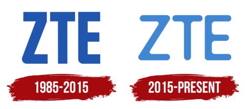
The ZTE logo exudes a feeling of lightness akin to a breath of wind. The emblem embodies wireless data transmission, the company’s primary focus. The manufacturer’s innovations represent the dreams and futuristic visions of tomorrow.
ZTE: Brand overview
| Founded: | 1985 |
| Founder: | Hou Weigui |
| Headquarters: | Shenzhen, Guangdong, China |
| Website: | zte.com.cn |
Originating in Shenzhen, China, ZTE Corporation was established in 1985 by Hou Weigui with a primary mission of producing PBX switches. The company set its sights on foreign markets three years later, marking its initiation into global trade. By 1993, ZTE pioneered China’s telecommunication landscape, laying out the country’s inaugural GSM digital mobile phone network.
In a milestone moment, the firm went public in 1997 on the Shenzhen stock exchange, further fortifying its financial footing. Two years later, it intensified its commitment to innovation by establishing research and development facilities in several Chinese cities, including Shanghai, Nanjing, and Xi’an. Expanding its financial presence, ZTE made its way onto the Hong Kong stock exchange in 2004.
Leadership transitioned in 2010 when Shi Lirong assumed the role of CEO, succeeding the founding visionary Hou Weigui. Under new guidance, ZTE climbed the ranks to become the world’s fourth-largest smartphone manufacturer by 2012. Fast-forwarding to the present day, ZTE has evolved into a telecommunications behemoth, providing an expansive array of products and services that span from wireless and core networks to telecom software. Boasting a global workforce that exceeds 75,000, the company is a testament to more than three decades of consistent growth and ingenuity.
Meaning and History
The company’s emblem primarily features English letters, targeting an international customer base. The symbols offer simplicity and conciseness, emphasizing the ease of use and accessibility of the company’s services. Although established in 1985, the company adopted its current name, which appears abbreviated on the emblem, in 1993. A minor rebranding in 2015 added even more lightness and airiness to the logo while barely altering its structure.
What is ZTE?
ZTE is a smartphone and internet equipment manufacturer initially established to fulfill military contracts. The company ranks 10th globally in its industry. Forty-seven of the world’s 50 largest telecom operators have contracts with ZTE. Nonetheless, the giant’s operations are not scandal-free. ZTE’s telecommunications services have been banned in Europe since 2023, and equipment imports to the U.S. have been restricted since 2022.
1985 – 2015
The company’s emblem consists of three large capital letters—Z, T, and E—in blue. The sign is an abbreviation of Zhongxing New Telecommunication Equipment Co., Ltd., adopted in the 1990s.
The lettering features sharp angles at the top and smooth curves at the bottom, symbolizing the company’s growth and evolution in both global and Chinese markets.
Initially, the company struggled to distribute its products in large cities due to renowned competitors like Ericsson. It primarily sold telephone stations and services in the provinces. Yet, a decade later, the company altered the landscape, went public, began accepting international orders, and made it into China’s top 300 companies. This change is reflected in the transformation of the logo’s letters.
Sharp angles signify confidence, strength, and a proactive stance that grows as the production expands. The smooth elements highlight the flexibility and attract customers with beneficial offers.
Elongated upward elements point to the aspiration for maximal development in their niche.
2015 – today
By 2015, the company secured 4th place globally in phone production. It was the first to introduce the Axon smartphone featuring two primary cameras. ZTE is actively working on its international image and refreshed the logo to emphasize progress.
The new brand logo retains the three iconic letters. The symbols now feature a lighter, pleasant color and a refined design with rounded glyphs. The lines appear smooth, devoid of angles and pockets, emphasizing flawless technology and continuous forward motion.
The glyphs have become narrower, but the letter width has expanded. It’s as if each symbol represents an individual plug or router that connects the customer to future technologies. After all, the first ZTE foldable smartphone with dual screens, an under-display camera, and an iris scanner is right around the corner.
Font and Colors
The manufacturer chose shades of blue for both logos that speak to technical excellence and professionalism. The modern logo is rendered in a light blue hue.
This color embodies the lightness that grows with technological advancement. Smartphones are becoming increasingly thin and lightweight, and equipment is shrinking to micro sizes.
The shade of the sky and clouds is the archetype for wireless data transmission and invisible mobile communication. This color indicates ease of product control, software excellence, and fast connectivity.
A slightly animated font resembling Thirdlone Sans Ink was chosen for the inscription, acting as a ticket to the world of artificial intelligence and virtual reality. Smooth lines without sharp angles symbolize flexible communication, equipment versatility, and support for the most popular standards.
ZTE color codes
| Bleu de France | Hex color: | #4186d2 |
|---|---|---|
| RGB: | 65 134 210 | |
| CMYK: | 69 36 0 18 | |
| Pantone: | PMS 279 C |


