The company’s drink is characterized by its lightness and refreshing taste. The 7up logo indicates a special twist in the form of sharp, fizzy gas bubbles that improve the soda’s digestion. The emblem contains naturalness, purity, and sourness from the green lime filling.
7up: Brand overview
7up is a famous lemon-lime soda in America and abroad. In 2019, the brand celebrated its 90th anniversary. Keurig Dr. Pepper Company currently owns it in the United States. The main flavors are lemon-lime and cherry.
The drink appeared in the American city of St. Louis in 1929. Charles Grigg’s company, The Howdy Corporation, advertised it as a hangover cure and mood regulator. It contains lithium compounds that stabilize HR and relieve migraines.
Meaning and history
The original name was Lithated Lemon-Lime Soda. The creator himself joked that his soda helped with seven types of hangovers. In addition, it consisted of 7 ingredients and was bottled in 7-ounce bottles. The atomic mass of lithium is also seven. Therefore, when the need arose to shorten the name, the number seven was used, and the signature up, signifying lift. The idea of seven and the soda’s ability to invigorate and normalize state of mind and mood was the key to creating the logo.
What is 7up?
7up is a popular lemon and lime-flavored carbonated drink created by Charles Leiper Grigg two weeks before the Great Depression. Although this product appeared at a very bad time, it managed to become famous all over the world and supplant everyone’s favorite cola. Its original name was Bib-Label Lithiated Lemon-Lime Soda.
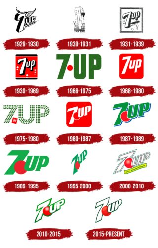
1929 – 1930
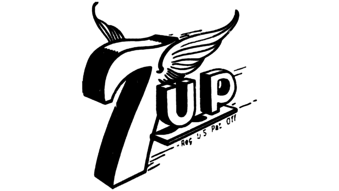
The first logo shows the number 7 with wings in the shape of a bird rushing forward and taking off. It carries the word “up” on a base. This symbolizes the drink’s ability to sober up, put you back on your feet quickly, and give you energy and strength. Interestingly, the image was made in black and white. Soda appeared during the Great Depression, when many businessmen were making losses, and color printing was expensive.
1930 – 1931
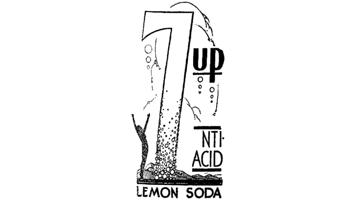
This emblem version depicts the seven as a gushing geyser that fills, invigorates, heals, and cools the person below. The compliment “up” also floats above the seven bases on a thin line, demonstrating its verbal meaning. The background of the composition shows the tops of mountain peaks below. The geyser rises above the mountains, which also symbolize purity and coolness. The logo rushes upwards to rise, prosperity, and cheerfulness.
The emblem appeared with the inscription “Anty-acid.” It stated that the composition removes salts of uric acid (urates) from the body, which were the cause of many diseases at the time. This sign added to the soda’s popularity.
1931 – 1939
The logo becomes more concise, retaining only the name. However, the idea of cheerfulness, sobriety, and good mood is still the key idea. This time, it is indicated by the inscription, which rises from the bottom to the top along with the surrounding air bubbles. The idea of “buoyancy” is also demonstrated by the word “up,” which has broken away from its stand and is floating upwards. The entire inscription is tilted obliquely upwards, complementing the movement’s message. At the same time, the user watches the composition rise slightly from below. The emblem urges him to grasp the drink and float to the surface. The idea of eliminating depression during the global recession came to mind. And sales of sodas with this logo quickly went up.
1939 – 1969
By the end of the global crisis, the drink’s logo had acquired brighter colors. This was the heyday of Pop Art in design, with bold colors and flowing contours. 1935, the era of color cinema began, and the logo became vaguely reminiscent of the frame.
The classic combination of red and black created contrast, a sense of transition from decline to vigor. The red background shows the leader and epitomizes the people’s love. By the 1940s, soda had become the third largest-selling soft drink worldwide. The black stripes that bordered the emblem at the top and bottom showed the golden mean that the drink provides without causing excessive emotions and hysteria and without driving into depression. The black shadow of the letters was associated with clarity of thought.
1948, lithium citrate was excluded from the formulation due to prohibition, and the product was no longer considered medicinal. Sales of the drink began to decline, as tonics were plentiful by then.
1966 – 1975
In the mid-1960s, designers interestingly played with the brand name by adding a large red dot between the letters “7” and “UP.” The lettering was dark green, associated with one of the drink’s main ingredients—lime. The tall, bold sans-serif letters and the number in the same font looked spectacular.
1968 – 1980
To stand out and keep customers’ attention, especially the younger audience, the 7up brand resorted to active and bold advertising, which the Walter Thompson agency handled. The advertising agency suggested that the name Uncola (rather than cola) be associated with the drink to encourage a spirit of opposition among young people. This period was the heyday of hippie culture and the struggle against war. In honor of the famous American Summer of Love (1967), initiated by the hippies, the logo was given a pure red background, “love.” The white letters of the name became a symbol of peace. The idea played its role, and the drink sales increased dramatically again.
1975 – 1980
The red square with the white lettering “7up” was reduced, moved down, and placed in one of the corners. In this form, it acted as a dot between the large “7” and “UP,” which consisted of many green circles of varying sizes. This “perforation” can be interpreted in different ways. On the one hand, the designers depicted air bubbles, which improve the taste of carbonated water. On the other hand, the green circles could be stylized limes.
1980 – 1987
In 1978, the brand changed ownership. During this period, a separator mark resembling an air bubble or balloon appeared between the number 7 and the lettering, which was used to make the lettering fly upwards.
1987 – 1989
The year 1986 marked the next sale of the brand and its division into two brands – in the United States and Europe. In America, the owner became Hicks & Haas, which merged with Dr. Pepper.
The bright red background was removed, leaving only a red circle. It symbolized cherry—a new taste for that time. The letters were also colored for the first time in history: green with a white outline, which indicated that the main flavor of the drink was lime, the rind of which was green. In general, the logo became bright and life-affirming.
1989 – 1995
In 1988, the 7up brand was merged with Dr. Pepper, which was the reason for the new rebranding. The designers aligned the name of the carbonated beverage so that it did not fly up and slightly changed the shape of the glyphs, achieving a better perception. Gone were the white outlines and blue shadows, and the red dot was enlarged.
1995 – 2000
In 1995, the drinks manufacturer was bought by Cadbury Schweppes, which served as a promise to create a new logo. The design is in the Art Nouveau style, characterized by asymmetry. This can be seen in the unusual shape of the number 7 with a strongly elongated base. The red circle has also changed a lot. It was elongated and now had the shape of a lime.
The new owners decided to appeal to history to increase the soda’s popularity and recognizability. They added to the label the inscription “uncola” (not “cola”), under which the brand was successfully advertised in the 1970s.
2000 – 2010
The brand continues to evolve, and the name on the logo reverts to the diagonal style, showing the rise. This time, the movement is towards naturalness. To fully live up to this definition, the owners change the formulation. But in the end, the wording “natural” was challenged, and the label is now labeled 100% natural flavors. It is placed on a bright yellow ribbon under the brand name. The name itself became very light, also symbolizing renewal and naturalness.
The red circle gained volume in ’93 when it was animated and turned into a red balloon game character.
2010 – 2015
In 2008, Dr. Pepper Snapple Group split from Cadbury and continued to work on the drink’s composition, expanding its range.
The logo’s emerald green outline returned. This change was meant to take the customer back in time as testing of the 7 Up Retro range began. This variation used sugar instead of the criticized HFC (glucose-fructose syrup). A stronger slant on the lettering marked the new “old” beginning.
2015 – today
The logo has acquired a more noble dark green outline, symbolizing the brand’s strong position and impressive history.
Font and Colors
The main colors are red, green, and white. These colors of health, love, cheerfulness, and naturalness match the 7-Up drinks. The logo’s font is Helvetica Neue.
FAQ
What does the 7UP logo stand for?
The 7UP logo consists solely of its name with no hidden connotation. Originally, the design of the can was a pattern of bubbles. Later versions featured a mascot in the form of a red spot, supposedly symbolizing the red eyes of the drink’s creator.
Why did 7UP change its logo?
According to PepsiCo’s design director, Mauro Porcini, the logo change modernized the brand’s look to better match modernity. The update aims to reinforce the “up” component of 7Up, reflecting the brand’s refreshing spirit.
What was the original 7UP logo?
The original 7UP logo, introduced in 1943, was a square-shaped icon with softened edges. The center portion was red and decorated with white bubbles. Black and white stripes framed the top and bottom, and the brand name was prominently displayed in 3D.
What does the number 7 in the word 7UP stand for?
According to Britvic, the “7” in the word 7UP refers to the original 7-ounce bottle size, which set the drink apart from others, as most other soft drinks were sold in 6-ounce containers. The term “UP” is believed to be derived from the phrase “bottoms up,” colloquially meaning “Let’s drink up!”.
