


 AARP Logo PNG
While the AARP logo is not original, it has deep meaning. The bright and inspiring symbol of the American Association of Retired Persons shows that this organization helps retirees feel confident, supports important issues, and improves their quality of life.
AARP grew from the work of Ethel Percy Andrus, a retired educator in Los Angeles. In 1916, she had become the first woman to lead a major urban high school in California as principal of Lincoln High School. After leaving education, she worked with the California Retired Teachers Association. She visited a former Spanish teacher living on a $40 monthly pension in a converted chicken coop behind a house.
That visit shaped Andrus’s next work. In 1947, at age 65, she founded the National Retired Teachers Association, or NRTA, to fight for better pensions and affordable insurance for retired teachers. Private insurers treated older Americans as uninsurable, and Andrus was rejected 42 times before New York broker Leonard Davis helped build a pilot insurance plan. In 1956, NRTA launched a national group health insurance program for older Americans, years before Medicare.
Demand soon came from people outside the teaching profession. In 1958, Andrus and Davis created the American Association of Retired Persons, or AARP, for Americans over 55, with Davis providing $50,000 in startup funding. The group began publishing Modern Maturity and, in 1959, started the AARP Drug Buying Service, which offered members mail-order medicines at wholesale prices.
AARP gained significant political influence in 1965 with the passage of Medicare and the Older Americans Act. It pushed for Medicare to cover all Americans over 65, not only Social Security recipients. In 1967, it backed the Age Discrimination in Employment Act, the same year Andrus died. Later, under Cyril Brickfield, AARP expanded its base, lowered the membership age to 50 in 1984, created AARP Services Inc. following a 1994 IRS settlement, and faced AMAC as a rival starting in 2007.
Meaning and History
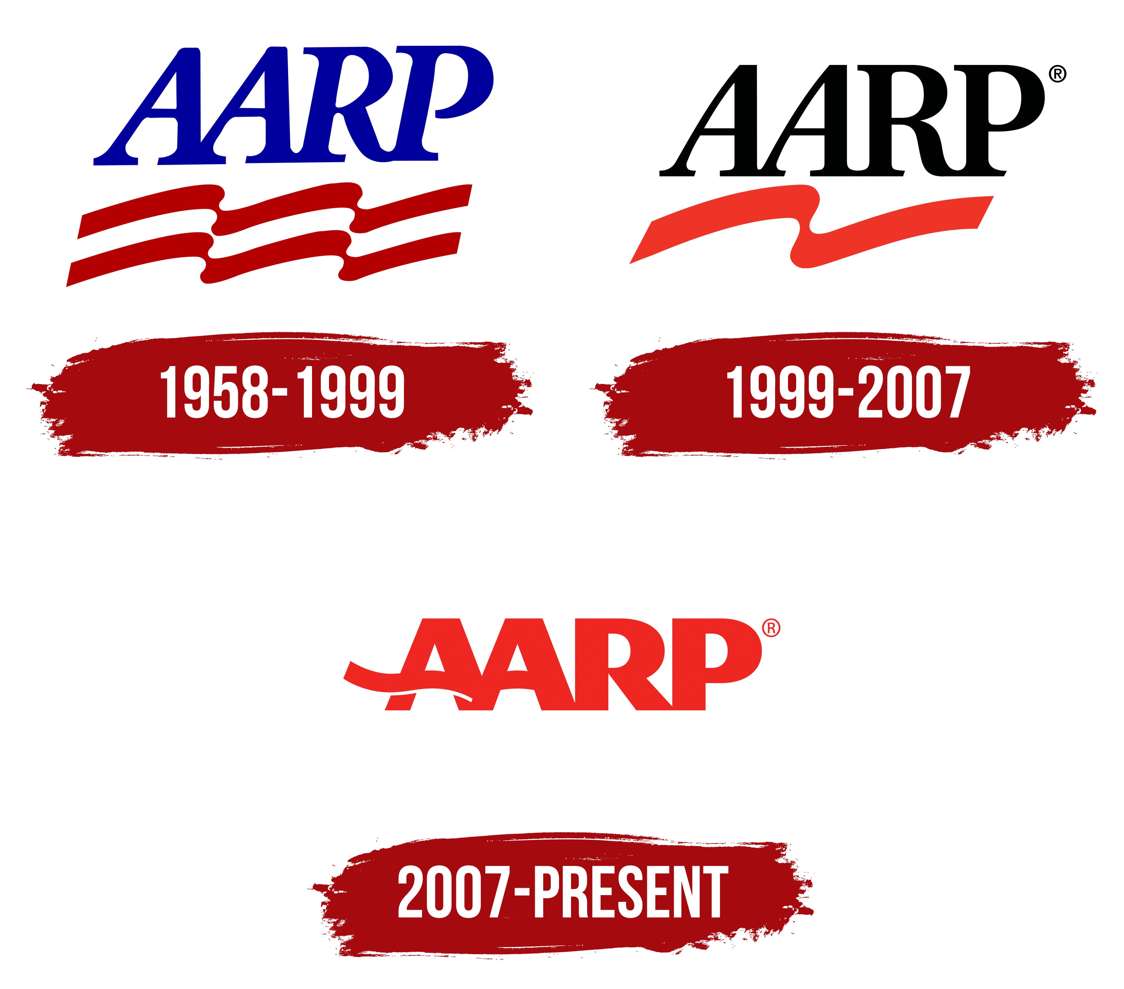
The public organization’s logo has changed many times. This shows that retirees keep up with the times and are active members of society, no strangers to modern technology and imagery.
What is AARP?
The association was organized in 1958 to support retirees and protect their rights. It includes five chapters with different areas of assistance: AARP Insurance Plan (health insurance), Legal Counsel for the Elderly (legal counseling), and others.
1958 – 1999
The first logo was an abbreviation of the name, highlighted by a descending red-and-white ribbon.
All capital letters of the monogram are connected by lower serifs, forming a single plane of support. This is a symbol of stability. The association helps one to stand strong even when one retires, and one’s income and vitality diminish. The image also shows mutual support among the association’s members.
The slight forward tilt demonstrates a continued movement in the flow of life, keeping up with the changing world. The association helps retirees stay in tune with what’s going on, stay connected, travel, continue visiting restaurants, and make major purchases.
The evolving ribbon below the acronym consists of two red ribbons and a white stripe between them. These colors echo the NRTA (Retired Teachers Association) emblem that preceded and merged with AARP.
The use of blue, red, and white ties the emblem to the American flag and reflects AARP’s country of origin and its members’ patriotism.
1999 – 2007
In 1999, the organization changed its name to an acronym. This decision was made to remove the emphasis on retirees, as the association allows membership of seniors, both active and retired. The letters RP were interpreted not to mean “Retired Persons” but “Real Possibilities”. That same year, AARP Services, the company that manages all member benefits, was established.
The new logo changed its color scheme to red and black, stripping away the hues and emphasizing the U.S. flag. The new colors signaled that the organization was addressing fundamental issues across all areas of retirees’ lives. The red color of the ribbon also testifies to the elderly’s energy and social activity, demonstrating care and support in addressing pressing, acute problems.
The slope has disappeared from the inscription, which emphasizes stability. The association helps pensioners to feel confident. The arc-shaped curve of A’s left leg resting on the massive straight right leg also hints at support for aging people.
2007 – today
The latest version of the emblem is different from the previous two. The color and font of the letters have changed, and the ribbon has moved upward, becoming a partition of the first letter, A.
The ribbon wave seems to depict the river of life, at the end of which AARP meets people. The association is a trusted ally. Membership in the organization instills confidence and connects members with many others who share common interests. This is indicated by the large, bold letters. The white underlining of the ribbon, like gray hair, hints at the members’ venerable age.
The former lower merge of letters is retained only between the two A’s denoting America and the Association. The organization works only for American retirees and covers all states. Membership brings together people from all over the country.
Font and Colors

The logo is done entirely in red. By 2007, the association decided to expand health insurance packages, which make up a significant part of its income (insurance companies pay the organization a commission for selling services under its umbrella). Red is the color of medicine and health care.

The choice of gamut also reflects AARP’s goal of helping retirees remain socially active and engaged in the community. From this perspective, the color red represents energy. The association has enough energy to inspire its members to live active lives.
The logo font is Magnesium MVB Regular.
AARP Logo Color Codes:
- red color: Pantone PMS Bright Red C; Hex #EE2722; RGB 238,39,34
FAQ
What does AARP stand for?
AARP was originally called the American Association of Retired Persons and was founded by Ethel Percy Andrus, a retired educator who had a Ph.
What font is the AARP emblem printed in?
The text on the AARP emblem appears to be an expanded version of the Le Monde Sans Black typeface, designed by Jean François Porchez and published by Typofonderie.
What color is the AARP emblem?
The latest version of the AARP logo retains its main visual elements but now uses an all-red color scheme, with simpler, more austere lettering.
What is the AARP interest group?
AARP, which began as the American Association of Retired Persons and has grown into a significant interest group in the United States, is primarily concerned with issues affecting Americans age 50 and older.
What are the benefits of AARP?
AARP membership gives you access to a variety of discounts covering everything from travel and restaurants to insurance and phone plans. The cost of membership is quite reasonable: $12 for the first year with automatic renewal and $16 per year thereafter.
Does AARP exist in Canada?
CARP is the Canadian version of AARP and serves Canadian retirees.