ACE Resource Network received a new identity from Numinous Agency before its July 2025 launch. The organization works with childhood trauma, toxic stress, and adverse childhood experiences. The main task is to help doctors, hospitals, states, and public organizations implement ACEs screening, prevention, and trauma-informed treatment beyond California.
The logo became the main sign of the update. The heavy educational emblem with a large letter “A” and numbers was replaced by a lighter mark. It looks like a star or a flower made from intersecting lines. The image moves away from literal medical, child-focused, and trauma-related motifs toward themes of connection, support, and a shared sense of direction.
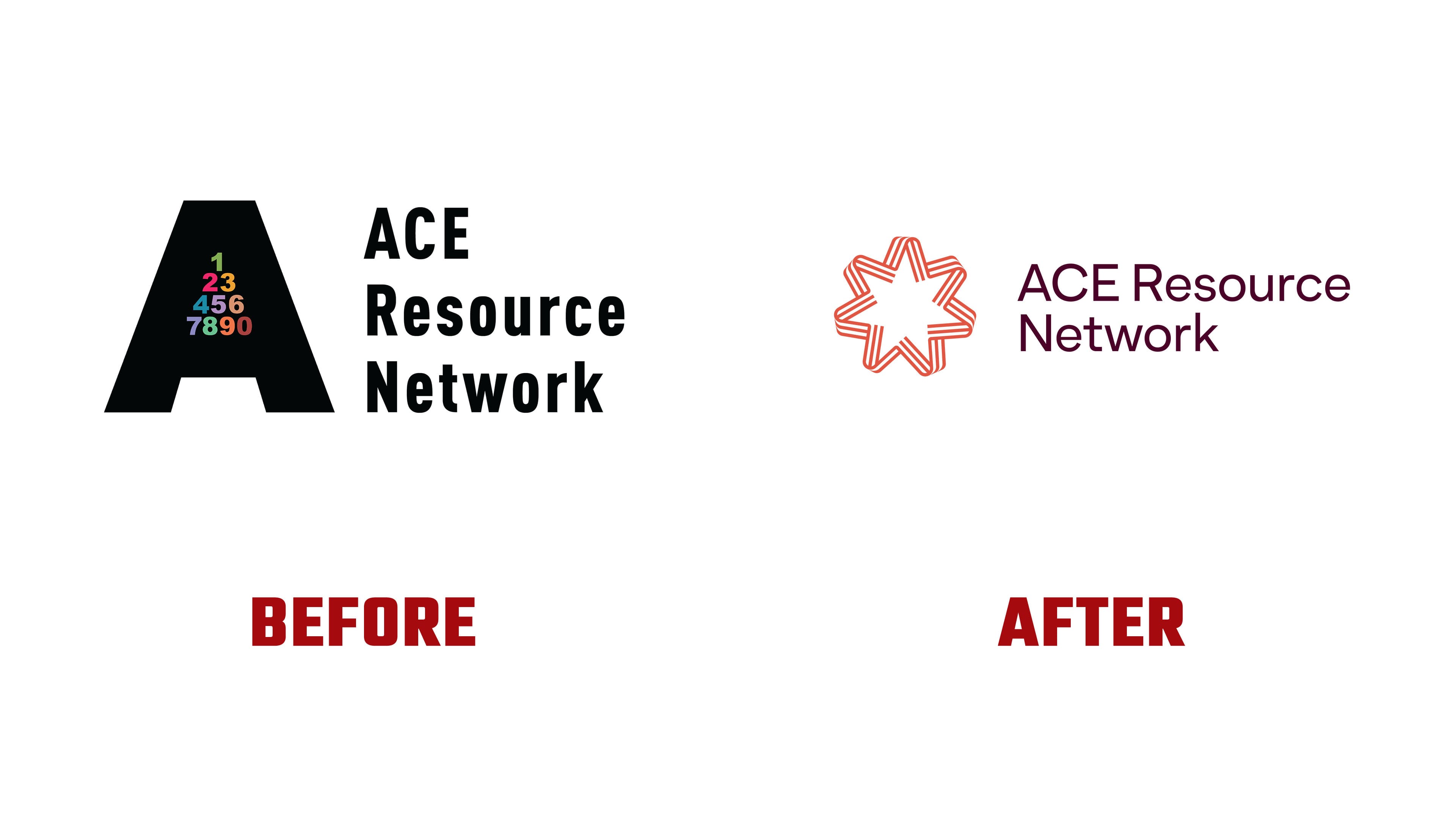
The mark is based on the ideas of a force multiplier and a North Star. The first is connected to a network in which the work of different participants strengthens the overall result. The second sets a course for doctors, hospitals, organizations, and lawmakers. The intersecting lines show how separate efforts come together to form a single support system.
The previous logo felt closer to an older type of social program. A rigid, sans-serif, dry presentation and educational associations made the image feel administrative. The new version has a softer tone. The coral background, light symbol, and calm typography give it a more human feeling. For the topic of childhood trauma, a warm presentation helps build trust.
For ACE Resource Network, the identity became a working tool for a national network. Numinous Agency prepared the brand strategy, logo design, visual identity system, guidelines, and collateral design. Uniko Studio handled the website.
The new logo helps the brand speak calmly and carefully about a difficult topic. The focus is coordination, care for people, and long-term change in systems that affect the health of children and families.